What this deck covers
This deck focuses on Information From Visuals Charts And Media, giving you a quick way to review the definitions, rules, and examples that matter most for 4th Grade ELA.
Study Information From Visuals Charts And Media in 4th Grade ELA with focused flashcards that help you recognize the idea, recall the key rule, and apply it in practice-style prompts.
0% Complete
Which option best describes how a diagram contributes to understanding a text about a process?
Tap card or press Space to flip
It shows the steps and parts so the process is easier to visualize. Diagrams make complex processes visually clear.
How well did you know it?
Card 1 / 54
Space to flip · ← / → to move · once flipped, → Got it · ← Still learning
This deck focuses on Information From Visuals Charts And Media, giving you a quick way to review the definitions, rules, and examples that matter most for 4th Grade ELA.
Work through these flashcards in short sessions. Try to answer each prompt before flipping the card, then revisit any cards you miss until the explanation feels automatic.
Answer: It shows the steps and parts so the process is easier to visualize. Diagrams make complex processes visually clear.
Answer: Number of books read. Y-axis shows what's being measured vertically.
Answer: It adds details or examples that support or clarify the text. Audio provides supplementary information through a different sensory channel.
Answer: The value increases steadily each day. Pattern shows consistent +2 daily growth.
Answer: They name parts so the reader can understand the diagram clearly. Labels identify specific components to help readers interpret visual information.
Answer: Title and labels first. Title and labels provide essential context before examining data.
Answer: Tell how the visual adds, clarifies, or supports the text's ideas. Explain how visuals enhance text comprehension.
Answer: Compare amounts across categories. Bar graphs excel at showing relative sizes between groups.
Answer:
Answer: Plant A. Compare the heights: 12 cm > 9 cm.
Answer: It explains what symbols, colors, or lines represent. Legends decode visual elements so readers can interpret the display.
Answer: 10. Sum all quantities: 3+5+2=10.
Answer: It provides a real-world example that helps the reader visualize details. Photos make abstract concepts concrete through visual examples.
Answer: Dogs. Compare the values: 8 > 5.
Answer: Labels. Labels identify specific parts in diagrams.
Answer: Compare two sides of an issue quickly. Pros/cons charts organize opposing viewpoints for easy comparison.
Answer: The building existed before it expanded and later closed. Timeline shows creation, growth, then closure.
Answer: Show parts of a whole. Pie charts display proportions within a total amount.
Answer: The title and the labels on the axes or categories. These elements define what data is being presented.
Answer: Show events in time order. Timelines arrange events chronologically to show sequence.
Answer: Increase. The line rises from 3 to 7, showing growth.
Answer: It compares amounts across categories. Bar graphs use rectangular bars to show relative quantities visually.
Answer: A timeline. Timelines organize events chronologically with dates.
Answer: It explains what the photo shows and why it matters to the text. Captions provide context and connect images to the main text content.
Answer: Explain what the visual, audio, or numbers show and what they mean. Interpreting means analyzing and understanding the meaning behind visual/audio elements.
Answer: To connect the feature's details to the author's point in the paragraph. Rereading ensures you understand how the feature supports the text.
Answer: It shows the steps or parts visually so the process is easier to follow. Visual representation breaks down complex procedures into understandable parts.
Answer: Bar: compares categories; Line: shows change over time. Bar graphs compare amounts; line graphs track trends.
Answer: It shows locations so you can connect places to the text information. Maps visualize geographic context for text content.
Answer: Cite a specific detail from the visual that matches the text idea. Evidence means pointing to specific visual details.
Answer: Roots. Roots are the plant's water absorption organs.
Answer: Read the visual and explain what it shows in your own words. Interpreting means understanding and explaining the visual's meaning.
Answer: Check titles, labels, and units, then use the graph's data to verify. Careful analysis helps identify discrepancies or misunderstandings.
Answer: The main idea, the details shown, and what each visual emphasizes. Compare content, focus, and presentation methods.
Answer: What symbols, colors, or lines represent. Keys decode visual symbols for proper interpretation.
Answer: Name the feature and state the specific detail it shows. Proper citation identifies the source and relevant information clearly.
Answer: It shows how something changes over time. Line graphs connect data points to display trends and patterns.
Answer: They signal the topic of each section and help locate information. Headings organize content and guide readers to specific information.
Answer: Read the title first. Titles provide context before examining specific data points.
Answer: x-axis: categories or time; y-axis: amounts or measurements. These axes create the framework for plotting and comparing data.
Answer: Show change over time. Line graphs track trends and patterns across time periods.
Answer: It shows events in time order to clarify sequence and change. Timelines visualize chronological relationships between events.
Answer: Dogs. Compare values: 12>8>5.
Answer: It tells what the visual shows and why it matters. Captions provide context and significance for visuals.
Answer: Read headings first. Headings explain what each column/row represents.
Answer: Reread both and check labels, units, and source. Verify accuracy by cross-checking all visual elements.
Answer: It provides evidence or details that make the main idea clearer. Supporting features reinforce and expand on the text's central concepts.
Answer: Explore information by changing what is shown. Interactive features let readers customize their view of data.
Answer: Parts or how something works. Diagrams visually break down components or processes.
Answer: Using numbers, amounts, or measurements to show information. Quantitative means expressed in measurable amounts.
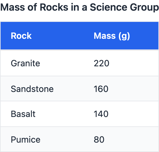
Answer: To compare information quickly and clearly. Tables organize data for efficient side-by-side analysis.
Answer: It organizes facts or numbers so they are easy to compare. Tables present data in rows and columns for efficient comparison.
Answer: What symbols or colors mean. Legends decode visual elements for proper interpretation.
Answer: It shows locations and spatial relationships described in the text. Maps visualize geographic information referenced in the text.