Bar Graphs and Box Plots
Help Questions
ISEE Upper Level: Mathematics Achievement › Bar Graphs and Box Plots
The double bar graph compares the number of students in two different schools over six months. Looking at the data, in March School B had exactly twice as many students reading books as School A. What was the total number of students reading books in March across both schools?
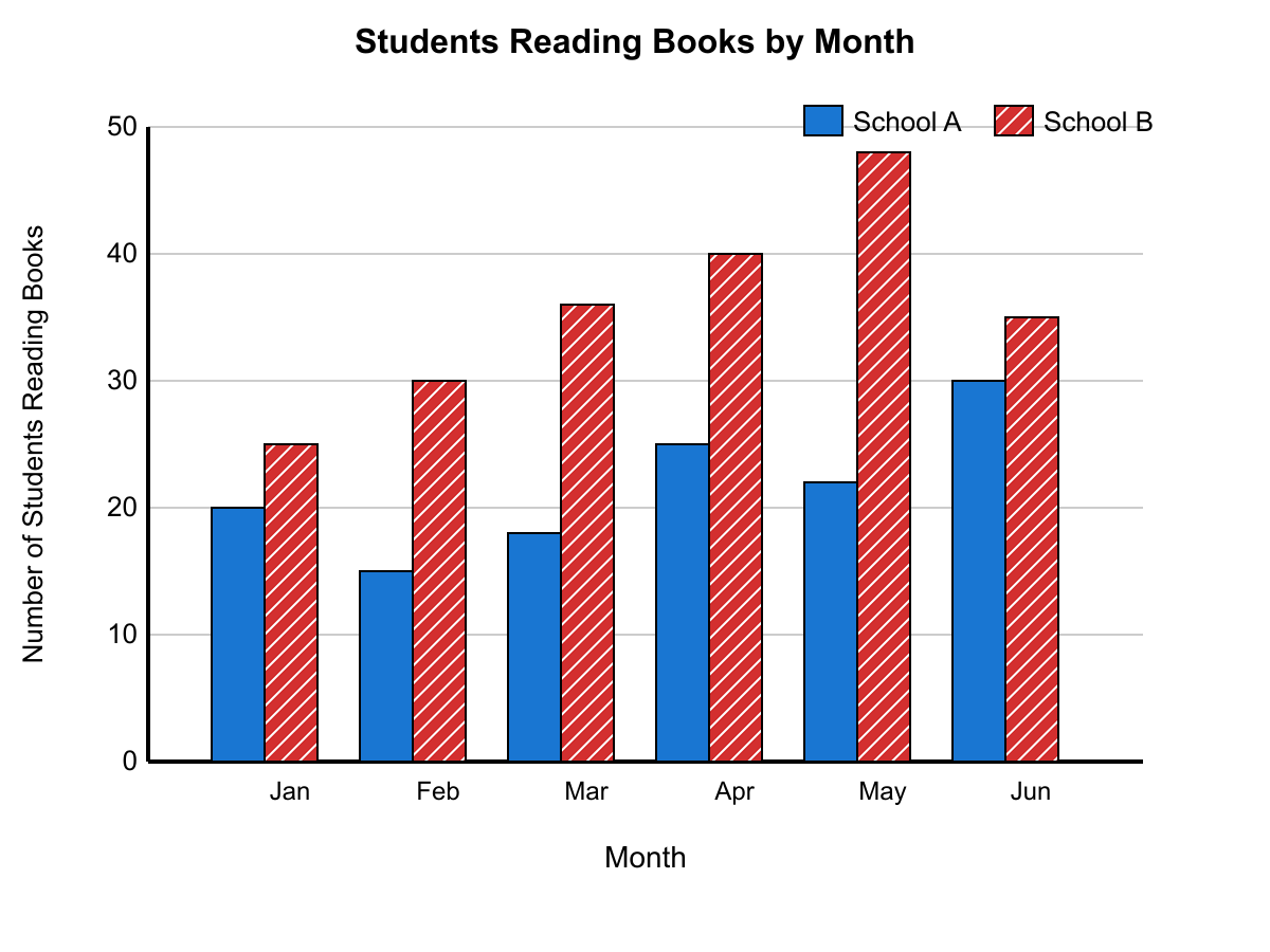
54 students total
60 students total
45 students total
72 students total
Explanation
From the double bar graph, in March School A had 18 students and School B had 36 students reading books. Since 36 = 2 × 18, School B had exactly twice as many as School A. The total for March = 18 + 36 = 54 students.
A box plot shows that a dataset has a minimum value of 12, first quartile of 18, median of 24, third quartile of 30, and maximum value of 42. If three additional data points (15, 27, and 36) are added to the dataset, which of the following statements about the new box plot is most likely to be true?
Both the first quartile and third quartile will shift, but the median may stay approximately the same
The minimum and maximum values will change, but all quartile values will remain identical
The median will increase and the interquartile range will remain unchanged
The median will remain the same and the third quartile will increase significantly
Explanation
When you encounter box plot questions involving added data points, focus on how new values affect the positions of quartiles rather than just looking at the raw numbers being added.
Let's analyze how adding 15, 27, and 36 impacts each part of the box plot. The original dataset has Q1 = 18, median = 24, and Q3 = 30. When you add three points, you're increasing the dataset size, which shifts where the quartile positions fall mathematically. The new points (15, 27, 36) are distributed across different sections: 15 falls between the minimum and Q1, 27 falls between the median and Q3, and 36 falls between Q3 and the maximum.
This distribution means both Q1 and Q3 will likely shift as the quartile positions recalculate with more data points. However, since 27 is relatively close to the original median of 24, the median may remain approximately the same, especially if the dataset is reasonably large. Answer C correctly captures this nuanced effect.
Answer A incorrectly assumes the median will definitely increase and the IQR won't change - but adding points at different positions typically affects the IQR. Answer B wrongly focuses only on Q3 changing significantly while claiming the median stays exactly the same. Answer D makes the impossible claim that quartiles remain identical when adding data points - quartile positions must recalculate with additional data.
Remember: when data points are added to a dataset, quartile positions shift mathematically, and you need to consider where the new points fall relative to existing quartiles to predict the direction of change.
A box-and-whisker plot displays test scores where the whiskers extend from 45 to 95, the box extends from 70 to 85, and the median line is at 78. If a student scored at the 90th percentile, approximately where would their score fall on this plot?
At the maximum whisker value since 90th percentile equals the maximum
Between the median and the third quartile within the box
Between the third quartile and the maximum value, closer to the maximum
Exactly at the third quartile position on the box plot
Explanation
Box-and-whisker plots organize data into quartiles, with each section representing 25% of the data. The key insight is understanding what the 90th percentile means: a student scoring there performed better than 90% of all test-takers, placing them in the top 10%.
Let's map out this plot: the box spans from the first quartile (70, representing the 25th percentile) to the third quartile (85, representing the 75th percentile), with the median at 78 (50th percentile). The whiskers extend to the minimum (45) and maximum (95) values.
Since the 90th percentile falls between the 75th percentile (third quartile at 85) and the 100th percentile (maximum at 95), a score at the 90th percentile would be positioned in the upper whisker region. More specifically, it would be closer to the maximum value than to the third quartile, since 90 is much closer to 100 than to 75.
Answer choice A correctly identifies this positioning. Answer choice B is wrong because the third quartile represents exactly the 75th percentile, not the 90th. Answer choice C incorrectly places the score within the box, but the 90th percentile must fall outside the box since the box only contains data from the 25th to 75th percentiles. Answer choice D assumes the 90th percentile equals the maximum, but the maximum represents the 100th percentile, not the 90th.
Remember: each section of a box plot represents 25% of the data, so use this to quickly estimate where any percentile should fall.
A box plot shows exam scores with the following five-number summary: minimum = 62, Q1 = 74, median = 81, Q3 = 88, maximum = 96. Using the 1.5×IQR rule for outliers, if a new student scored 45 on the exam, how would this affect the box plot display?
The new score would be plotted as an outlier point, and the whisker would extend to the lowest non-outlier value
The new score would extend the left whisker to 45 without changing the box structure
The new score would shift the first quartile downward but remain within the normal whisker range
The new score would be ignored in the box plot since it represents an invalid data measurement
Explanation
When you encounter box plot questions involving outliers, you need to understand how the 1.5×IQR rule works and how outliers affect the display structure.
First, calculate the IQR: $$Q3 - Q1 = 88 - 74 = 14$$. The outlier boundaries are $$Q1 - 1.5 \times IQR = 74 - 21 = 53$$ (lower bound) and $$Q3 + 1.5 \times IQR = 88 + 21 = 109$$ (upper bound). Since the new score of 45 is below 53, it's an outlier.
When a data point is an outlier, box plots follow a specific protocol: the outlier gets plotted as a separate point (usually a dot or asterisk), and the whisker extends only to the most extreme non-outlier value. Since 45 is an outlier, it would be shown as a point, and the left whisker would still extend to 62 (the original minimum, which isn't an outlier).
Choice A is wrong because outliers don't extend whiskers—they're plotted separately. Choice C incorrectly suggests the quartiles would change; adding one data point to a dataset rarely shifts quartiles significantly, and outliers don't affect the box structure anyway. Choice D is incorrect because outliers are valid measurements that must be displayed, not ignored.
The correct answer is B: the score becomes a plotted outlier point while the whisker extends to the lowest non-outlier value.
Remember this pattern: outliers always appear as separate points on box plots, never as whisker extensions. Calculate the 1.5×IQR boundaries first, then determine what happens to the display structure.
A box-and-whisker plot shows the distribution of daily temperatures for two cities over the same month. City A has a median of 72°F and an interquartile range of 8°F. City B has a median of 75°F and an interquartile range of 12°F. If both cities have the same range of temperatures (difference between maximum and minimum), which city likely has more extreme temperature outliers?
City A likely has more extreme outliers since its smaller IQR with the same range suggests more data in the tails
City B likely has more extreme outliers since its larger IQR indicates greater overall variation
Both cities have identical outlier patterns since they share the same total temperature range
City A likely has more extreme outliers due to its lower median temperature value
Explanation
When analyzing box-and-whisker plots, understanding the relationship between the interquartile range (IQR) and the overall range helps you identify where data concentrations occur. The IQR captures the middle 50% of data, while the range shows the spread from minimum to maximum values.
City A has a smaller IQR (8°F) compared to City B (12°F), but both cities share the same total range. This means City A's middle 50% of temperatures are more tightly clustered around the median, leaving more "room" in the tails of the distribution for extreme values. Since the same total range must be distributed across the data, City A likely has more extreme outliers extending toward the minimum and maximum temperatures.
Choice A incorrectly focuses on the median value itself. A lower median doesn't inherently create more outliers—it's the distribution pattern that matters. Choice B makes the common error of assuming larger IQR means more outliers, but larger IQR actually indicates the middle data is more spread out, potentially leaving less extreme variation in the tails. Choice D ignores the crucial relationship between IQR and range—having the same range doesn't guarantee identical outlier patterns when the central tendencies differ.
Study tip: Remember that outliers appear in the tails of distributions. When comparing datasets with equal ranges, the one with the smaller IQR (tighter middle clustering) typically has more extreme values pushed toward the minimum and maximum, creating more potential outliers.
A box plot displays the ages of participants in a community marathon. The plot shows: minimum age 16, Q1 = 28, median = 35, Q3 = 42, and maximum age 68. If the race organizers want to create age categories such that each category contains approximately 25% of participants, what should be the age boundaries for these four categories?
16-27, 27-36, 36-43, 43-68 years for the four age categories respectively
16-28, 28-35, 35-42, 42-68 years for the four age categories respectively
16-30, 30-40, 40-50, 50-68 years for the four age categories respectively
16-25, 25-35, 35-45, 45-68 years for the four age categories respectively
Explanation
When you encounter box plots with questions about dividing data into equal groups, remember that the five-number summary (minimum, Q1, median, Q3, maximum) already divides your data into four quartiles, each containing exactly 25% of the participants.
The beauty of box plots is that they're specifically designed to show these quartile divisions. Q1 marks where the bottom 25% ends, the median shows where the bottom 50% ends, and Q3 indicates where the bottom 75% ends. So if you want four categories with 25% of participants each, you simply use these quartile boundaries as your category limits.
Choice A correctly uses the quartile boundaries: 16-28 (bottom 25%), 28-35 (second 25%), 35-42 (third 25%), and 42-68 (top 25%). These ranges correspond exactly to the four quartiles shown in the box plot.
Choice B (16-25, 25-35, 35-45, 45-68) ignores the actual data distribution and creates arbitrary, rounded boundaries that wouldn't contain equal numbers of participants. Choice C (16-30, 30-40, 40-50, 50-68) makes the same mistake with different rounded numbers. Choice D (16-27, 27-36, 36-43, 43-68) appears to approximate the quartile values but uses incorrect boundaries that would create unequal group sizes.
Study tip: When a question asks you to divide data into equal percentages and you're given quartile information, always use the exact quartile boundaries (Q1, median, Q3) as your category divisions. The quartiles are mathematically designed to create these equal groups.
A comparative box plot shows the heights of basketball players from two different leagues. League A has a median height of 6'4" with an IQR of 4 inches. League B has a median height of 6'6" with an IQR of 6 inches. If both leagues have the same number of players and similar overall ranges, which league likely has more players whose heights fall within one standard deviation of their league's mean?
Both leagues have identical distributions since their ranges are similar despite different medians
League B likely has more players within one standard deviation due to its higher median height
Neither league can be determined without knowing the exact positions of all outlier values
League A likely has more players within one standard deviation due to its smaller interquartile range
Explanation
When you encounter questions about data distribution and variability, focus on how different measures of spread relate to each other. The interquartile range (IQR) and standard deviation both measure variability, and they're positively correlated—smaller IQR typically indicates smaller standard deviation.
League A has a smaller IQR (4 inches vs. 6 inches), which suggests its data is more tightly clustered around the center. When data is less spread out, more values fall within one standard deviation of the mean. Since both leagues have similar overall ranges, the key difference is how the data is distributed within that range. League A's smaller IQR indicates less variability in the middle 50% of players, suggesting the entire distribution is more concentrated.
Choice A correctly identifies this relationship between IQR and concentration of data. Choice B incorrectly assumes that a higher median affects the proportion of players within one standard deviation—but the median's position doesn't determine how spread out the data is. Choice C makes the error of assuming similar ranges mean identical distributions, ignoring the crucial difference in IQRs that reveals different clustering patterns. Choice D unnecessarily complicates the problem by focusing on outliers, when the IQR comparison already provides sufficient information about the distribution's concentration.
Remember this connection: smaller IQR generally means smaller standard deviation, which means more data points fall within one standard deviation of the mean. On statistics questions, always consider how different measures of variability relate to each other.
Two box plots are shown representing the daily sales (in dollars) for two competing coffee shops over the same 30-day period. Coffee Shop A has a five-number summary of (180, 220, 240, 280, 320), while Coffee Shop B has (160, 200, 250, 290, 340). Which statement best compares the consistency and performance of these two coffee shops?
Coffee Shop A is more consistent with better overall performance than Coffee Shop B
Coffee Shop A has lower minimum sales but Coffee Shop B has more extreme outlier potential
Coffee Shop B has higher peak performance but Coffee Shop A has more predictable daily sales
Both shops have identical median performance, but Coffee Shop B shows greater sales variability
Explanation
When analyzing box plots and five-number summaries, you need to compare both central tendency (median performance) and variability (consistency) between datasets. The five-number summary gives you (minimum, Q1, median, Q3, maximum), which tells the complete story of distribution shape and spread.
Let's examine what each shop's data reveals. Coffee Shop A has a range of $140 (320-180) and an interquartile range (IQR) of $60 (280-220). Coffee Shop B has a range of $180 (340-160) and an IQR of $90 (290-200). Shop B's median ($250) exceeds Shop A's median ($240), indicating better overall performance. However, Shop A shows much less variability in both range and IQR, meaning more predictable daily sales.
Choice B correctly identifies that Shop B has higher peak performance ($340 maximum vs $320) while Shop A has more predictable sales due to its smaller spread measures.
Choice A is wrong because while Shop A is more consistent, Shop B actually has better overall performance with a higher median. Choice C incorrectly states the medians are identical ($240 ≠ $250), though it correctly notes Shop B has greater variability. Choice D misses the main comparison points—while Shop A does have a higher minimum ($180 vs $160), the key insight is about predictability versus peak performance, not outlier potential.
Remember: When comparing distributions, always analyze both center (median) and spread (range, IQR) separately. Higher medians indicate better performance, while smaller spreads indicate greater consistency.
A comparative box plot shows the response times (in seconds) for customer service calls at two different companies. Company X has a median response time of 45 seconds with quartiles at 30 and 60 seconds. Company Y has a median of 50 seconds with quartiles at 40 and 55 seconds. Which company provides more predictable customer service response times?
Company Y provides more predictable response times due to its smaller interquartile range of values
Company X provides more predictable response times due to its lower median value overall
Predictability cannot be determined without knowing the minimum and maximum response times for each company
Both companies provide equally predictable service since their median values are very similar
Explanation
When analyzing box plots to determine predictability or consistency in data, you need to focus on measures of spread rather than central tendency. Predictability in response times means less variation - customers can more reliably expect similar service times.
The key measure here is the interquartile range (IQR), which captures the spread of the middle 50% of the data. Company X has an IQR of $$60 - 30 = 30$$ seconds, while Company Y has an IQR of $$55 - 40 = 15$$ seconds. Company Y's smaller IQR means their response times are more tightly clustered around the median, making their service more predictable.
Choice A incorrectly focuses on the median value. While Company X does have a lower median (45 vs 50 seconds), a lower average response time doesn't indicate predictability - it just means faster service on average. Predictability is about consistency, not speed.
Choice C makes the error of comparing medians to assess predictability. The medians being similar (45 vs 50 seconds) tells us about typical response times, but nothing about how much variation customers should expect.
Choice D suggests you need the minimum and maximum values, but this is incorrect. While the full range could provide additional context, the IQR already gives you the essential information about spread in the central portion of the data, which is more reliable than extreme values.
Remember: when questions ask about predictability, consistency, or reliability in data, look for measures of spread like IQR or standard deviation, not measures of central tendency like mean or median.
A box-and-whisker plot displays the test scores for two different classes. Class A has a median of 78, first quartile of 72, and third quartile of 84. Class B has the same median but an interquartile range that is 50% larger than Class A's interquartile range. If Class B's first quartile is 70, what is Class B's third quartile?
86 points
92 points
94 points
88 points
Explanation
When you encounter box-and-whisker plot questions involving quartiles and interquartile ranges, focus on the relationships between these key values rather than getting lost in the individual numbers.
Start by finding Class A's interquartile range (IQR): $$84 - 72 = 12$$ points. Since Class B's IQR is 50% larger, calculate $$12 \times 1.5 = 18$$ points for Class B's IQR.
Now you can find Class B's third quartile. You know Class B has a median of 78 (same as Class A) and a first quartile of 70. Since IQR equals third quartile minus first quartile: $$18 = Q_3 - 70$$, so $$Q_3 = 88$$ points.
Looking at the wrong answers: Choice (A) 86 points would give an IQR of $$86 - 70 = 16$$, which represents about a 33% increase rather than 50%. Choice (C) 92 points creates an IQR of $$92 - 70 = 22$$, which is roughly an 83% increase—far too large. Choice (D) 94 points yields an IQR of $$94 - 70 = 24$$, representing a 100% increase (double the original), which completely misinterprets "50% larger."
The correct answer is (B) 88 points.
Remember that "50% larger" means you multiply the original value by 1.5, not by 0.5. This percentage increase language appears frequently on standardized tests, so practice converting phrases like "25% larger" (multiply by 1.25) or "40% smaller" (multiply by 0.6) to avoid calculation errors.