Graphing Data
Help Questions
AP Statistics › Graphing Data
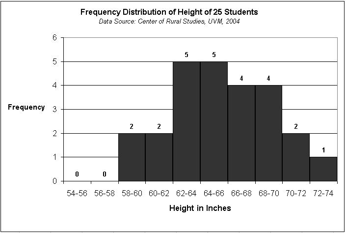
Based on the histogram, which of the following sets of values was most common in the sample?
62-68
58-64
66-72
64-70
54-60
Explanation
You can see from the histogram that the two most frequent ranges for values are 62-64 and 64-66, with 5 values in each group. And from the answer choices, you should see that only one choice, 62-68, contains both of the high-frequency bars. It also contains the next-highest bar (66-68, with a total of 4), so at 14 total values the range 62-68 has the highest frequency of any of these six-inch-range sets in the choices.
A basketball coach wants to determine if a player's height can be used to predict the number of points that player scores in a season. Before using a statistical test to determine the precise relationship of the variables, the coach wants a visual of the data to see if there is likely to be a relationship. Which of the following should the coach create?
Scatterplot
Histogram
Bar chart
Z-score
Bell curve
Explanation
A scatterplot is a diagram that shows the values of two variables and provides a general illustration of the relationship between them.
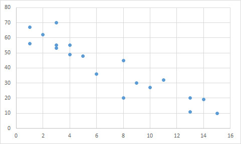
Based on the scatter plot below, is there a correlation between the 

Yes; negative linear relationship
Yes; positive linear relationship
No; there is no correlation
Yes; negative exponential relationship
Explanation
The data points follow an overall linear trend, as opposed to being randomly distributed. Though there are a few outliers, there is a general relationship between the two variables.
A line could accurately predict the trend of the data points, suggesting there is a linear correlation. Since the y-values decrease as the x-values increase, the correlation must be negative. We can see that a line connecting the upper-most and lower-most points would have a negative slope.
An exponential relationship would be curved, rather than straight.
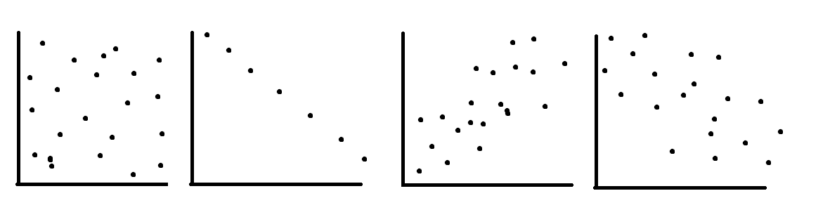
Order the correlation coefficients to fit the order of the following graphs (two coefficients will not be used)


Explanation
The first graph is random scatter, no correlation, the second is perfect linear, corellation 

Based on the scatter plot below, is there a correlation between the
Yes; negative linear relationship
Yes; positive linear relationship
No; there is no correlation
Yes; negative exponential relationship
Explanation
The data points follow an overall linear trend, as opposed to being randomly distributed. Though there are a few outliers, there is a general relationship between the two variables.
A line could accurately predict the trend of the data points, suggesting there is a linear correlation. Since the y-values decrease as the x-values increase, the correlation must be negative. We can see that a line connecting the upper-most and lower-most points would have a negative slope.
An exponential relationship would be curved, rather than straight.
Order the correlation coefficients to fit the order of the following graphs (two coefficients will not be used)
Explanation
The first graph is random scatter, no correlation, the second is perfect linear, corellation
Louie collected the following data on sleeping habits of his classmates:
Calculate the median, 1st and 3rd quartile (Q1 and Q3) and mode for the data. There are 19 students in the class.
Median:6 Q1:6 Q3:8 Mode:6
Median:6 Q1:5 Q3:8 Mode:6
Median:7 Q1:6 Q3:9 Mode:8
Median:6 Q1:5 Q3:9 Mode:8
Median:7 Q1:6 Q3:8 Mode:6
Explanation
graphing the data, or counting the quarter and halfway points at 10, 15 and 5, results in Q1 and the median both being 6, while Q3 is 8. 6 is the most common value so it is the mode
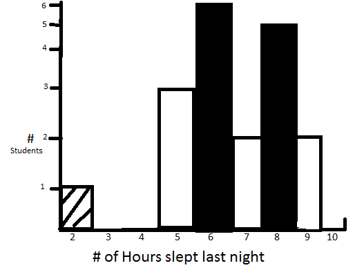
Louie collects data on the amount of sleep students in his class get.
Below is a graphical representation of the data
Which of the following is/are false about Louie's class' data?
i: the student with 2 hours of sleep is an outlier
ii: without the student with 2 hours of sleep the data is roughly normally distributed
iii: without the student with 2 hours of sleep the data is slightly right skewed
iv: the student with 2 hours of sleep is within 2 standard deviations of the mean
ii & iv
i, ii & iii
ii, iii & iv
i & ii
iii & iv
Explanation
Entering the data into a calculator you can quickly find the mean to be 6.5 and the sd to be 1.6 6.5-3.2=3.3 3.3>2 so iv is false and by virtue of this 2 is an outlier so i is true.
Between ii and iii, the data is not bell shaped, and does exhibit a slight right skew without the mentioned pt due to more density on 5 and 6 hours than 8 and 9