Scatter Plots
Help Questions
SAT Math › Scatter Plots
A researcher recorded the number of advertisements shown to users in a session and the percentage of users who clicked at least one ad. The scatterplot shows ads shown on the x-axis (ads) and click rate on the y-axis (percent). One point appears to be an outlier. If that outlier were removed, which change would most likely occur to the correlation between ads shown and click rate?
It would stay exactly the same because outliers never affect correlation.
It would become weaker because removing any point always reduces correlation.
It would become stronger because the remaining points follow a clearer negative trend.
It would switch to positive because the outlier causes the negative trend.
Explanation
This question asks about the effect of removing an outlier on correlation strength. The scatterplot shows a general negative trend (as ads increase, click rate decreases), but one point deviates significantly from this pattern. When an outlier doesn't follow the trend of the other points, removing it typically strengthens the correlation because the remaining points follow a clearer, more consistent pattern. The correlation would remain negative (not switch to positive) but become stronger as the data becomes more linear. Remember that outliers that deviate from the overall pattern tend to weaken correlation, so their removal strengthens it.
A student measured how much time a phone was used in a day and the phone’s battery percentage remaining at the end of that day. The scatterplot shows usage time on the x-axis (hours) and battery remaining on the y-axis (percent). A line of best fit is shown. What does the slope of the line of best fit represent in this context?
Usage time decreases by about 8 hours per 1% battery remaining.
Battery percent decreases by about 8 percentage points per hour of use.
Battery percent increases by about 8 percentage points per hour of use.
Battery percent at 0 hours of use is about 8%.
Explanation
This question asks about interpreting the slope of the line of best fit in context. The slope represents the rate of change in battery percentage (y) per hour of usage (x). Since the line slopes downward from left to right, the slope is negative, indicating battery percentage decreases as usage time increases. Looking at the line, for each additional hour of use, the battery percentage drops by approximately 8 percentage points - this is what the slope of -8 means in this context. A common error is confusing the units or direction of change, or interpreting slope as the starting value rather than the rate of change. Remember that slope always represents change in y per unit change in x.
A teacher compared the number of pages assigned for reading and the average time students reported spending on the assignment for 9 different homework nights. The scatterplot shows Pages Assigned (pages) versus Time Spent (minutes) and includes a line of best fit $y = 2.5x + 5$. For the night when 20 pages were assigned, the actual time spent was 62 minutes. Approximately how many minutes greater is the actual time than the predicted time?
12 minutes
7 minutes
2 minutes
17 minutes
Explanation
This question requires calculating both predicted and actual values, then finding their difference. Using the equation y = 2.5x + 5, when x = 20 pages, the predicted time is y = 2.5(20) + 5 = 50 + 5 = 55 minutes. The actual time spent was 62 minutes. The difference is 62 - 55 = 7 minutes, so the actual time was 7 minutes greater than predicted. This type of residual calculation helps us understand how well the model fits individual data points. Students often make arithmetic errors or confuse which value to subtract from which. Always calculate predicted minus actual (or actual minus predicted) consistently to avoid sign errors.
A lab measured the temperature of a chemical solution and the time it took for a reaction to finish for 10 trials. The scatterplot shows Temperature (°C) on the x-axis and Reaction Time (seconds) on the y-axis, along with a line of best fit given by $y = -1.5x + 120$. What does the slope of the line of best fit represent in this context?
At 0°C, the reaction time is about 1.5 seconds.
For each 1°C increase, reaction time increases by about 1.5 seconds.
At 120°C, the reaction time is about 0 seconds.
For each 1°C increase, reaction time decreases by about 1.5 seconds.
Explanation
This question asks about the meaning of the slope in the equation y = -1.5x + 120. The slope is -1.5, which means for each 1-unit increase in x (temperature), y (reaction time) decreases by 1.5 units. Since temperature is measured in °C and reaction time in seconds, this translates to: for each 1°C increase in temperature, reaction time decreases by 1.5 seconds. The negative slope indicates an inverse relationship - as temperature goes up, reaction time goes down. Students often confuse the sign of the slope or misinterpret what the variables represent. Remember that slope represents the rate of change: how much y changes for each unit change in x.
A delivery company recorded the number of packages delivered (packages) and total driving time (minutes) for 12 shifts. The scatterplot shows packages on the x-axis and time on the y-axis, with a line of best fit. Based on the line of best fit, about how many additional minutes of driving time are predicted for each additional package delivered?
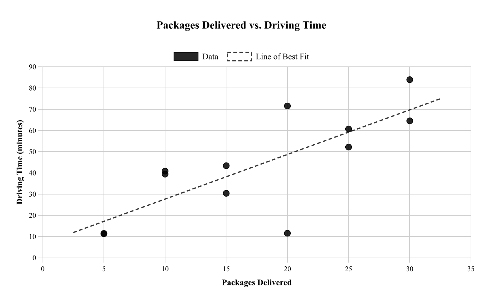
About 0.5 minute per package
About 30 minutes per package
About 2 minutes per package
About 10 minutes per package
Explanation
This question asks about the slope of the line of best fit in the context of packages delivered versus driving time. The slope represents the additional minutes of driving time per additional package. Looking at the line, we can estimate the slope by finding two points on the line and calculating rise over run. The line appears to increase by about 20 minutes for every 10 packages, giving a slope of 20/10 = 2 minutes per package. This means each additional package is associated with about 2 more minutes of driving time. When interpreting slope in context, always include the appropriate units.
A nutritionist recorded the number of sugary drinks consumed per week (drinks) and a health score (points) for 8 clients. The scatterplot shows drinks on the x-axis and health score on the y-axis. Which statement best describes the correlation?
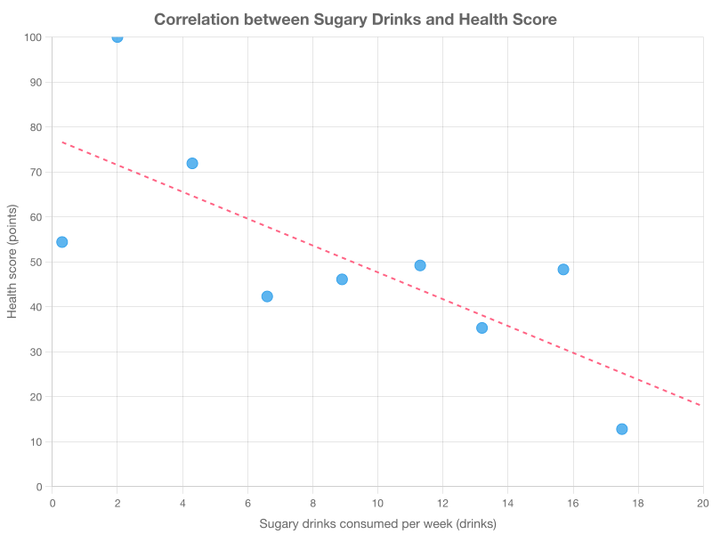
Strong positive correlation
Perfect correlation, so sugary drinks cause the health score change.
No correlation
Strong negative correlation
Explanation
This question asks about the correlation between sugary drinks consumed and health score. The scatterplot shows that as sugary drinks increase (moving right), health scores decrease (moving down), indicating a negative correlation. The points follow a relatively clear downward trend with little scatter, making this a strong negative correlation. Choice D is incorrect because correlation never proves causation, regardless of how strong the correlation is. When describing correlation, use terms like "strong" or "weak" to indicate how closely points follow the trend, and "positive" or "negative" to indicate the direction.
A science class measured the mass of a sample (grams) and the volume of the sample (milliliters) for 8 different objects made of similar material. The scatterplot shows mass on the x-axis and volume on the y-axis, with a line of best fit. What does the slope of the line of best fit represent in this context?
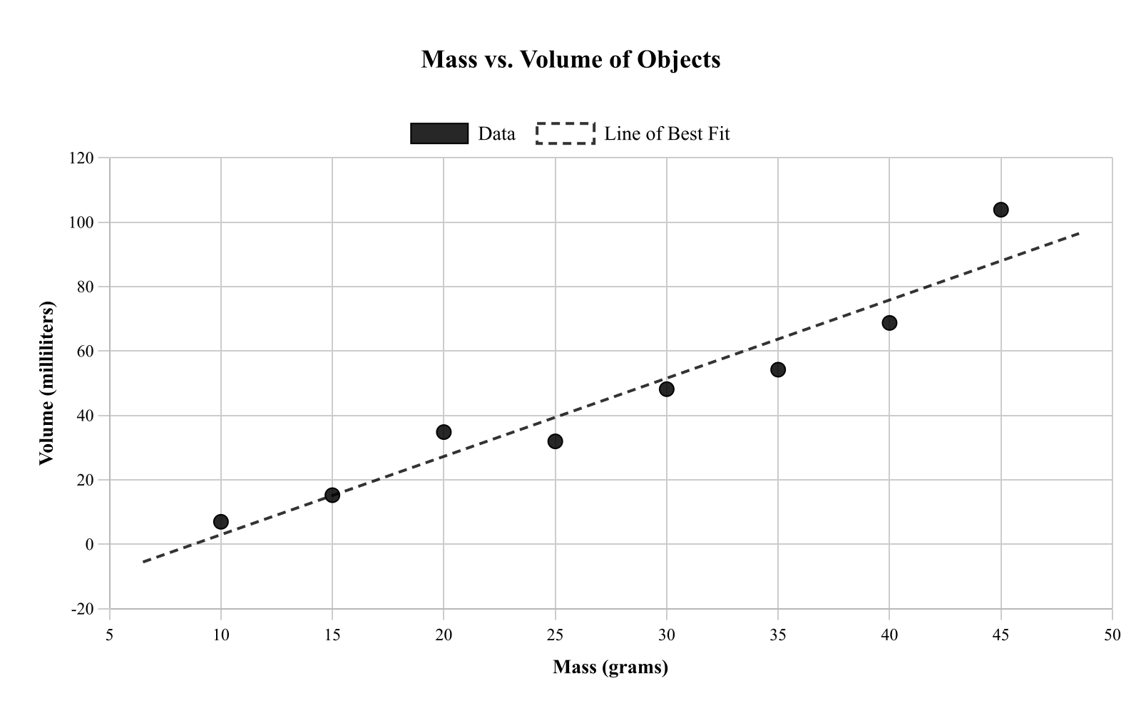
The percent increase in volume for each additional gram of mass.
The predicted mass when volume is 0 milliliters.
The increase in volume (mL) for each 1-gram increase in mass.
The predicted volume when mass is 0 grams.
Explanation
This question asks about the meaning of slope in the context of mass versus volume. In a scatterplot with mass on the x-axis and volume on the y-axis, the slope represents the change in y per unit change in x, which is the change in volume per unit change in mass. Specifically, the slope tells us how many milliliters the volume increases for each 1-gram increase in mass. Choice D is incorrect because slope represents an absolute change, not a percent change. Understanding slope in context means translating "rise over run" into the specific units and variables of the problem.
A teacher recorded the number of students in a class and the average project score for 8 different classes. The scatterplot shows class size on the x-axis and average score (points) on the y-axis. Which statement is supported by the scatterplot?
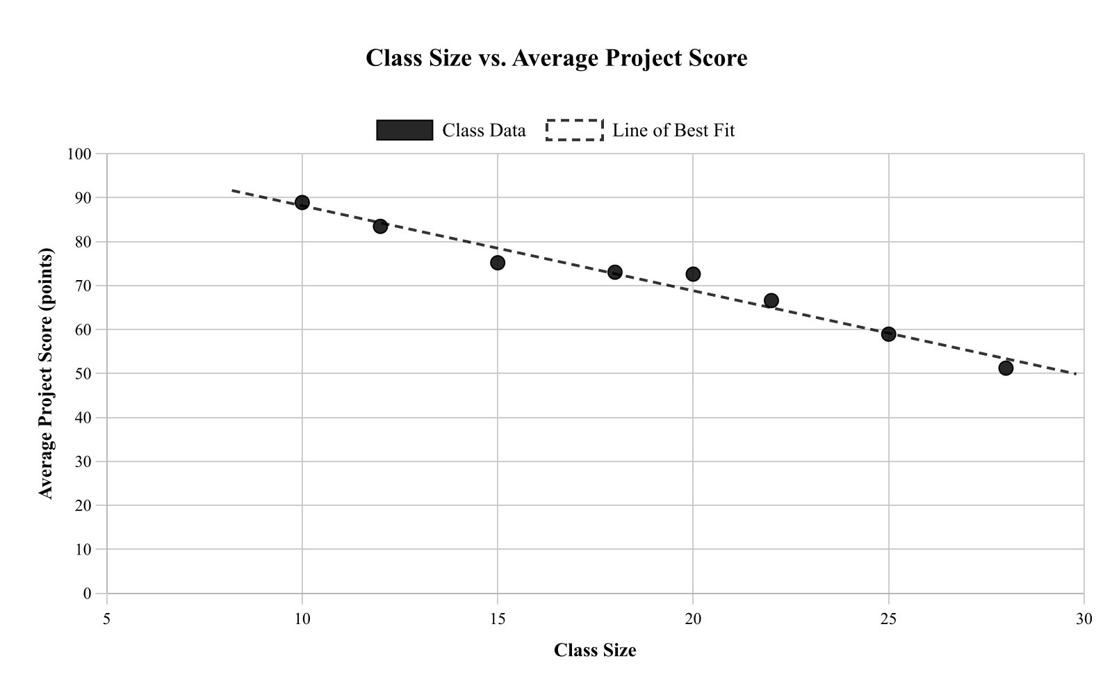
The scatterplot proves reducing class size will increase average scores by exactly 10 points.
Larger classes always have higher average scores, so the relationship is perfectly positive.
There is no relationship because the points form a straight horizontal line.
Larger classes tend to have lower average scores, but the plot does not prove class size causes it.
Explanation
This question asks which statement is supported by the scatterplot of class size versus average project score. The scatterplot shows a negative trend - as class size increases, average scores tend to decrease. However, correlation does not imply causation; the scatterplot shows an association but cannot prove that class size causes the score differences. Choice A correctly states this relationship while acknowledging the limitation. Choices B and C misrepresent the pattern, and choice D makes an unsupported causal claim with a specific numerical prediction. When interpreting scatterplots, distinguish between describing patterns (what we observe) and making causal claims (what causes what).
A student measured the length of a candle burned (centimeters) and the time it burned (minutes) for 8 trials. The scatterplot shows time on the x-axis and length burned on the y-axis. Which statement best describes the association and its strength?
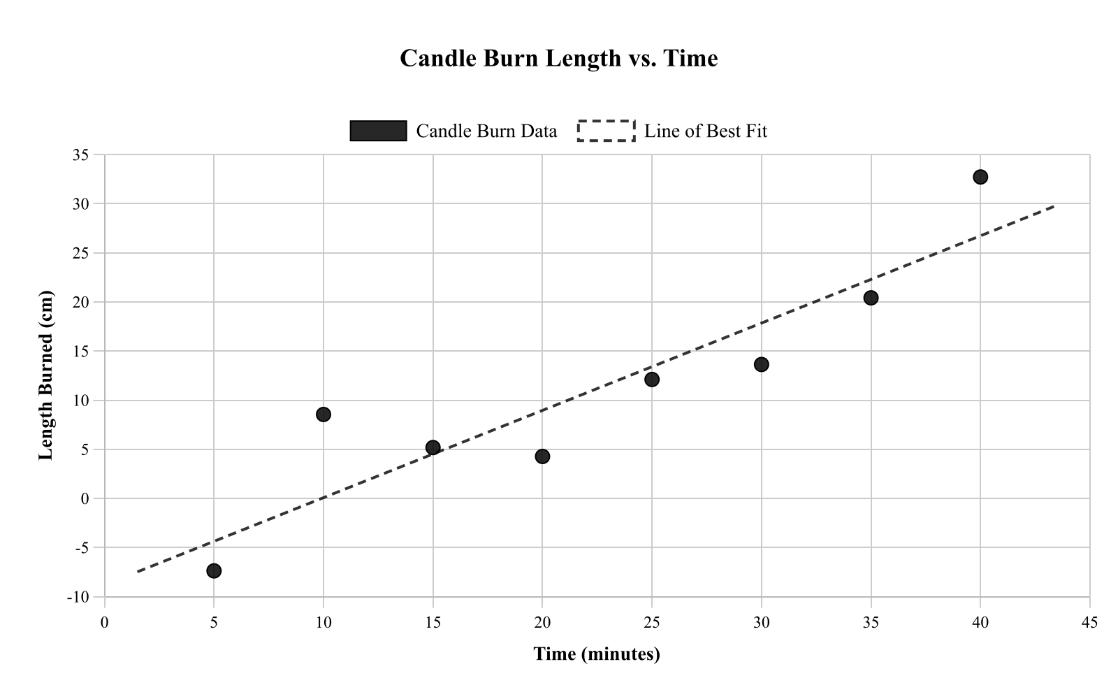
No association
Strong negative association
Strong positive association
Weak positive association
Explanation
This question asks about the association between time a candle burned and length burned. The scatterplot shows that as time increases (moving right), length burned increases (moving up), indicating a positive association. The points follow a very clear linear pattern with little scatter, making this a strong positive association. This relationship makes physical sense - the longer a candle burns, the more of its length is consumed. When describing association strength, consider how closely the points follow a linear pattern; tightly clustered points indicate strong association.
A student compared the number of minutes spent stretching (minutes) and the number of injuries reported that month for 9 athletes. The scatterplot shows stretching on the x-axis and injuries on the y-axis. Which statement is most reasonable based on the scatterplot?
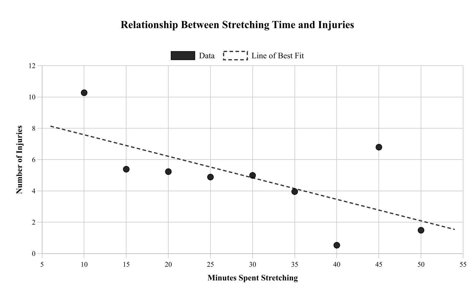
More stretching causes fewer injuries, as shown by the downward trend.
More stretching is associated with more injuries because both variables increase together.
More stretching is associated with fewer injuries, but the plot alone cannot prove stretching prevents injuries.
There is no association because the points are perfectly linear.
Explanation
This question asks for a reasonable interpretation of the relationship between stretching time and injuries. The scatterplot shows a negative association - more stretching is associated with fewer injuries. However, this observational data cannot prove that stretching prevents injuries; there could be other factors involved (athletes who stretch more might also be more careful in general). Choice A correctly describes the association while acknowledging the limitation that correlation doesn't prove causation. This is a key principle in data analysis: scatterplots can show relationships but cannot establish cause and effect.