Evidence in Tables & Graphs
Help Questions
PSAT Reading & Writing › Evidence in Tables & Graphs
A retail chain compared the number of transactions completed with cash versus card in two stores (Figure 1). A report claims that in Store X, card transactions exceeded cash transactions by _______ transactions. Which choice best describes data from the bar graph that support the claim?
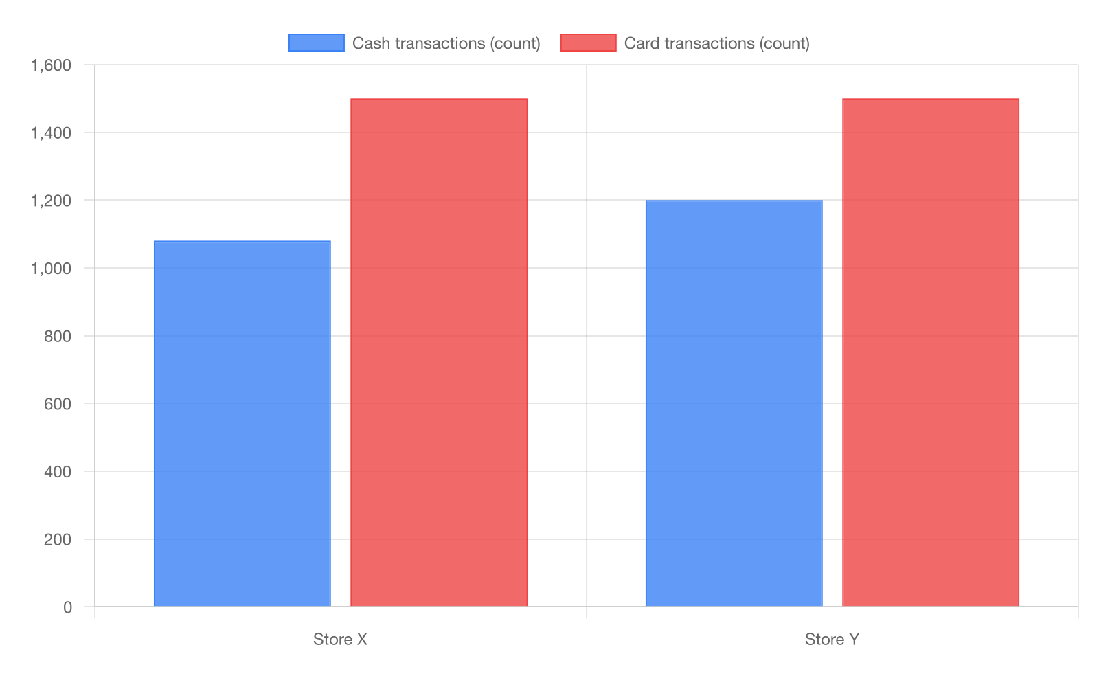
420 transactions, from 1,080 cash to 1,500 card in Store X
300 transactions, from 1,080 cash to 1,380 card in Store X
420 transactions, from 1,500 cash to 1,080 card in Store X
300 transactions, from 1,200 cash to 1,500 card in Store Y
Explanation
The report claims that in Store X, card transactions exceeded cash transactions by a specific number, so we need data showing card higher than cash in that store with the correct difference. From the bar graph, Store X shows 1,080 cash transactions and 1,500 card transactions, yielding a 420-transaction difference where card exceeds cash. Choice C tempts with the same 420 difference but reverses the values, incorrectly showing cash exceeding card, which opposes the claim. Choice B calculates correctly but applies to Store Y, not the specified Store X. In graph questions, carefully match the exact categories like store names to avoid distractors with similar numbers from wrong groups.
Researchers tested four soil treatments and measured plant height after 6 weeks. They argue that Treatment C produced taller plants than Treatment A by _______. Which choice most effectively uses data from the bar graph to complete the text?
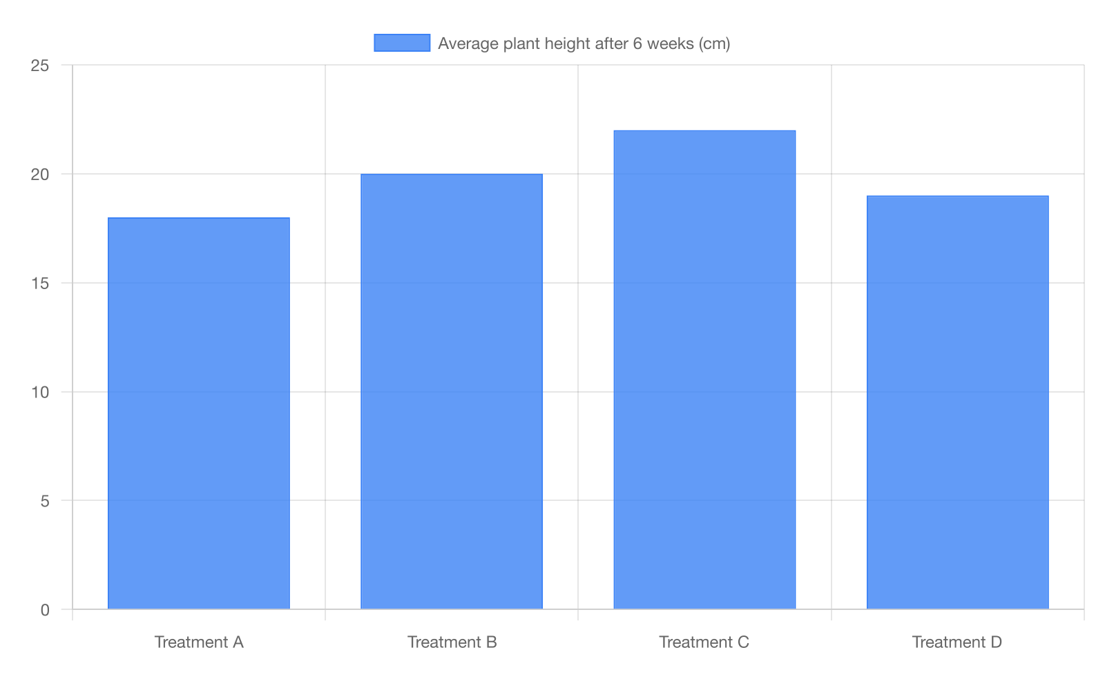
4 cm, with 22 cm under Treatment C and 18 cm under Treatment A
5 cm, with 23 cm under Treatment C and 18 cm under Treatment A
4 cm, with 20 cm under Treatment C and 16 cm under Treatment A
3 cm, with 21 cm under Treatment C and 18 cm under Treatment A
Explanation
The researchers argue Treatment C produced taller plants than A by a specific amount, needing data comparing heights with the correct difference. The bar graph shows 22 cm for Treatment C and 18 cm for A, a 4 cm difference. Choice C also gives a 4 cm difference but with incorrect heights of 20 cm and 16 cm, likely a misreading of bars. Choice B understates to 3 cm using different values. When interpreting bar graphs, measure heights precisely and confirm they match the claimed comparison.
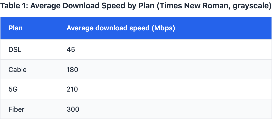
A technology report lists average download speeds for four internet plans (Table 1). The report claims the Fiber plan is fastest, exceeding the Cable plan by _______ megabits per second (Mbps). Which choice most effectively uses data from the table to complete the text?
90 Mbps, from 210 Mbps (5G) to 300 Mbps (Fiber)
120 Mbps, from 180 Mbps (Cable) to 300 Mbps (Fiber)
120 Mbps, from 300 Mbps (Cable) to 180 Mbps (Fiber)
90 Mbps, from 180 Mbps (Cable) to 270 Mbps (Fiber)
Explanation
The report's claim requires data showing Fiber as fastest, exceeding Cable by specific Mbps. Choice A cites 120 Mbps from 180 (Cable) to 300 (Fiber), calculating 300 minus 180 as 120, confirming faster. Choice C uses 120 but reverses from 300 (Cable) to 180 (Fiber), implying Cable faster, contradicting the claim. Choice B shows 90 from 5G to Fiber, true but not Cable comparison. When using tables for speed comparisons, calculate differences in the direction that aligns with 'exceeding.'
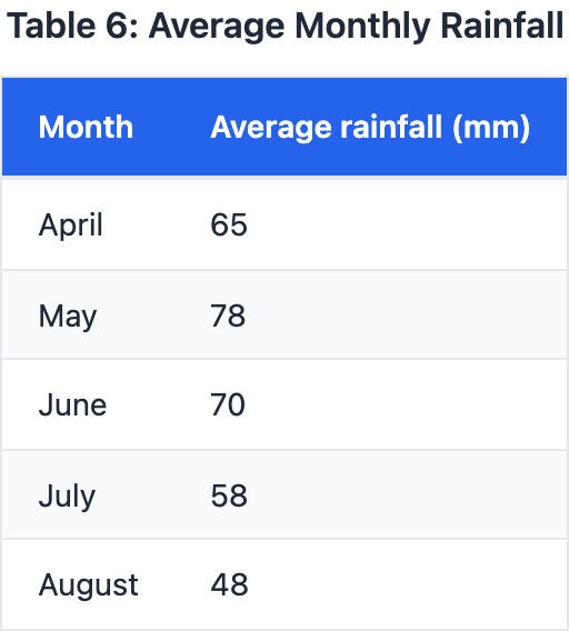
A climate summary lists the average monthly rainfall in a town for April through August. The summary notes that rainfall decreased each month from May to August, dropping from 78 mm in May to _______ in August. Which choice most effectively uses data from the table to complete the text?
52 mm
60 mm
42 mm
48 mm
Explanation
The summary notes rainfall decreased monthly from May to August, dropping from 78 mm in May to a specific amount in August, so data should show the August value fitting the decline pattern. The table lists August at 48 mm, consistent with decreases from 78 mm. Choices like D at 60 mm would not show a decrease if misreading months. In sequential data tables, confirm the direction of change across all periods mentioned.
Researchers tested four fertilizers on tomato plants and recorded average yield per plant (Figure 1). In a summary, they claim Fertilizer C produced the highest average yield, exceeding Fertilizer A by _______. Which choice most effectively uses data from the bar graph to complete the text?
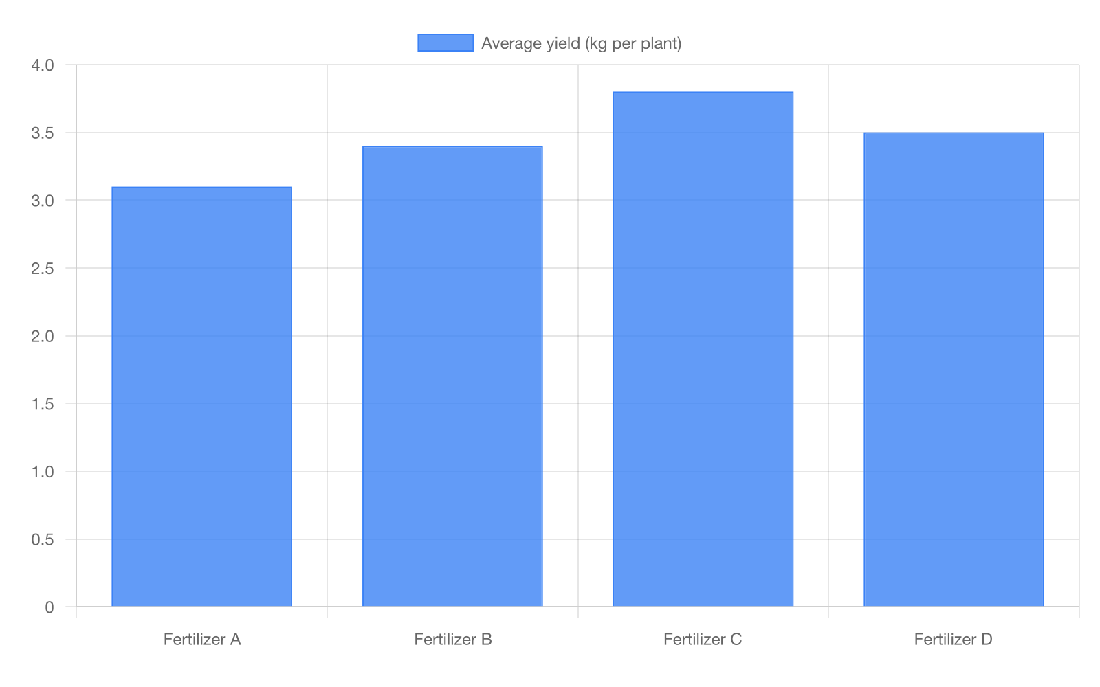
0.7 kg per plant, from 3.8 kg (C) to 3.1 kg (A)
0.4 kg per plant, from 3.4 kg (B) to 3.8 kg (C)
0.7 kg per plant, from 3.1 kg (A) to 3.8 kg (C)
0.4 kg per plant, from 3.1 kg (A) to 3.5 kg (D)
Explanation
The researchers' claim requires data showing Fertilizer C's yield exceeds Fertilizer A's by a specific amount, emphasizing C as highest. From the bar graph, choice A cites 0.7 kg per plant from 3.1 kg (A) to 3.8 kg (C), correctly calculating the difference as 3.8 minus 3.1. Choice C uses the same 0.7 kg but reverses the order from 3.8 kg (C) to 3.1 kg (A), implying A exceeds C, which contradicts the claim. Choice B accurately notes a 0.4 kg difference but compares B to C instead of A to C, missing the required pairing. In bar graphs, always confirm labels and directions to avoid reversing comparisons or selecting incorrect bars.
A labor economist compared median hourly wages in 2015 and 2025 for four occupations. The economist claims that the occupation with the greatest absolute wage increase over the period was _______. Which choice most effectively uses data from the table to complete the text?
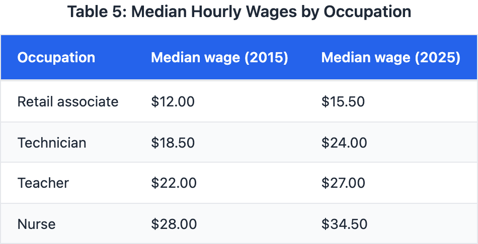
Retail associate, rising from $12.00 in 2015 to $15.50 in 2025
Technician, rising from $18.50 in 2015 to $24.00 in 2025
Nurse, rising from $28.00 in 2015 to $34.50 in 2025
Teacher, rising from $22.00 in 2015 to $27.00 in 2025
Explanation
The economist claims the greatest absolute wage increase over the period was for a specific occupation, needing the largest dollar rise from 2015 to 2025. The table shows Nurse wages from $28 to $34.50, a $6.50 increase, surpassing $5.50, $3.50, and $5.00 in others. Choice A has a $5.50 rise for Technician, close but not the greatest if overlooking Nurse. In tables with changes, calculate all differences to confirm the maximum, not just spot high final values.
A bookstore recorded sales revenue by genre for one quarter (Table 1). A manager claims Mystery generated the most revenue, bringing in _______ more dollars than Science Fiction. Which choice most effectively uses data from the table to complete the text?
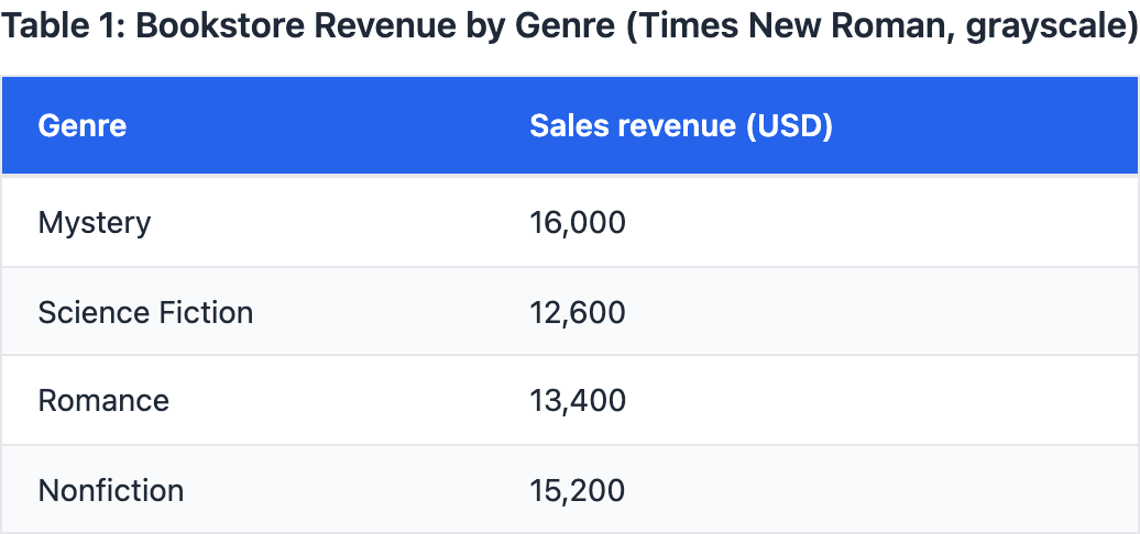
$2,600, from $12,600 (Science Fiction) to $15,200 (Nonfiction)
$2,600, from $13,400 (Romance) to $16,000 (Mystery)
$3,400, from $16,000 (Science Fiction) to $12,600 (Mystery)
$3,400, from $12,600 (Science Fiction) to $16,000 (Mystery)
Explanation
The manager's claim requires data showing Mystery's highest revenue exceeding Science Fiction by specific dollars. Choice A cites $3,400 from $12,600 (Science Fiction) to $16,000 (Mystery), as 16,000 minus 12,600 equals 3,400. Choice C uses $3,400 but reverses from $16,000 (Science Fiction) to $12,600 (Mystery), suggesting lower for Mystery. Choice B shows $2,600 from Romance to Mystery, true but wrong genre. In tables by categories, ensure comparisons and directions match to support 'more than' claims.
A manufacturing study measured average defect rates (defects per 1,000 units) for four production lines before and after a new inspection protocol was introduced. The study concludes that the largest reduction in defects occurred on Line _______. Which choice most effectively uses data from the table to complete the text?
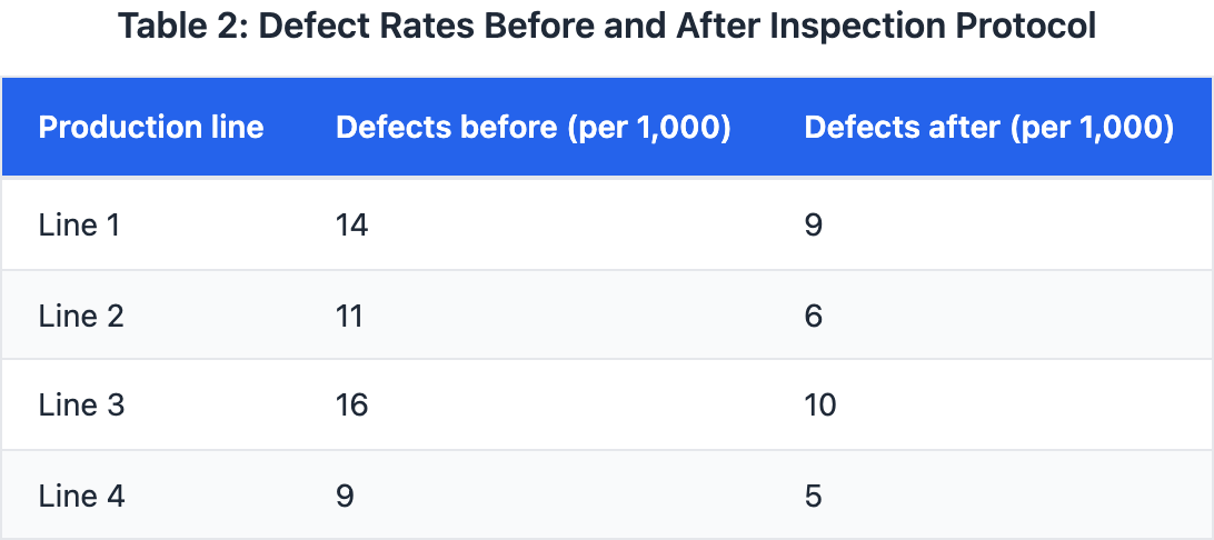
Line 4, decreasing from 9 to 5 defects per 1,000 units
Line 1, decreasing from 14 to 9 defects per 1,000 units
Line 3, decreasing from 16 to 10 defects per 1,000 units
Line 2, decreasing from 11 to 6 defects per 1,000 units
Explanation
The study concludes the largest defect reduction occurred on a specific line, requiring data with the greatest decrease in defects per 1,000 units. The table shows Line 3 dropping from 16 to 10 defects, a 6-unit reduction, exceeding the 5, 5, and 4 reductions in other lines. Choice A ties with a 5-unit drop but not the largest, potentially distracting if not calculating all. Choice D shows the smallest change, misrepresenting the maximum. Always compute differences for all options in tables to identify the true extreme.
Researchers tested how four fertilizer treatments affected tomato yield in a greenhouse. Data from Table 1 show that while Treatment B had the highest average yield, the largest improvement over the no-fertilizer control occurred with _______. Which choice most effectively uses data from the table to complete the text?
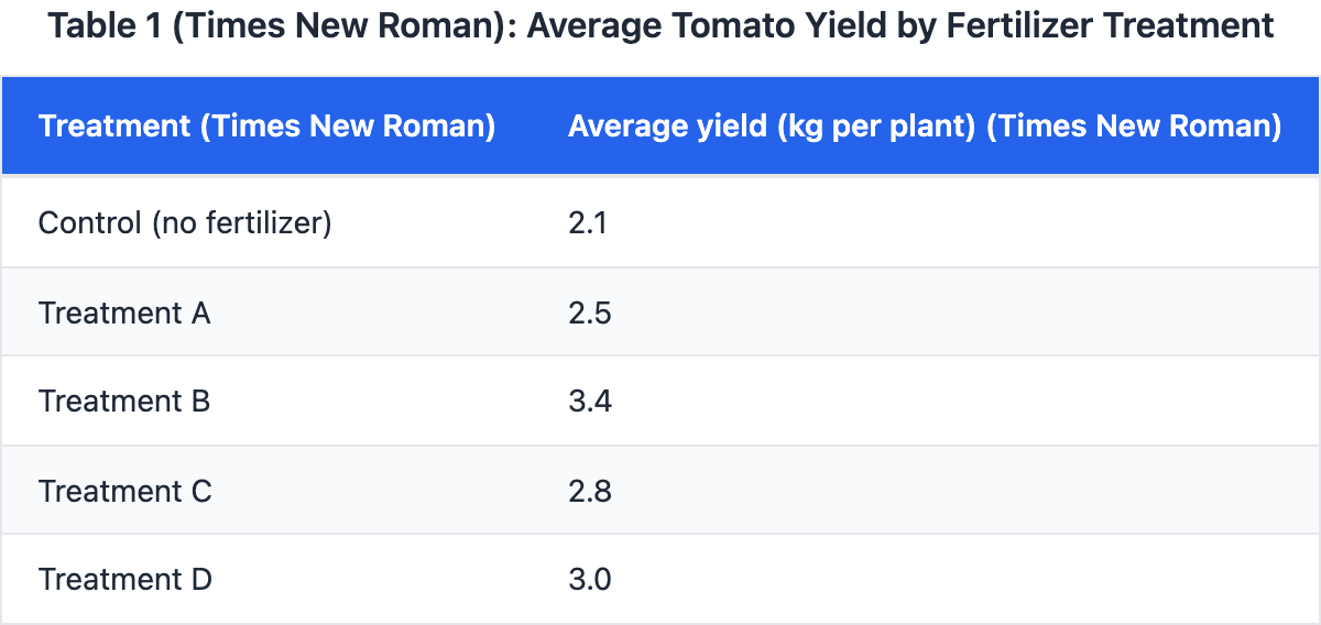
Treatment D, increasing yield from 2.1 to 3.0 kg per plant (+0.9).
Treatment A, increasing yield from 2.1 to 2.5 kg per plant (+0.4).
Treatment B, increasing yield from 2.1 to 3.4 kg per plant (+1.3).
Treatment C, increasing yield from 2.1 to 2.8 kg per plant (+0.7).
Explanation
The text notes that Treatment B had the highest average yield but asks for the treatment with the largest improvement over the no-fertilizer control of 2.1 kg per plant, so we need to calculate each treatment's gain from the table and identify the maximum difference. The table data show Treatment A at 2.5 kg (+0.4), B at 3.4 kg (+1.3), C at 2.8 kg (+0.7), and D at 3.0 kg (+0.9), confirming that B has the largest improvement of +1.3 kg, as stated in choice A. Choice B incorrectly selects Treatment D with +0.9, which is not the largest, perhaps confusing a moderate yield with the biggest gain. Choice D picks Treatment A with the smallest gain of +0.4, likely from miscalculating differences or focusing only on final yields. To build data literacy in such questions, subtract the control value from each treatment to compute improvements, then compare those deltas directly rather than the absolute yields.
A conservation group recorded the number of nesting pairs of a seabird on four islands in 2005 and 2020. The group argues that Island C experienced the greatest percentage increase in nesting pairs, rising from 80 to 120 pairs (a 50% increase). Which choice best describes data from the table that support the claim?
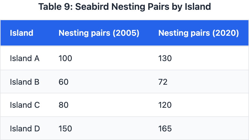
Island A rose from 100 pairs in 2005 to 130 pairs in 2020
Island B rose from 60 pairs in 2005 to 72 pairs in 2020
Island C rose from 80 pairs in 2005 to 120 pairs in 2020
Island D rose from 150 pairs in 2005 to 165 pairs in 2020
Explanation
The group argues Island C had the greatest percentage increase, so data should show its numbers yielding the highest percent change. The table lists Island C from 80 to 120 pairs, a 50% increase, higher than 30%, 20%, and 10% in others. Choice A shows a 30% rise for Island A, tempting if confusing absolute with percentage change. In tables, compute percentages yourself to confirm claims about relative growth.