Draw Picture and Bar Graphs to Represent a Data Set: CCSS.Math.Content.2.MD.D.10
Help Questions
MAP 2nd Grade Math › Draw Picture and Bar Graphs to Represent a Data Set: CCSS.Math.Content.2.MD.D.10
Melissa's class made a chart to display her and her classmates' favorite sports.
Use the graph below to answer the question.

Based on the graph, how many people are in Melissa's class?


Explanation
To find out how many people are in Melissa's class, we need to add up all of the votes that each sport received.

Melissa's class made a chart to display her and her classmates' favorite sports.
Use the graph below to answer the question.
How many more people favor cheerleading than baseball?


Explanation
The phrase "how many more" tells us that we are going to subtract. We can take the number of people who favor for cheerleading and subtract the number of people who favor for the baseball.

Mr. Ray's class created a bar graph to show how many stuffed animals each student has at home. According to the graph, how many students have one stuffed animal?


Explanation
Using the bar graph, we look for the bar that is for 


Mr. Shine wants to do something different on Fridays, so he is going to add a subject to his class that he will teach every Friday. The results are shown in the table below.
Use the graph below to help answer the question.

What is the label of the x-axis?
Subject
Number of Votes
What Subject Should We Add?
Mr. Shine's Class
Fridays
Explanation
A graph is made up of an x-axis and a y-axis. The x-axis of a graph is always the horizontal line (a line that runs from left to right) and the y-axis is alway the vertical line (a line that runs from top to bottom)
The x-axis of this graph is labeled "Subject".
Mrs. Ryan's class had their class election today for their class president. The results are displayed in the chart below.
Use the graph below to help answer the question.
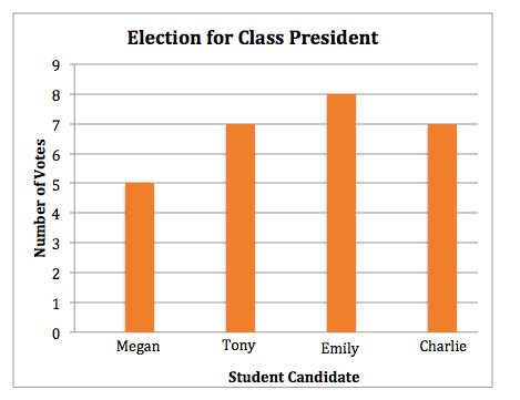
How many people voted for Megan?


Explanation
The bar for Megan is the first bar on the left. The bar raises to the number 

Mrs. Ryan's class had their class election today for their class president. The results are displayed in the chart below.
Use the graph below to help answer the question.
How many people voted for Tony?


Explanation
The bar for Tony is the second bar from the left. The bar raises to the number 

All of the 
Use the graph below to help answer the question.

How much money has Mr. Tie's class saved?


Explanation
The bar for Mr. Tie's class is the first bar on the left. The bar raises to the number 

Dan's class made a chart to display his and his classmates' favorite subjects.
Use the graph below to answer the question.

How many people listed English as their favorite subject?


Explanation
The bar for English is the fourth bar from the left. The bar raises to the number 

Melissa's class made a chart to display her and her classmates' favorite sports.
Use the graph below to answer the question.
If six students change their minds and decide that soccer is actually their favorite sport, how many students would favor soccer?


Explanation
If six more people favor soccer, we can add 


Miss. West's class made a chart of the pets that they own.
Use the graph below to answer the question.

How many people own a fish?


Explanation
The bar for fish is the third bar from the left. The bar raises to the number 
