ISEE Upper Level Quantitative Reasoning Flashcards: Interpreting Data Displays

Study Interpreting Data Displays in ISEE Upper Level Quantitative Reasoning with focused flashcards that help you recognize the idea, recall the key rule, and apply it in practice-style prompts.

ISEE Upper Level Quantitative Reasoning

Interpreting Data Displays

0 mastered0 still learning

0% Complete

QUESTION
1/ 25

What does a pie chart represent, and what does the full circle correspond to?

Tap card or press Space to flip

ANSWER

Parts of a whole; full circle is 100%100\% of the total. Pie charts divide a total into proportional sectors, where the entire circle equates to the complete dataset.

How well did you know it?

Card 1 / 25

What this deck covers

This deck focuses on Interpreting Data Displays, giving you a quick way to review the definitions, rules, and examples that matter most for ISEE Upper Level Quantitative Reasoning.

How to use these flashcards

Work through these flashcards in short sessions. Try to answer each prompt before flipping the card, then revisit any cards you miss until the explanation feels automatic.

All flashcards

Flashcard 1: What does a pie chart represent, and what does the full circle correspond to?

Answer: Parts of a whole; full circle is 100%100\% of the total. Pie charts divide a total into proportional sectors, where the entire circle equates to the complete dataset.

Flashcard 2: Identify the value at x=3x=3 if a line graph includes the point (3,7)(3,7).

Answer: 77. The y-coordinate directly gives the dependent variable's value at the specified x on the graph.

Flashcard 3: A bar chart shows Category A = 1212 and Category B = 99. What is ABA-B?

Answer: 33. Subtract bar values directly to compare quantities between categories as shown.

Flashcard 4: What does a line graph most commonly show about a variable over time?

Answer: How the variable changes across time intervals. Line graphs illustrate trends and fluctuations in a continuous variable over sequential time periods.

Flashcard 5: What is the correct formula for percent of a total: part pp out of total TT?

Answer: pT×100%\frac{p}{T}\times 100\%. This formula calculates the proportion of the part relative to the total, expressed as a percentage.

Flashcard 6: What does the slope on a line graph represent in terms of the variables shown?

Answer: Rate of change:  rac{\Delta y}{\Delta x} between the variables. Slope quantifies the rate at which the dependent variable changes relative to the independent variable on the graph.

Flashcard 7: What does a negative slope indicate about the relationship between xx and yy?

Answer: As xx increases, yy decreases. A negative slope reflects an inverse relationship where increases in one variable correspond to decreases in the other.

Flashcard 8: What does the mode of a data set represent when interpreting a frequency table?

Answer: The most frequent value (highest frequency). The mode identifies the value that appears most often, highlighting the peak in data distribution.

Flashcard 9: What is the mean of data values x1,x2,,xnx_1,x_2,\dots,x_n as used in table summaries?

Answer: x1+x2++xnn\frac{x_1+x_2+\cdots+x_n}{n}. The mean represents the average value by summing all data points and dividing by the count.

Flashcard 10: What is the central angle in degrees for a pie slice representing p%p\% of the total?

Answer: p100×360\frac{p}{100}\times 360^\circ. The angle scales the percentage to the circle's 360 degrees for accurate proportional representation.

Flashcard 11: What is the median of an ordered data set with an odd number nn of values?

Answer: The middle value (position n+12\frac{n+1}{2}). For an odd number of ordered values, the median is the central value that divides the dataset into two equal halves.

Flashcard 12: What does the yy-intercept on a line graph represent in a real-world context?

Answer: The value of yy when x=0x=0 (the starting amount). The y-intercept shows the initial value of the dependent variable when the independent variable is zero, often representing a starting point in contexts like growth or cost.

Flashcard 13: A table shows total T=80T=80 and part p=20p=20. What percent of the total is the part?

Answer: 25%25\%. Divide the part by the total and multiply by 100 to express the proportion as a percentage.

Flashcard 14: What is the correct formula for percent change from old value aa to new value bb?

Answer: baa×100%\frac{b-a}{a}\times 100\%. This formula expresses the relative difference between old and new values as a percentage of the original.

Flashcard 15: What does the range of a data set represent when summarizing a table of values?

Answer: Maximum minus minimum. The range measures the spread of data by calculating the difference between the highest and lowest values.

Flashcard 16: What does a point (x,y)(x,y) on a graph mean in words for the two variables shown?

Answer: At xx, the corresponding value is yy. A coordinate pair indicates the specific value of the dependent variable corresponding to a given value of the independent variable.

Flashcard 17: Compute the percent change from 4040 to 5050 as you would from a data table.

Answer: 25%25\% increase. Percent change uses the difference divided by the original, multiplied by 100, to quantify relative growth.

Flashcard 18: What is the median of an ordered data set with an even number nn of values?

Answer: Average of the two middle values. For an even number of ordered values, the median averages the two central values to represent the middle of the dataset.

Flashcard 19: Find the slope between points (2,5)(2,5) and (6,13)(6,13) as read from a graph.

Answer: 22. Slope is calculated as the change in y over change in x, yielding the rate between the points.

Flashcard 20: Find the yy-intercept if a line passes through (2,5)(2,5) with slope 33.

Answer: 1-1. Using the point-slope form, solve for b in y = mx + b to find where the line crosses the y-axis.

Flashcard 21: A pie chart slice is 7272^\circ. What percent of the total does it represent?

Answer: 20%20\%. Convert the angle to a percentage by dividing by 360 degrees and multiplying by 100.

Flashcard 22: What does the term "frequency" mean in a table or histogram context?

Answer: The number of times a value or interval occurs. Frequency counts occurrences, providing insight into data distribution within categories or bins.

Flashcard 23: A line graph shows y=6y=6 at x=2x=2 and y=10y=10 at x=4x=4. What is the average rate of change?

Answer: 22 per 11 unit of xx. Average rate of change is the slope, computed as Δy/Δx between the given points.

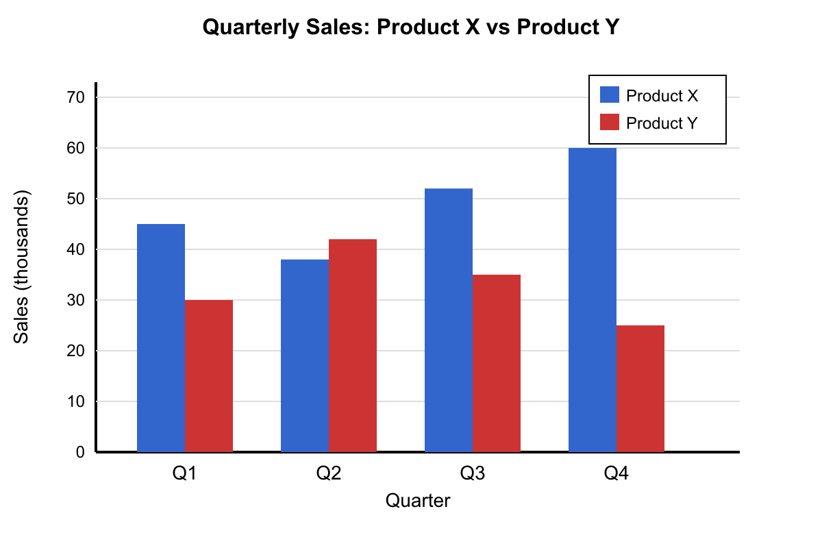
Flashcard 24: What does a bar chart typically compare, and what does bar height represent?

Answer: Categories; height represents the value or frequency. Bar charts compare discrete categories, with bar heights proportionally representing quantities or counts.

Flashcard 25: What does a positive slope indicate about the relationship between xx and yy?

Answer: As xx increases, yy increases. A positive slope indicates a direct proportional relationship between the variables.