Pie Charts
Help Questions
GED Math › Pie Charts
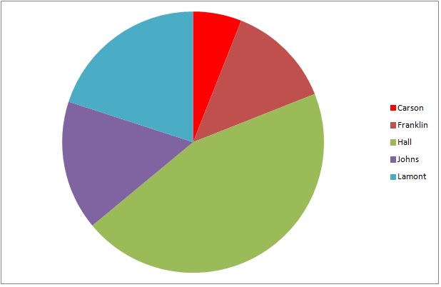
The above graph represents the results of a general election for two seats on the city council of Lincoln City. Frankllin and Hall are Democrats; Johns and Lamont are Republicans; Carson is an independent.
4,429 people voted for Democrats. Which of the following is the best estimate for the number of people who voted for Republicans?


Explanation
The two wedges that represent the Democratic candidates - green (Hall) and dark red (Franklin) - together make up about 55% of the circle. The two wedges that represent the Republican candidates - purple (Johns) and blue (Lamont) - make up about 40% of the circle. We can estimate the number of people who voted for a Republican using a proportion statement:

Solve for 


The best estimate is 3,200 votes.
Use the following pie chart to answer the question:
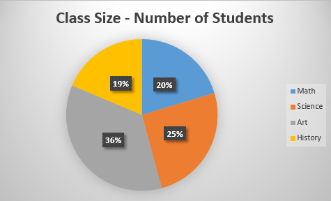
Which class has the lowest percentage of students?


Explanation
Let's look at the pie chart.
We can see it represents the percentage of students in each class. The legend on the right displays which color represents which class:
blue=Math
orange=Science
gray=Art
yellow=History
So, we will look at the percentages and find the smallest/lowest number. We see it is 19% and it is the yellow class. We know yellow represents History.
Therefore, History has the lowest percentage of students.
Use the chart to answer the following question.
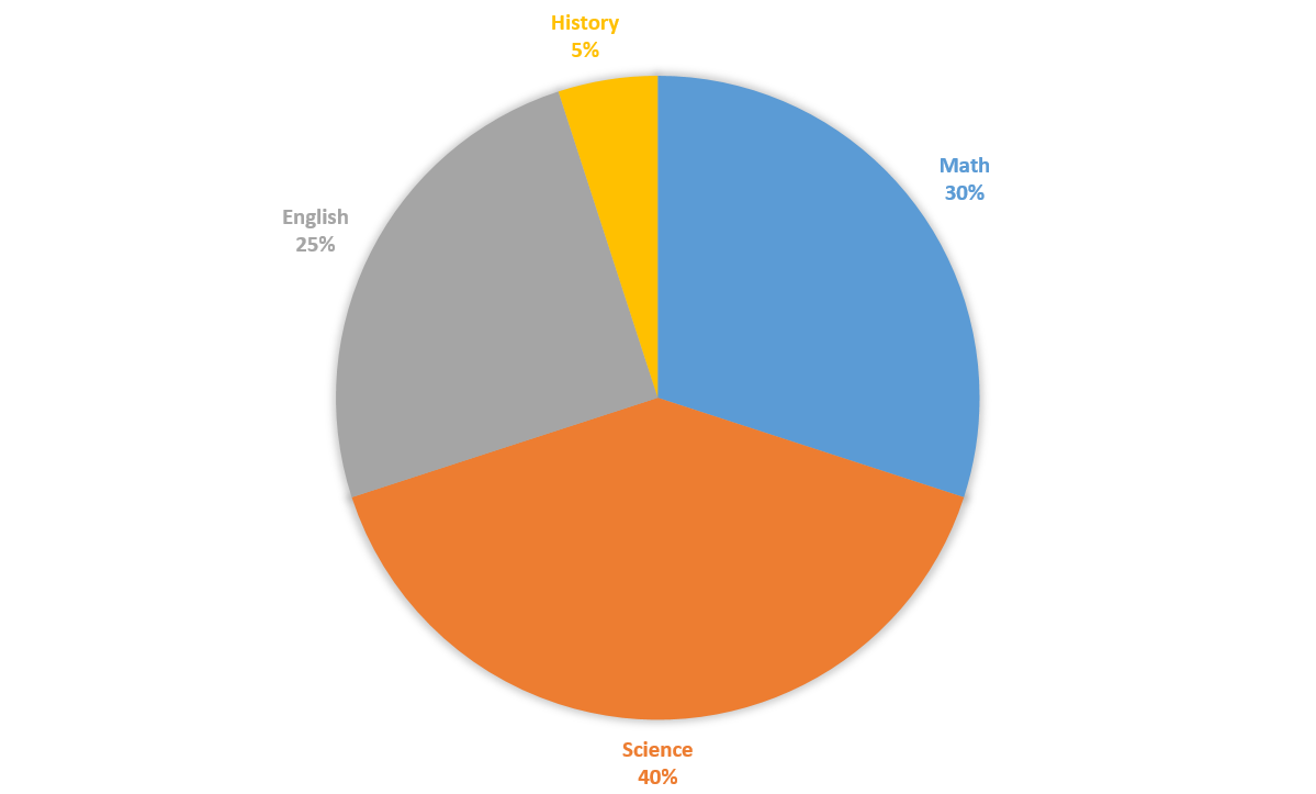
What is the central angle formed by the sum of English and Science sectors of the chart?


Explanation
The English and the Science sectors of the pie chart make up 


=234")
The central angle formed is 
Do NOT use a calculator for this question.
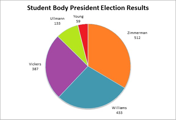
Refer to the above circle graph.
The top two finishers engage in a runoff election.
The third-place finisher tells his voters to choose the second-place finisher. The fourth- and fifth-place finishers tell their voters to choose the first-place finisher.
If each voter who selected one of the top two finishers stays with his choice, and every other voter does what is requested of him by his original chosen candidate, who will win the election?
Williams
Vickers
Zimmerman
Ullman
Explanation
In one group will be those who voted for first-place finisher Zimmerman, fourth-place finisher Ullman, and fifth-place finisher Young. These people will vote for Zimmerman.
In the second group will be those who voted for second-place finisher Williams and third-place finisher Vickers. These people will vote for Williams.
The pieces of the circle representing Vickers and Williams together make up more than half the circle. Therefore, Williams will win the runoff.
The above graph represents the results of a general election for two seats on the city council of Wilson City. Frankllin and Hall are Democrats; Johns and Lamont are Republicans; Carson is an independent.
4,987 people voted for Republicans. Which of the following is the best estimate of the number of people who voted in the election overall?


Explanation
The two wedges that represent the Republican candidates - purple (Johns) and blue (Lamont) - make up about 40% of the circle. The problem becomes, essentially, to figure out what 4,987 is 40% of. This can be done by dividing 4,987 by 0.40:

12,500 is the best estimate.
Approximately what percent of respondents prefers McDonald's?


Explanation
The percentage of respondents who answered McDonald's is between 


The above graph represents the results of a general election for mayor of Washington City. Hall is a Republican; Johns is a Democrat; the other three are independents.
5,328 people voted for Hall. Which is the best estimate for the number of people who voted for an independent candidate?


Explanation
The green wedge, which represents Hall, is about 45% of the circle. The three wedges representing independents Carson, Franklin, and Lamont - dark red, bright red, and turquoise, respectively - together comprise about 40% of the circle. We can set up, and solve for the unknown in a proportion statement as follows:


4,700 is the best estimate.
Refer to the above graph. Which of the following comes closest to the ratio of people who voted for Zimmerman to people who voted for Ullman?


Explanation
Divide the number of people who voted for Zimmerman, 512, by the number of people who voted for Ullman, 133.

About four times as many people voted for Zimmerman as Ullman, so of the given choices, 
The above represents the results of a student council election at Jefferson High. According to the results, the top three finishers will be awarded seats on the student council.
Which two did not win a seat on the student council?
Franklin and Carson
Franklin and Johns
Johns and Carson
Lamont and Carson
Explanation
The wedges, in descending order by size, are those representing Hall, Lamont, Johns, Franklin, Carson. Hall, Lamont, and Johns were elected to the student council, so the correct choice is Franklin and Carson.
Use the chart to answer the following question.
A survey found the favorite subjects of 


Explanation


=42")
