Bar Graphs
Help Questions
GED Math › Bar Graphs
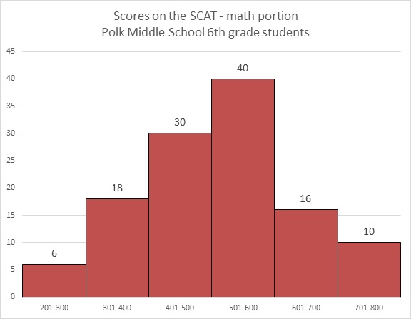
Which question can be answered about Polk Middle School sixth graders' performance on the math portion of the SCAT by looking at the above bar graph?
How many students took the test?
What was the mode of the scores on the test?
What was the mean score on the test?
What was the median score on the test?
Explanation
The graph only provides information about how many students scored in each range (201-300, 301-400, etc.) on the test; it provides no information about the mean, median, or mode. The only question that can be answered is the number of students total who took the test - this can be answered by adding the numbers on top of the bars.
Use the following bar graph to answer the question:
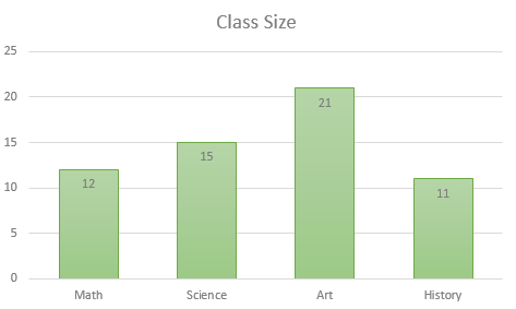
How many students are in Art class?


Explanation
Let's look at the bar graph.
The bottom of the bar graph lists the different classes. The height of each bar displays a quantity that matches up with the scale on the left side. This quantity represents the number of students in that class.
You can either use the left scale to determine the number of students, or you can see the quantities posted on each bar.
So, we will find the bar that corresponds to Art class. We can see it is the 3rd class listed. Now, we can see that bar goes up to 21.
Therefore, the number of students in Art class is 21.
A class of 

What is the mode number of pets that are owned?


Explanation
Recall that the mode in a set of data is the number that is repeated most often. For this question, this means that the mode number of pets owned will be the number that correlates to the most number of students. Since 

The following five countries rank highest in total energy consumption (source: CIA World Factbook website). Figures are given in megawatt-hours per year total:


A vertical bar graph is to be constructed so that its vertical axis is marked 


Explanation
The bar representing Japan will reflect a total energy usage of about 


By similar reasoning, the bar representing India will only show

Through some rounding, we see that about Japan is represented by a bar about

as long as the bar that represents India.
A class of
How many total pets are owned by the students in the class?


Explanation
From the graph, we can see that 
We can see that 

Next, notice that 


Next, 


Then, 


Finally, 


To find the total number of pets owned by the students, add these values together:

Refer to the above bar graph.
What percent of the students achieved a score above 500?


Explanation
40 students achieved a score of 501-600; 16 achieved a score of 601-700; 10 achieved a score of 701-800. Add these:

The number of students who took the test is the sum of the students who finished in the six ranges:

The question is now to find out what percent 66 is of 120, which can be calculated as follows:

Refer to the above graph. Clarissa, a sixth grader at Polk, scored a 673 on the math portion of the SCAT. Which of the following could have been her rank among the students?


Explanation
By making a 673, Clarissa finished in the second-highest range shown (601-700). She was outscored by at least 10 students (the ones in the 701-800 range), but by at most 25 students (the 10 in the 701-800 range plus the other 15 in the 601-700 range). She finished between 11th and 26th, inclusive, so the only plausible choice is 14th.
Use the following bar graph to answer the question:
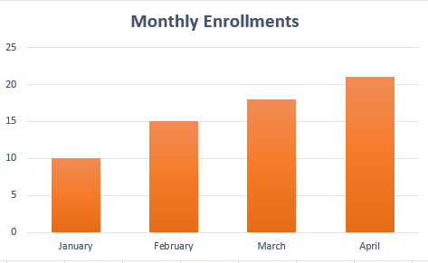
Approximately, how many enrollments were there in April?


Explanation
Let's look at the bar graph.
We can see the months are listed along the bottom axis. We can also see the scale on the left ranges from 0 to 25. These numbers represent the number of enrollments.
Now, to find the approximate number of enrollments for April, we will first find April. We can see it is the last month listed.
Now, we can see the value of the bar is between 20 and 25. We can also see that it is fairly close to 20.
Therefore, we can approximate the number of enrollments for April is 21.
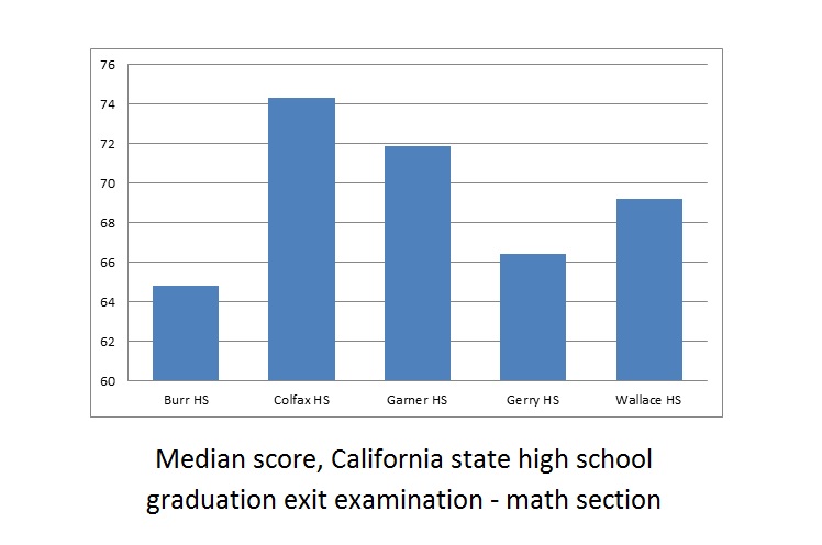
Refer to the above bar graph. The exit examination was given to all high school seniors in the above five schools.
Juanita attended Wallace High School and scored a 75 on the math portion. Wallace High School had 188 seniors take the examination. How many seniors could Juanitia have conceivably outscored?


Explanation
The median score at Wallace was 69, so Juanita scored above the median. By definition, she outscored at least half the seniors, which means that she must have outscored at least 
Use the following bar graph to answer the question:
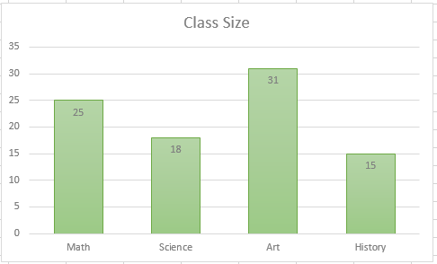
How many students are in the largest class?


Explanation
Let's look at the bar graph
To find the number of students in the largest class, we will essentially be looking at the class with the most students (or the class with the tallest bar).
We can see the class with the tallest bar is Art. We can see it has 31 students.
Therefore, the largest class has 31 students.