Comparing Data Sets
Help Questions
ACT Science › Comparing Data Sets
A pharmacology lab monitored a drug in blood plasma. Table A lists measured concentration (mg/L) at several times after dosing. Table B lists percent of the initial concentration at the same times, calculated as $100\times C_t/C_0$. Compare what Table B changes relative to Table A.
Table B reports new measured mg/L values from a different dose, while Table A reports percentages.
Both tables report absolute concentration in mg/L, but Table B uses a different chromatography method.
Table B expresses each time point as percent of the initial concentration, normalizing Table A’s mg/L values.
Table A reports percent remaining, while Table B reports time in hours converted to minutes.
Explanation
Table B normalizes Table A's absolute concentration measurements to percentages relative to the initial value at the same time points. Table A reports drug concentration in mg/L measured by chromatography at four times after dosing; Table B reports percentage of initial concentration (% of C₀) calculated as 100 × (C_t / C₀). This normalization matters because it focuses on relative decline, enabling comparisons across varying initial doses or subjects. A distractor might reverse which table has absolute versus relative values, but the captions specify A as measured mg/L and B as derived percentages.
A physics lab investigated motion down an incline. Table A shows measured position versus time from video tracking. Table B shows calculated velocity versus time computed from the position data using $
v=\Delta x/\Delta t$. Determine the best description of the relationship.
Table B lists position values measured by a different camera, while Table A lists calculated velocities.
Table B lists velocity derived from Table A’s position-time data using differences over equal time intervals.
Table A reports velocity in m/s, while Table B reports the same velocity in cm/s.
Table A and Table B both report acceleration, but Table B uses smaller time steps.
Explanation
Table B derives its velocity data directly from the position-time measurements in Table A using a calculation over uniform intervals. Table A lists cart position in meters (m) at specific times in seconds (s) from video tracking software; Table B lists velocity in m/s calculated as the change in position divided by the time step for corresponding times. This transformation matters because it shows how raw position data can be processed to reveal motion characteristics like speed, teaching the importance of derived quantities in kinematics. A distractor might swap which table has measured versus calculated data, but the captions confirm A as direct measurements and B as derived.
A city air-quality project monitored particulate matter near two locations.
Table A shows hourly measured PM 2.5 concentrations from a roadside sensor on one weekday.
Table B shows daily averaged PM 2.5 from a rooftop station over the same week.
Compare how the two tables differ in time scale and sampling location.
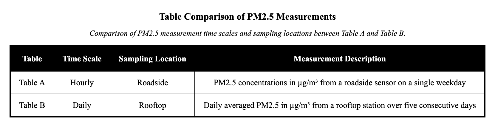
Table A and Table B both show hourly PM$_{2.5}$, but in different units.
Table A reports hourly roadside PM$_{2.5}$ for one day, while Table B reports daily rooftop averages across several days.
Table A shows daily averages from a rooftop site, while Table B shows hourly roadside spikes.
Table A reports PM${10}$, while Table B reports PM${2.5}$ using the same monitoring method.
Explanation
The primary relationship between Table A and Table B is their differing time scales and sampling locations for PM${2.5}$ measurements. Table A shows hourly PM${2.5}$ concentrations in µg/m³ from a roadside sensor on a single weekday, capturing short-term traffic-related spikes; Table B shows daily averaged PM$_{2.5}$ in µg/m³ from a rooftop station over five consecutive days, smoothing out hourly variations to represent overall daily exposure. This difference matters because it affects how the data reflect air quality—short-term peaks versus broader trends—requiring careful attention to context when comparing pollution levels. A distractor might reverse the locations or time scales, but the captions clearly specify roadside hourly for A and rooftop daily for B.
A nutrition study compared two ways of reporting sugar in beverages. Table A lists measured sugar mass per serving in grams (g) from lab analysis. Table B lists calculated sugar concentration in grams per 100 mL, using each drink’s serving volume. Identify the key difference between the tables.
Table A reports sugar per serving measured in grams, while Table B reports calculated sugar per 100 mL normalized by volume.
Both tables report measured sugar per serving, but Table B uses ounces instead of grams.
Table A reports calculated sugar, while Table B reports measured sugar using a different laboratory method.
Table A reports sugar concentration per 100 mL, while Table B reports calories per serving from labels.
Explanation
The key difference is that Table A reports absolute sugar mass per serving, while Table B normalizes it to concentration per volume using calculations. Table A shows measured sugar in grams per serving (g/serving) from lab analysis for four beverages with varying serving sizes; Table B shows calculated sugar in grams per 100 mL by dividing mass by volume and scaling. This normalization matters because it enables fair comparisons across drinks regardless of portion size, focusing on density rather than total intake. A distractor could claim both are measured in similar ways, but Table B's values are explicitly derived from A's data.
An oceanography lab compared salinity measurements from two instruments. Table A shows salinity measured in practical salinity units (PSU) using a conductivity probe. Table B shows chloride concentration measured in g/L using a titration method at the same depths. Identify the primary difference in what is being measured and how.
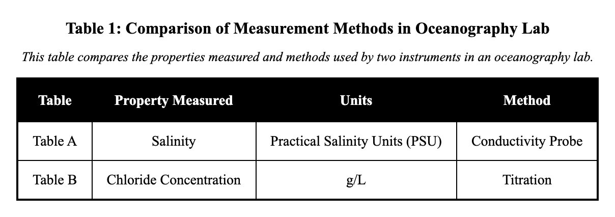
Table A measures salinity (PSU) with a conductivity probe, while Table B measures chloride (g/L) by titration at the same depths.
Both tables measure salinity in PSU, but Table B uses a different depth scale in centimeters.
Table A measures chloride (g/L) by titration, while Table B measures salinity (PSU) with a conductivity probe.
Both tables measure chloride, but Table A reports daily averages and Table B reports hourly spikes.
Explanation
The main difference lies in the specific property measured and the method used, even at the same depths. Table A reports salinity in practical salinity units (PSU) using a conductivity probe during a cast; Table B reports chloride concentration in g/L using lab titration of samples. This distinction matters because salinity estimates total salts via conductivity, while chloride measures one component chemically, affecting how data are interpreted for ocean properties. A distractor could swap the methods or variables, but the captions specify conductivity for salinity in A and titration for chloride in B.
Consider the plant in Chamber 3 and the plant in Chamber 7. Which of the following statements about these two plants is most accurate?
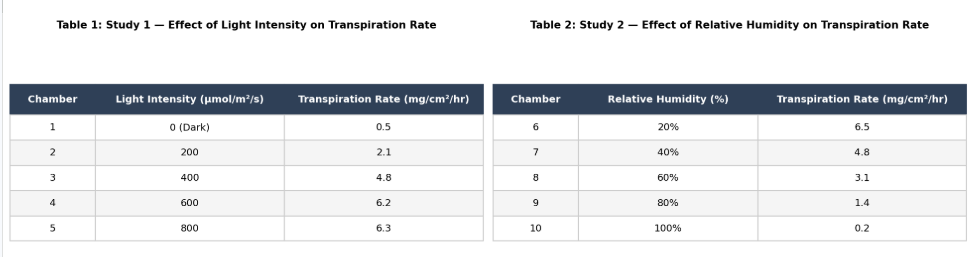
Both plants were exposed to the same environmental conditions (40% humidity and 400 μmol/m²/s light) and had the same transpiration rate of 4.8 mg/cm²/hr.
The plant in Chamber 3 experienced a higher temperature than the plant in Chamber 7.
The plant in Chamber 7 was exposed to a higher light intensity than the plant in Chamber 3.
The plant in Chamber 3 had a transpiration rate of 6.5, while the plant in Chamber 7 had a transpiration rate of 4.8.
Explanation
The correct answer is C. Chamber 3 was in Study 1: light intensity was varied, humidity was constant at 40%, and Chamber 3 received 400 μmol/m²/s light, producing a transpiration rate of 4.8. Chamber 7 was in Study 2: humidity was varied, light intensity was constant at 400 μmol/m²/s, and Chamber 7 had 40% humidity, also producing 4.8. Both plants were therefore exposed to identical conditions (400 light, 40% humidity) and produced identical transpiration rates. A is wrong — temperature was held constant at 22°C in both studies. B is wrong — both chambers received 400 μmol/m²/s. D is wrong — 6.5 corresponds to Chamber 6 (20% humidity), not Chamber 3. Pro tip: Cross-study comparison questions require identifying the controlled variables in each study and checking whether they match the comparison point.
Which of the following best describes the relationship between the two data tables? Table A shows the temperature in Celsius of a chemical reaction over time, while Table B shows the pressure in atmospheres of the same reaction under identical conditions.
Table A measures temperature; Table B measures pressure.
Table A and B use different units for the same measurements.
Table A shows pressure, while Table B shows velocity.
Both tables measure the same variable under different conditions.
Explanation
Table A measures temperature while Table B measures pressure—they track completely different physical variables. Table A shows temperature data in Celsius for a chemical reaction over time, while Table B shows pressure data in atmospheres for the same reaction under identical conditions. This demonstrates that the same experimental system can be monitored for multiple different properties simultaneously. The key distinction is that these are fundamentally different types of measurements, not variations of the same variable.
A geology lab compared two methods for estimating rock density. Table A lists measured mass and volume for rock samples using a balance and water displacement. Table B lists calculated density for the same samples using $\rho=\text{mass}/\text{volume}$. Identify the relationship.
Table B lists density calculated from Table A’s measured mass and volume for the same rock samples.
Table A reports water temperature and meniscus height, while Table B reports mass from a balance.
Table B lists measured mass and volume, while Table A lists calculated density using a different formula.
Both tables list density, but Table B uses SI units (kg/m$^3$) instead of g/cm$^3$.
Explanation
Table B computes density from the raw mass and volume measurements provided in Table A for the same rock samples. Table A lists measured mass in grams (g) from a balance and volume in cm³ from water displacement for four samples; Table B lists density in g/cm³ calculated as mass divided by volume. This derivation matters because density summarizes a material property independent of sample size, facilitating comparisons that raw measurements alone do not. A distractor might reverse the measured and calculated roles, but the captions specify A as primary data and B as computed.
A robotics team tested battery performance. Table A shows measured voltage (V) over time while the robot drove on flat ground. Table B shows measured current (A) over time during the same flat-ground test. Determine the main difference between the data sets.
Table A reports power (W), while Table B reports energy (J) calculated from voltage and current.
Table A reports current in amps, while Table B reports voltage in volts for a different driving route.
Table A reports voltage over time, while Table B reports current over time for the same drive and matching time points.
Both tables report voltage, but Table B converts volts to millivolts and changes the sampling times.
Explanation
Table A and Table B report different electrical variables measured during the same robot test at matching time points. Table A shows battery voltage in volts (V) over time during a 10-minute flat-ground drive using an onboard sensor; Table B shows current in amps (A) over the same times using an inline sensor. This separation matters because voltage reflects potential while current indicates flow, together providing a fuller picture of battery performance under load. A distractor might suggest different routes, but both tables share the same test conditions.
An astronomy club recorded brightness of a variable star. Table A lists apparent magnitude measured by a telescope camera each night. Table B lists relative brightness (unitless) calculated from magnitude using the logarithmic relationship that lower magnitude means brighter. Compare what differs between the tables.
Table A gives measured magnitude values, while Table B gives calculated linear brightness ratios derived from those magnitudes.
Table A reports brightness ratios, while Table B reports magnitudes from a different star.
Table A and Table B both report magnitude, but Table B uses a different telescope and calibration.
Table A reports distance in parsecs, while Table B reports magnitude for the same nights.
Explanation
The primary difference is that Table A reports measured apparent magnitudes on a logarithmic scale, while Table B calculates linear relative brightness from those magnitudes. Table A shows apparent magnitude (mag) of a variable star on four nights using telescope photometry; Table B shows unitless relative brightness ratios derived from A's magnitudes relative to Night 1 using the logarithmic relationship. This conversion matters because it transforms the data into a more intuitive linear scale for interpreting brightness changes as factors. A distractor could claim both are magnitudes with different calibrations, but Table B explicitly derives linear ratios.