Information from Visuals, Charts, and Media
Help Questions
4th Grade Reading › Information from Visuals, Charts, and Media
Look at the bar graph and read the text. The class tracked how many books they read in February. Mia read the most books, and Jay read the fewest. Which detail from the bar graph best supports the text?
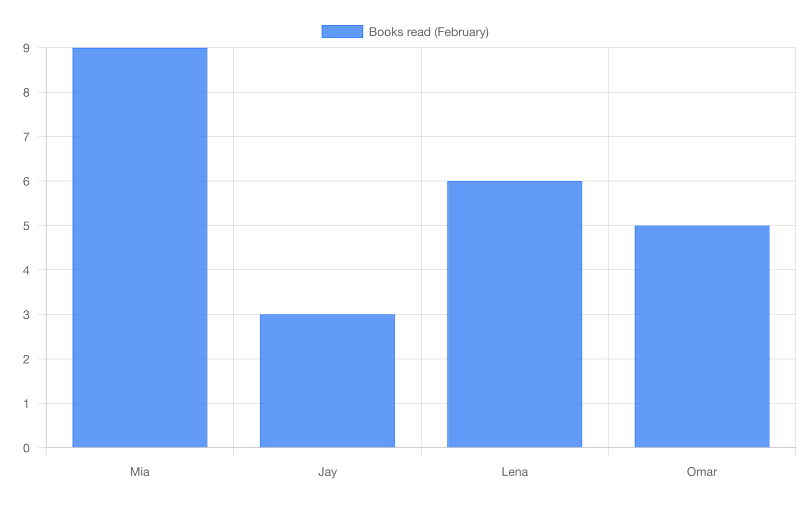
The bar graph shows Mia read 7 books and Jay read 7 books.
The bar graph shows Mia read 9 books and Jay read 3 books.
The bar graph shows Mia read 6 books and Jay read 5 books.
The bar graph shows Mia read 3 books and Jay read 9 books.
Explanation
This question tests interpreting information from visuals and understanding how visuals contribute to text (CCSS.RI.4.7), specifically reading a bar graph. The bar graph shows the number of books each student read in February, with bars of different heights representing different quantities. The text explains that Mia read the most books and Jay read the fewest, and the visual provides the specific data that supports these claims. Together, the visual and text give complete information about the class reading data. Choice A is correct because it accurately interprets data from the bar graph showing Mia with the highest bar at 9 books and Jay with the lowest bar at 3 books. Specifically, these values match the text's claims about who read most and fewest. Choice B is incorrect because it reverses the values, contradicting both the visual data and the text's statements about who read most/fewest. This error occurs when students confuse which bar belongs to which person or misread the graph. To help students interpret visuals: Teach them to read visuals systematically—(1) Identify visual type (bar graph); (2) Read title, labels, and key; (3) Look for patterns or relationships (highest/lowest bars); (4) Check units and scale; (5) Connect to text (does the data support the text's claims?). For bar graphs, teach reading the horizontal axis for categories (student names) and vertical axis for values (number of books). Practice by asking: Which bar is tallest? Which is shortest? Do these match what the text says? Watch for: confusing which bar belongs to which category, misreading the scale, or not connecting visual data to text claims.
Look at the table and read the text. A science group compared four rocks by mass. Granite was the heaviest, and pumice was the lightest. Which detail from the table best supports the text?
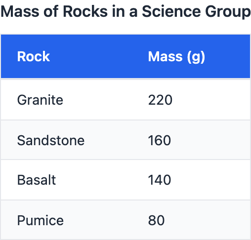
The table shows granite and pumice are both 150 g.
The table shows granite is 220 g and pumice is 80 g.
The table shows granite is 140 g and pumice is 160 g.
The table shows granite is 80 g and pumice is 220 g.
Explanation
This question tests interpreting information from visuals and understanding how visuals contribute to text (CCSS.RI.4.7), specifically reading a table about rock masses. The table shows mass measurements for different rock types organized in rows. The text states that granite was the heaviest and pumice was the lightest, and the visual provides specific mass data in grams to support these claims. Together, the visual and text help readers understand the relative densities of different rock types. Choice A is correct because it shows granite at 220 g (heaviest mass) and pumice at 80 g (lightest mass). Specifically, these values support the text's claims about which rock type was heaviest and lightest. Choice B is incorrect because it reverses the masses, making pumice heavier than granite, which contradicts both the table data and the text. This error occurs when students misread which mass value belongs to which rock type in the table. To help students interpret visuals: Teach them to read data tables carefully—(1) Identify what each column represents (Rock Type, Mass); (2) Find the row for each rock mentioned; (3) Read across to find the corresponding value; (4) Compare all values to find highest/lowest; (5) Verify these match the text claims. For tables with measurements, teach students to pay attention to units (grams) and use finger-tracking to avoid row confusion. Practice by asking: Which rock has the highest mass number? Which has the lowest? Do these match what the text says about heaviest and lightest? Watch for: reading the wrong row, not comparing all values before deciding, or confusing which column contains which type of information.
Look at the line graph and read the text. Sam measured a plant each week for 4 weeks. The plant grew every week, and it grew most from Week 2 to Week 3. How does the line graph support the text?
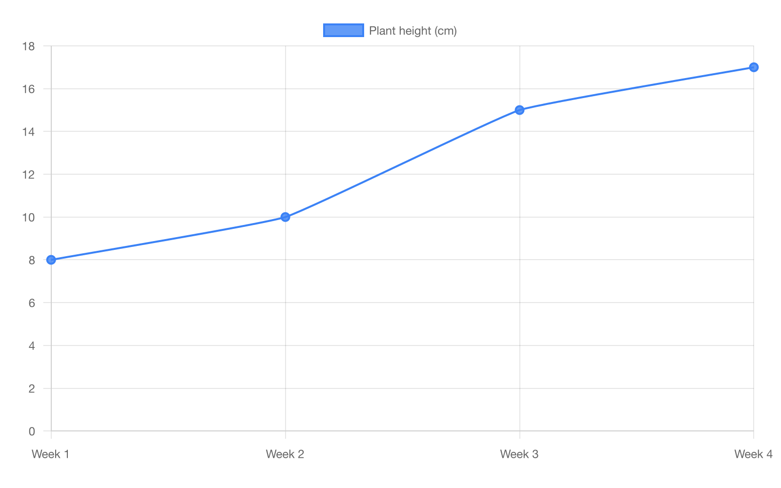
The line graph shows the plant grew most from Week 1 to Week 2.
The line graph shows the plant got shorter after Week 3.
The line graph shows the plant grew each week, most from Week 2 to Week 3.
The line graph shows the plant stayed the same height each week.
Explanation
This question tests interpreting information from visuals and understanding how visuals contribute to text (CCSS.RI.4.7), specifically reading a line graph. The line graph shows plant height measurements over 4 weeks, with points connected by lines showing growth trends. The text explains that the plant grew every week with the most growth from Week 2 to Week 3, and the visual illustrates this pattern with specific measurements. Together, the visual and text provide evidence of the plant's growth pattern. Choice C is correct because it accurately describes what the line graph shows—an upward trend each week with the steepest increase between Week 2 and Week 3. Specifically, the line segment between these weeks shows the greatest vertical change, supporting the text's claim. Choice B is incorrect because it identifies the wrong growth period, misreading which segment shows the steepest increase. This error occurs when students don't carefully compare the slopes of different line segments. To help students interpret visuals: Teach them to read line graphs systematically—(1) Identify that line graphs show change over time; (2) Read axes labels (time on horizontal, measurement on vertical); (3) Look for trends (up, down, flat); (4) Compare steepness of segments; (5) Connect to text claims. For line graphs, teach that steeper lines mean faster change and flatter lines mean slower change. Practice by asking: Is the line going up or down? Where is it steepest? Does this match what the text says? Watch for: confusing which time periods show most change, not understanding that steepness indicates rate of change, or making claims about data points not shown on the graph.
Look at the bar graph and read the text. Students counted birds at four feeders. Feeder A had more birds than Feeder C, but fewer than Feeder B. Which choice is supported by the bar graph?
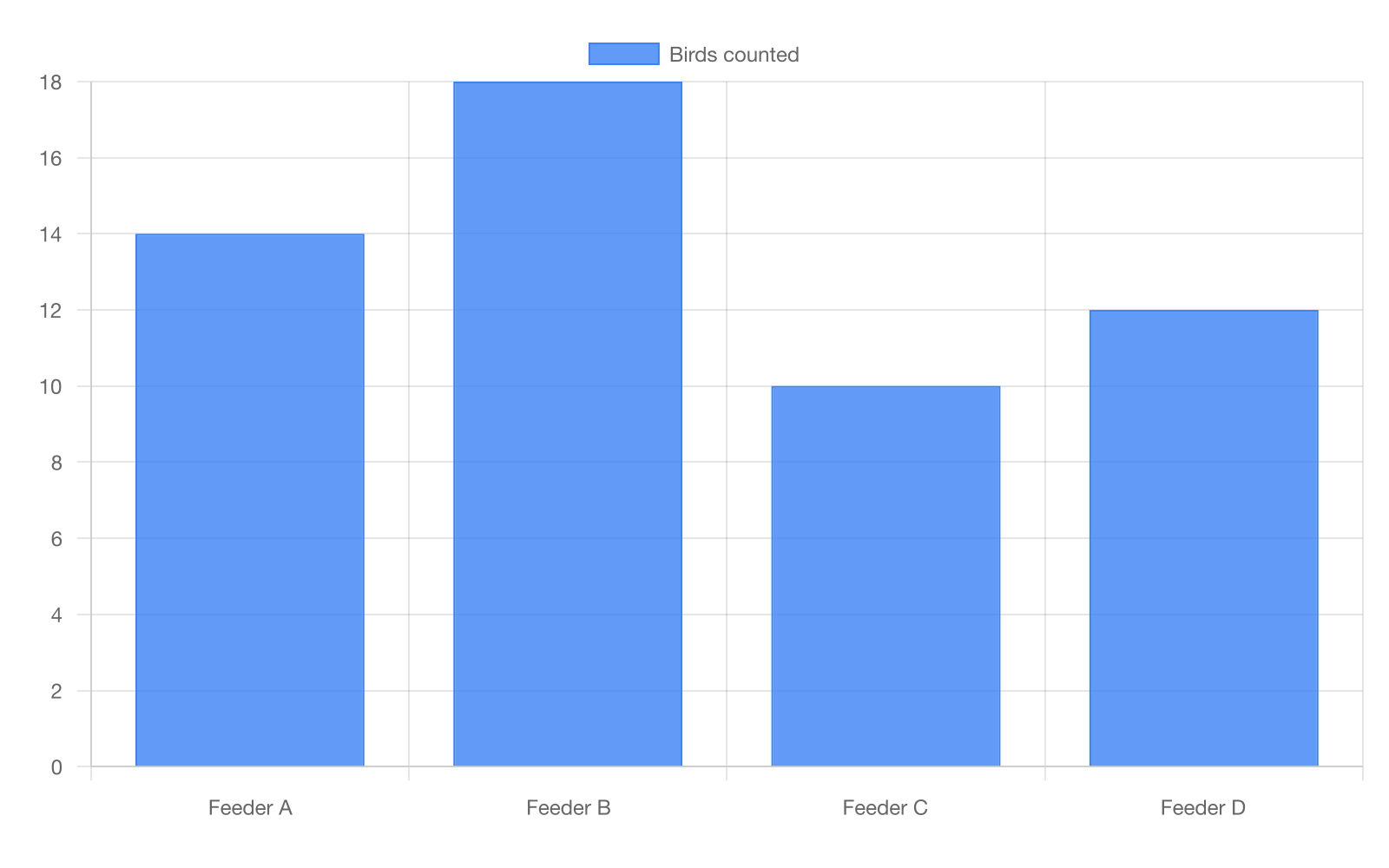
The bar graph shows Feeder A had 10 birds, between B at 14 and C at 18.
The bar graph shows Feeder A had 8 birds, fewer than C.
The bar graph shows Feeder A had 14 birds, between B at 18 and C at 10.
The bar graph shows Feeder A had 18 birds, more than B and C.
Explanation
This question tests interpreting information from visuals and understanding how visuals contribute to text (CCSS.RI.4.7), specifically reading a bar graph to verify relationships between values. The bar graph shows bird counts at different feeders with bars of different heights. The text describes a specific relationship: Feeder A had more birds than C but fewer than B, and the visual must provide data supporting this ordering. Together, the visual and text provide complete information about relative bird populations. Choice A is correct because it shows Feeder A at 14 birds, which is between B at 18 (more than A) and C at 10 (fewer than A). Specifically, this creates the relationship C < A < B that matches the text's description. Choice B is incorrect because it shows A at 10 and C at 18, which would mean A had fewer birds than C, contradicting the text. This error occurs when students don't systematically check that all relationships are satisfied. To help students interpret visuals: Teach them to verify multiple relationships—(1) Write out what the text says (A > C and A < B); (2) This means C < A < B; (3) Check each answer to see if numbers follow this pattern; (4) Verify by checking each comparison separately; (5) Eliminate choices that fail any part. For complex comparisons, teach students to use inequality symbols to organize their thinking. Practice by asking: Is A's number bigger than C's? Is A's number smaller than B's? Does this choice satisfy both conditions? Watch for: checking only one relationship, getting confused with multiple comparisons, or not understanding that 'between' means satisfying both greater than and less than conditions.
Look at the line graph and read the text. A runner timed a 1-mile run over 5 days. The time got faster each day, with the biggest drop from Day 1 to Day 2. Which statement matches the line graph?
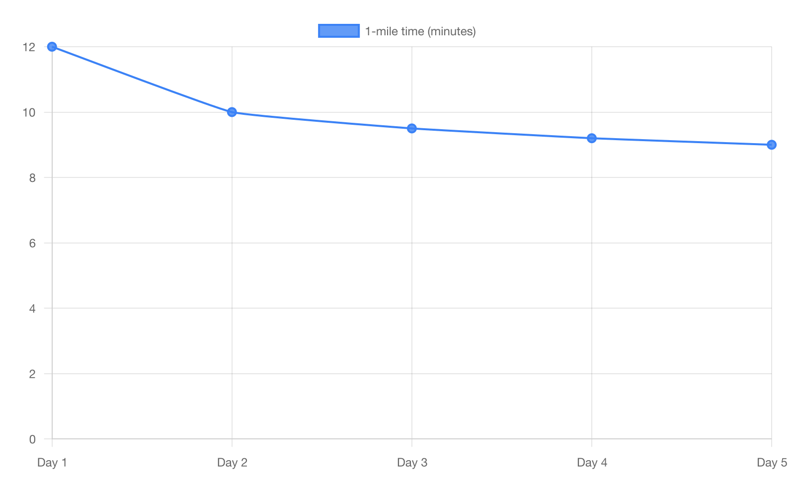
The line graph shows time increased from Day 1 to Day 2.
The line graph shows time stayed the same from Day 3 to Day 5.
The line graph shows time decreased daily, most from Day 1 to Day 2.
The line graph shows the biggest drop was from Day 4 to Day 5.
Explanation
This question tests interpreting information from visuals and understanding how visuals contribute to text (CCSS.RI.4.7), specifically reading a line graph showing decreasing values. The line graph shows running times over 5 days, with the line showing how times changed. The text explains that times got faster each day with the biggest drop from Day 1 to Day 2, and the visual illustrates this improvement pattern. Together, the visual and text document the runner's progress. Choice D is correct because it accurately describes a line graph showing times decreasing daily (getting faster) with the steepest drop between Day 1 and Day 2. Specifically, a downward line indicates decreasing time values, and the steepest segment shows the biggest improvement. Choice C is incorrect because it identifies the wrong time period for the biggest drop, misreading which segment is steepest. This error occurs when students don't understand that in time measurements, decreasing values mean improvement (faster). To help students interpret visuals: Teach them to read line graphs with time data—(1) Understand that for race times, down is good (faster); (2) Look for overall trend (decreasing = improving); (3) Find steepest downward segment (biggest improvement); (4) Read specific day pairs carefully; (5) Connect to text claims about when most improvement occurred. For graphs showing time or speed, explicitly teach the inverse relationship: lower times mean faster performance. Practice by asking: Is the line going down (getting faster)? Where does it drop most steeply? Which days show this biggest drop? Watch for: confusing decreasing time with getting slower, not identifying the steepest segment correctly, or misunderstanding that improvement in running means decreasing time values.
Look at the bar graph and read the text. The weather station counted rainy days in four months. April had the most rainy days, and June had the fewest. According to the bar graph, how many rainy days were in April?
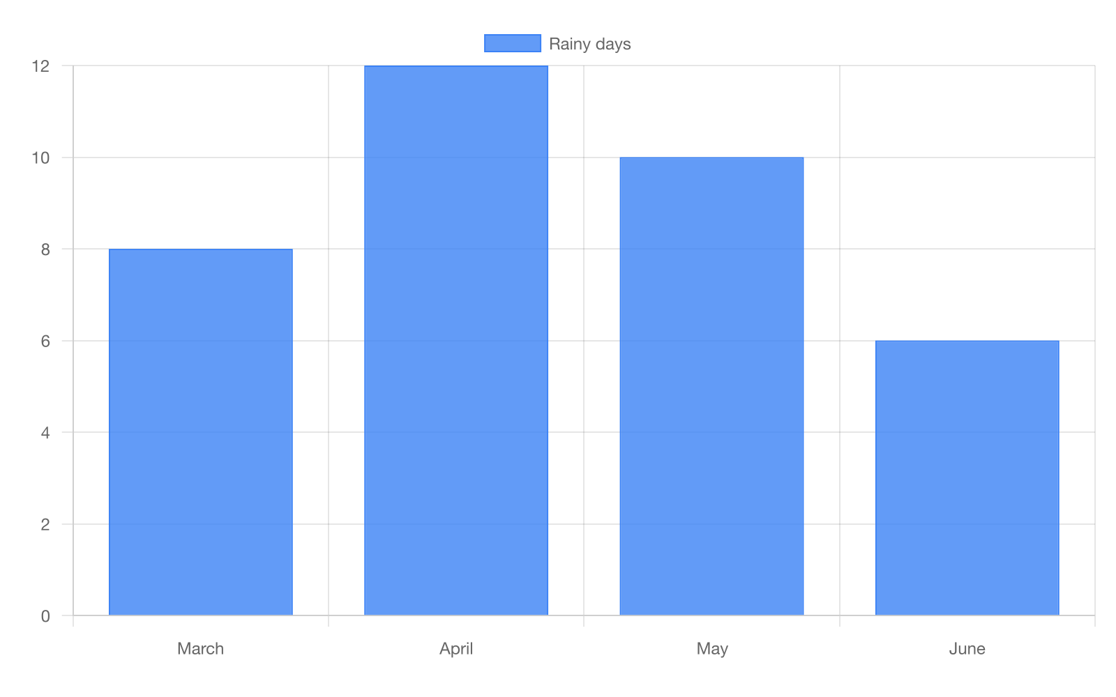
The bar graph shows April had 4 rainy days.
The bar graph shows April had 8 rainy days.
The bar graph shows April had 6 rainy days.
The bar graph shows April had 12 rainy days.
Explanation
This question tests interpreting information from visuals and understanding how visuals contribute to text (CCSS.RI.4.7), specifically reading specific data from a bar graph. The bar graph shows rainy days for different months, with bar heights representing the number of days. The text states that April had the most rainy days and June had the fewest, and the visual provides the specific numerical data. Together, the visual and text provide complete weather information. Choice B is correct because it accurately reads the bar graph showing April's bar reaching the 12 mark on the vertical axis. Specifically, this is the tallest bar on the graph, confirming the text's claim that April had the most rainy days. Choice C is incorrect because it misreads the scale, identifying 8 days instead of 12. This error occurs when students don't carefully align the top of the bar with the scale markings on the vertical axis. To help students interpret visuals: Teach them to read bar graphs precisely—(1) Find the bar for the category asked about (April); (2) Follow the top of the bar horizontally to the scale; (3) Read the exact number where it aligns; (4) Double-check by counting grid lines if needed; (5) Verify this matches text claims (is it the highest bar?). For reading exact values, teach students to use a ruler or finger to trace from bar top to scale. Practice by asking: Where does the bar top align with the numbers? Is this the tallest bar as the text claims? Watch for: reading between scale marks instead of on them, estimating instead of reading precisely, or reading the wrong bar due to not checking labels carefully.