Interpreting Graphs & Tables - SAT Math
Card 0 of 188
The chart below maps how scientists view others' work (left) and how they suspect others will view their own work (right) if the researcher (the scientist or another, depending on the focus) admitted to engaging in questionable research practices.

Adapted from Fetterman & Sassenberg, "The Reputational Consequences of Failed Replications and Wrongness Admission among Scientists." December 9, 2015, PLOS One.
According to the graph, when the focus of the question was on their own actions, scientists
The chart below maps how scientists view others' work (left) and how they suspect others will view their own work (right) if the researcher (the scientist or another, depending on the focus) admitted to engaging in questionable research practices.
Adapted from Fetterman & Sassenberg, "The Reputational Consequences of Failed Replications and Wrongness Admission among Scientists." December 9, 2015, PLOS One.
According to the graph, when the focus of the question was on their own actions, scientists
The key to any graph-based question is to make sure to look not just at the graph itself, but also at any additional information that is presented with the graph. In this case, you are told that the bars on the left represent how the scientists would view others' future work if the other person admitted to wrongdoing. Notice that if the other person admitted that they had been wrong that the people surveyed would be less likely to suspect them than if they didn't admit to wrongdoing. In contrast, the bars on the right show how they would anticipate others to react if they admitted to wrongdoing. In this case, they said that others would be more suspicious of their work if they did admit to wrongdoing than if they didn't. The answer that matches this is "incorrectly assumed that admitting that a study was wrong would lead others to be more suspicious of their work". While they assumed that others would be more suspicious of their work if they admitted to wrongdoing, scientists, in general, were less suspicious of individuals who admitted to wrongdoing.
The key to any graph-based question is to make sure to look not just at the graph itself, but also at any additional information that is presented with the graph. In this case, you are told that the bars on the left represent how the scientists would view others' future work if the other person admitted to wrongdoing. Notice that if the other person admitted that they had been wrong that the people surveyed would be less likely to suspect them than if they didn't admit to wrongdoing. In contrast, the bars on the right show how they would anticipate others to react if they admitted to wrongdoing. In this case, they said that others would be more suspicious of their work if they did admit to wrongdoing than if they didn't. The answer that matches this is "incorrectly assumed that admitting that a study was wrong would lead others to be more suspicious of their work". While they assumed that others would be more suspicious of their work if they admitted to wrongdoing, scientists, in general, were less suspicious of individuals who admitted to wrongdoing.
Compare your answer with the correct one above
The chart below maps how scientists view others' work (left) and how they suspect others will view their own work (right) if the researcher (the scientist or another, depending on the focus) admitted to engaging in questionable research practices.

Adapted from Fetterman & Sassenberg, "The Reputational Consequences of Failed Replications and Wrongness Admission among Scientists." December 9, 2015, PLOS One.
Which of the following is best supported by the graph?
The chart below maps how scientists view others' work (left) and how they suspect others will view their own work (right) if the researcher (the scientist or another, depending on the focus) admitted to engaging in questionable research practices.
Adapted from Fetterman & Sassenberg, "The Reputational Consequences of Failed Replications and Wrongness Admission among Scientists." December 9, 2015, PLOS One.
Which of the following is best supported by the graph?
Scientists viewed others who admitted to wrongdoing with less suspicion than they viewed people who did not admit to wrongdoing. However, scientists believed that others would view them as less trustworthy if they admitted to wrongdoing. This matches "scientists believed that others would view them as much less honest if they admitted to wrongness."
The other choices can all be eliminated because they make the claim that there is some sort of relationship that can be drawn between scientists in one group and the other. Because you don't have scientist- by-scientist data, however, you can't make any conclusions linking individual scientists in each survey group.
Compare your answer with the correct one above
The following is excerpted from a textbook addressing the breakdown and landmass of the earth. (2018)

Which of the following conclusions cannot be drawn from the graph above?
The following is excerpted from a textbook addressing the breakdown and landmass of the earth. (2018)
Which of the following conclusions cannot be drawn from the graph above?
When breaking down graphs and tables, it’s important to pay close attention to often overlooked details such as scale, labels, and titles. Here, we’re told what this pie graph is measuring right in the title - it’s a graph of world landmass by continent. We can do the math to identify that “Asia is approximately 50% larger, based on landmass than Africa,” that “The landmass of Africa is approximately the same size as the combined landmass of Antarctica, Europe, and Australia,” and that “The two Americas account for a combined 29% of the world’s landmass.” However, we do not know that “Half of the earth’s surface area is covered by Asia and Africa.” If we attempt to draw this conclusion, we’ve made a critical mistake in reading - we’ve forgotten about the water! There’s a drastic difference between “world landmass” and “world surface area,” since the former is looking only to the land, and the latter includes all surface area, even the portion covered by the deep blue! It’s critical that we pay close attention to what the data is measuring when interpreting graphs and tables, because convincing wrong answers - and in this case, our answer to an “except” question - will often draw us in with options that sound on-topic but address different data from the data we were presented within the figure.
When breaking down graphs and tables, it’s important to pay close attention to often overlooked details such as scale, labels, and titles. Here, we’re told what this pie graph is measuring right in the title - it’s a graph of world landmass by continent. We can do the math to identify that “Asia is approximately 50% larger, based on landmass than Africa,” that “The landmass of Africa is approximately the same size as the combined landmass of Antarctica, Europe, and Australia,” and that “The two Americas account for a combined 29% of the world’s landmass.” However, we do not know that “Half of the earth’s surface area is covered by Asia and Africa.” If we attempt to draw this conclusion, we’ve made a critical mistake in reading - we’ve forgotten about the water! There’s a drastic difference between “world landmass” and “world surface area,” since the former is looking only to the land, and the latter includes all surface area, even the portion covered by the deep blue! It’s critical that we pay close attention to what the data is measuring when interpreting graphs and tables, because convincing wrong answers - and in this case, our answer to an “except” question - will often draw us in with options that sound on-topic but address different data from the data we were presented within the figure.
Compare your answer with the correct one above
The following is excerpted from a 2010 study concerning patterns of enrollment and graduation at Ivy League schools. (2010)

Which of the following conclusions is supported by the bar graph above?
The following is excerpted from a 2010 study concerning patterns of enrollment and graduation at Ivy League schools. (2010)
Which of the following conclusions is supported by the bar graph above?
When breaking down graphs and tables, it’s important to pay close attention to often overlooked details such as scale, labels, and titles. Here, the bar graph we’ve been given represents undergraduate enrollment. So, we can only feasibly draw conclusions about the enrollment of the schools in question. So, answers that address graduation rates or compare them cannot be concluded based on the bar graph alone. Only our correct answer “The total enrollment for Ivy League schools in 2010 was greater than 40,000 students,” can be confidently concluded based on the information, and we can get there efficiently using rounding and estimation, as the total is well over the 40,000 mark.
When breaking down graphs and tables, it’s important to pay close attention to often overlooked details such as scale, labels, and titles. Here, the bar graph we’ve been given represents undergraduate enrollment. So, we can only feasibly draw conclusions about the enrollment of the schools in question. So, answers that address graduation rates or compare them cannot be concluded based on the bar graph alone. Only our correct answer “The total enrollment for Ivy League schools in 2010 was greater than 40,000 students,” can be confidently concluded based on the information, and we can get there efficiently using rounding and estimation, as the total is well over the 40,000 mark.
Compare your answer with the correct one above
The following graph is excerpted from a study on the part-time work of high school seniors. The graph depicts the average hours worked per week by a sampled group of seniors in 2018, the year before the study was conducted. (2019)

Which of the following conclusions is supported by the line graph above?
The following graph is excerpted from a study on the part-time work of high school seniors. The graph depicts the average hours worked per week by a sampled group of seniors in 2018, the year before the study was conducted. (2019)
Which of the following conclusions is supported by the line graph above?
In this example, we can use process of elimination and a bit of rounding to arrive at our correct answer efficiently. We can conclude that the sample’s total hours worked per month did not increase each month from January to December, or even from January to July, as there is a clear decrease from February to March, as well as several more decreases later in the year. We also cannot conclude that hours worked decreased each month from July to December, as we can see a clear increase from October to November, and again from November to December. We can, however, conclude that “The sample’s total hours worked in May through August were greater than the total hours worked for the rest of the year.” Even if we apply a bit of rounding, the roughly 15+20+40+36 gives us around 110 for the months in question. (and yes, we’d want to keep in mind that these are weekly figures and that the *actual* values would depend on the weeks in the month and the number of participants in the sample group. That said, this change will be proportional, so we can simplify by looking to the weekly and average amounts.) This roughly 110 far surpasses the sum for the remainder of the months, even if we round up, as most are at or below roughly 10. Keep in mind, graph questions on the SAT are never meant to be an eye exam - so if it seems as though the numbers are “too close to call,” you’re probably missing something along the way!
In this example, we can use process of elimination and a bit of rounding to arrive at our correct answer efficiently. We can conclude that the sample’s total hours worked per month did not increase each month from January to December, or even from January to July, as there is a clear decrease from February to March, as well as several more decreases later in the year. We also cannot conclude that hours worked decreased each month from July to December, as we can see a clear increase from October to November, and again from November to December. We can, however, conclude that “The sample’s total hours worked in May through August were greater than the total hours worked for the rest of the year.” Even if we apply a bit of rounding, the roughly 15+20+40+36 gives us around 110 for the months in question. (and yes, we’d want to keep in mind that these are weekly figures and that the *actual* values would depend on the weeks in the month and the number of participants in the sample group. That said, this change will be proportional, so we can simplify by looking to the weekly and average amounts.) This roughly 110 far surpasses the sum for the remainder of the months, even if we round up, as most are at or below roughly 10. Keep in mind, graph questions on the SAT are never meant to be an eye exam - so if it seems as though the numbers are “too close to call,” you’re probably missing something along the way!
Compare your answer with the correct one above

Which of the following best describes the information in the graph?
Which of the following best describes the information in the graph?
When you’re selecting an answer choice that describes the graph, it’s important that the entire answer choice be true. For example, consider the answer choice that reads “For every level of education, as education increases the unemployment rate decreases.” For almost every level of education, as the level of education increases the unemployment rate decreases. So, choice B is almost true. But that last level – doctoral degree – has an unemployment rate just higher than the level before it (professional degree), so “every level” isn’t quite true. Make sure you read each choice critically and are careful with words that are hard to prove (every, all, always, never, none, etc.). “As the level of education increases, the unemployment rate and the median weekly income are positively correlated” is incorrect, again for just one word: the unemployment rate and the median weekly income are indeed correlated, but as income goes up the unemployment rate goes down. This is a negative – not positive – correlation.
“The median holder of an associate’s degree earns more than twice as much per week as the median person who has not completed high school” is also incorrect. The Associate’s Degree median is \$768 while the median for no high school degree is \$451. Since \$768 is not quite twice as much as \$451, this answer can be eliminated.
However, the first level of college degree listed is an Associate’s Degree, with an unemployment rate of 6.8%, and all other degrees listed have unemployment rates less than that. Since the unemployment rate for those without high school degrees is 14.1%, you can conclude that this rate is more than double the rate for any college degree, meaning that any college degree will have a rate of less than half the rate for no high school degree. This makes “The average holder of any type of college degree is less than half as likely to be unemployed as is the average person who has not completed high school” our correct answer.
Compare your answer with the correct one above
The following graph plots the average wind speed by time of day for a windmill farm outside of Toronto. Time of day is given in military time (0 hours to 2400 hours).

Which of the following best summarizes the data in the graph?
The following graph plots the average wind speed by time of day for a windmill farm outside of Toronto. Time of day is given in military time (0 hours to 2400 hours).
Which of the following best summarizes the data in the graph?
Very often with line graphs, the SAT will ask you to describe a trend evident from the graph. In these cases, it’s helpful to get a quick glance at the graph to notice extremes (Where is the line the highest? Where is it the lowest? Are there any places where it stays flat for multiple increments?), but ultimately you’ll need to utilize Process of Elimination with the answer choices. We cannot conclude that “Average wind speed increases steadily between 5:00 am and midnight” because the graph clearly shows periods where the line goes down after 5:00 but before 24:00. Therefore the average wind speed does not increase steadily; in some instances, it decreases. We are also unable to conclude that “Average wind speed is lowest between 3:00 and 5:00.” Although the period between 3:00 and 5:00 marks one of the lower points on the graph, the line dips even lower below the 6.6 line at 18:00.
We also want to be sure to check the scale on graph problems! The entire y-axis for this graph only spans 6.5 to 7.2 meters per second, so although the line jumps up sharply it only represents a small percentage increase. Thus, we can eliminate “Average wind speed more than doubles from 18:00 to 22:00. This leaves us with “Average wind speed is highest between 20:00 and 22:00,” our correct answer. The highest point on the line is at 21:00, between the stated times of 20:00 and 22:00.
Compare your answer with the correct one above
The following scatter plot displays the world record time, in seconds, for the men’s 100-meter dash from 1910 through 2010. The line of best fit displays what the expected world record time would be at each point along the years 1900 to 2100.

Which of the following best summarizes information displayed in the scatter plot above?
The following scatter plot displays the world record time, in seconds, for the men’s 100-meter dash from 1910 through 2010. The line of best fit displays what the expected world record time would be at each point along the years 1900 to 2100.
Which of the following best summarizes information displayed in the scatter plot above?
Notice that 3 of the 4 answer choices include the term “line of best fit” with regard to a prediction. With scatter plots, the line of best fit can serve as a tool to predict where new data points will fall. In this case, the line of best fit represents where one would expect the world record to be at any given point between 1900 and 2100. Remember that a faster time will be a lower number (running the 100 meters in 9 seconds is faster than running it in 10 seconds). So, “The world records set between 1980 and 1995 were all faster than what the line of best fit predicts” is incorrect, as the data points from 1980 to 1995 are above the line of best fit, so slower than what would have been predicted. Additionally, each data point represents a new world record – a point in time at which the world record was broken. So you can look at the horizontal space between each data point to see how long the duration was in between. And between approximately 1930 and just after 1950 there are no data points, so you can conclude that the world record was not broken for a period of approximately 20 years. Thus, “Since 1900, the world record has never gone more than 15 years without being lowered” is incorrect.
“The world record time in 2050, in seconds, is predicted by the line of best fit to be less than half what it was in 1910” is also incorrect, and brings up another point critical to your work with graphs: look at the scale! Even though the line of best fit is much, much lower at 2050 than it was in 1910, the total scale goes from 9.4 seconds at the bottom to 10.8 seconds at the top. So there’s no chance for one data point to be half of another: half of 10.8 (the top data point) would be 5.4, and the graph doesn’t go that low. It’s quite common for the lines or bars on a graph to appear to have a much greater difference in size than is actually true, so always check the scale when answering questions dealing with percent change. However, because the data points between 2000 and 2010 are all below the line of best fit, those times were all faster than would have been predicted. Thus, “The world records set between 2000 and 2010 were all faster than what the line of best fit predicts” is our correct answer.
Compare your answer with the correct one above
The following graph displays, for several major categories of public transportation, the share of total trips taken via public transportation in the United States over a year.

What statement is best supported by the data in the figure above?
The following graph displays, for several major categories of public transportation, the share of total trips taken via public transportation in the United States over a year.
What statement is best supported by the data in the figure above?
Perhaps the easiest way to miss a graph-based question is to answer based only on the image without consideration of the words that accompany it. So make sure you always take note of what, specifically, the graph is displaying. Here it’s the percentages of trips taken, which is critical. It may seem convincing that “Over half of all users of public transportation are bus riders” at first (“more than half” certainly applies to “bus”), but the units matter! You can’t conclude that more than half of all users are bus riders, just that more than half of all trips taken were by bus. Suppose, for example, that people who take the bus take it twice per day, but people who use heavy rail only use it once per week. Each user of the bus would then take 10 trips for every one trip that a heavy rail user takes, and in that case, you’d need a lot more heavy rail users than bus users to have 35% of all trips be taken by heavy rail. “45% of all miles traveled on public transportation are traveled by rail of some kind” is also incorrect, because we’re once again facing a units problem. You don’t know about the percentage of miles traveled via each public transportation service; you only know about the percentage of trips taken. “More people travel via paratransit than via ferry” makes the same mistake: it draws a conclusion about the percentage of people when the information you have is about the percentage of trips taken. This leaves us with our correct answer: “Over 40% of all public transportation trips are taken by rail of some kind.” This option correctly makes an inference about the percentage of trips taken, and if you check the actual numbers you’ll see that the three categories of rail add up to 45% of all trips taken. Therefore, it is true that rail accounts for more than 40% of all trips taken.
Perhaps the easiest way to miss a graph-based question is to answer based only on the image without consideration of the words that accompany it. So make sure you always take note of what, specifically, the graph is displaying. Here it’s the percentages of trips taken, which is critical. It may seem convincing that “Over half of all users of public transportation are bus riders” at first (“more than half” certainly applies to “bus”), but the units matter! You can’t conclude that more than half of all users are bus riders, just that more than half of all trips taken were by bus. Suppose, for example, that people who take the bus take it twice per day, but people who use heavy rail only use it once per week. Each user of the bus would then take 10 trips for every one trip that a heavy rail user takes, and in that case, you’d need a lot more heavy rail users than bus users to have 35% of all trips be taken by heavy rail. “45% of all miles traveled on public transportation are traveled by rail of some kind” is also incorrect, because we’re once again facing a units problem. You don’t know about the percentage of miles traveled via each public transportation service; you only know about the percentage of trips taken. “More people travel via paratransit than via ferry” makes the same mistake: it draws a conclusion about the percentage of people when the information you have is about the percentage of trips taken. This leaves us with our correct answer: “Over 40% of all public transportation trips are taken by rail of some kind.” This option correctly makes an inference about the percentage of trips taken, and if you check the actual numbers you’ll see that the three categories of rail add up to 45% of all trips taken. Therefore, it is true that rail accounts for more than 40% of all trips taken.
Compare your answer with the correct one above
The scatter plot below displays the daily sales figures for a beachfront ice cream shop for the month of June, with each data point representing the sales totals and the high temperature for the day.

The scatter plot above offers evidence that the ice cream store will:
The scatter plot below displays the daily sales figures for a beachfront ice cream shop for the month of June, with each data point representing the sales totals and the high temperature for the day.
The scatter plot above offers evidence that the ice cream store will:
Sometimes the SAT will ask you a question about what the graph suggests will happen in the future. Here, you won’t always be able to find the exact answer simply by looking at the graph, but will instead have to pay attention – as always – to trends in the graph and to precision in wording in the answer choices.
“Not sell any” is a very strong statement, particularly when the bottom of the graph shows \$700 worth of ice cream and you have data points near 55 degrees that are well above that line. It’s not likely (even though it’s technically possible) that sales would fall off the graph entirely with just a slight move leftward on the x-axis (temperature axis), so “not sell any ice cream on a day for which the high temperature is below 55 degrees” is incorrect.
Similarly, over \$2,100 in sales would jump above the highest gridline on the graph, and the trend shows that the two closest data points to 90 degrees retreat slightly toward lower sales. Such a jump to over \$2,100 is possible, but not entirely likely. Thus, we can eliminate “sell over \$2,100 in ice cream on a day for which the high temperature is over 90 degrees.” The answer choice, “typically sell more ice cream on weekends than on weekdays” uses softer wording, but is problematic in its contents. The graph only shows information regarding temperature and sales, not about the day of week and sales, so even though this might very well be true, the graph gives no evidence to make this prediction.
“Usually sell less ice cream on days with lower temperatures than on days with higher temperatures” uses softer language than the previous two choices, something you should notice given that precision in wording matters quite a bit on graph problems. “Usually” is a bit easier to prove than “will,” and the general trend in the data supports this – the trend in the data points is from lower left (lower temperature, less sales revenue) to upper right (higher temperature, more sales revenue), so we’ve found our correct answer.
Compare your answer with the correct one above

The incomplete table above shows the percentage breakdown of athletes at a cross-country invitational meet at which 60% of the athletes were girls and 35% of the athletes represented their schools’ varsity teams. If there were 480 athletes, and twice as many of the girls were junior varsity team members than were varsity team members, how many athletes were boys on a junior varsity team?
The incomplete table above shows the percentage breakdown of athletes at a cross-country invitational meet at which 60% of the athletes were girls and 35% of the athletes represented their schools’ varsity teams. If there were 480 athletes, and twice as many of the girls were junior varsity team members than were varsity team members, how many athletes were boys on a junior varsity team?
The key to incomplete tables is the “total” designation for the bottom row and for the right-hand column. Here two of those cells are filled in for you, and they form your “foothold” for solving the rest. You know that 35% of all athletes were members of varsity teams, meaning that the Varsity Girls cell plus the Varsity Boys cell must equal 35%. That also tells you that, since the total has to add up to 100%, the JV Total cell must be 65% so that Varsity + JV can add to 100%. Similarly, you know that the Girls Total is 60%, meaning that the sum of Varsity Girls and JV Girls must add to 60%. And you also know that 40% of the total athletes were boys so that that column can add to 100%. Filling in what you know now, you have the bottom row and the right-most column filled in:

You’re also told that there are twice as many JV girls as varsity girls, which allows you to set up a system of equations: Varsity Girls + JV Girls = 60 JV Girls = 2(Varsity Girls) Therefore, you can conclude that the JV Girls cell is 40% and the Varsity Girls cell is 20%, which leads you another step closer to filling in the whole table:

Since each column needs to sum to its total in the bottom row, you can conclude that Varsity Boys = 15% and JV Boys = 25%. And since you’re responsible for the JV Boys number, you can now take that 25% and apply it to the total number of athletes, 480. 25% of 480 is 120, so the correct answer is “120.”
The key to incomplete tables is the “total” designation for the bottom row and for the right-hand column. Here two of those cells are filled in for you, and they form your “foothold” for solving the rest. You know that 35% of all athletes were members of varsity teams, meaning that the Varsity Girls cell plus the Varsity Boys cell must equal 35%. That also tells you that, since the total has to add up to 100%, the JV Total cell must be 65% so that Varsity + JV can add to 100%. Similarly, you know that the Girls Total is 60%, meaning that the sum of Varsity Girls and JV Girls must add to 60%. And you also know that 40% of the total athletes were boys so that that column can add to 100%. Filling in what you know now, you have the bottom row and the right-most column filled in:
You’re also told that there are twice as many JV girls as varsity girls, which allows you to set up a system of equations: Varsity Girls + JV Girls = 60 JV Girls = 2(Varsity Girls) Therefore, you can conclude that the JV Girls cell is 40% and the Varsity Girls cell is 20%, which leads you another step closer to filling in the whole table:
Since each column needs to sum to its total in the bottom row, you can conclude that Varsity Boys = 15% and JV Boys = 25%. And since you’re responsible for the JV Boys number, you can now take that 25% and apply it to the total number of athletes, 480. 25% of 480 is 120, so the correct answer is “120.”
Compare your answer with the correct one above
In a certain boutique shop for infant toys, 20% of toys are pink and the rest are blue. One half of the toys are made of wood and the rest are made of plastic. If 10% of the toys are pink, wooden toys, and 80 are blue, plastic toys, how many total toys are there?

In a certain boutique shop for infant toys, 20% of toys are pink and the rest are blue. One half of the toys are made of wood and the rest are made of plastic. If 10% of the toys are pink, wooden toys, and 80 are blue, plastic toys, how many total toys are there?
When we’re able to create an incomplete table using two categories of information, in this case, “wood vs. plastic” and “pink vs. blue,” we can fill out any third cell horizontally or vertically if we know the other two, since our interior cells sum to each total row/column. In this case, if we know that 10% of the toys are wood, pink toys, and 50% of all toys are wood, we can fill in the blue, wood column with 40%. Similarly, if we know that wood, pink toys are 10% and total pink toys are 20%, we can fill in pink, plastic toys with the remaining 10%.

From here, we can also fill out our other total categories as follows:

Now, we have several ways to prove that blue, plastic toys make up the remaining 40% of the toys. So, if 40% of our total is equal to 80 toys, we can solve for the total number of toys as follows:
40%(T) = 80
10%(T) = 20
T = 200
When we’re able to create an incomplete table using two categories of information, in this case, “wood vs. plastic” and “pink vs. blue,” we can fill out any third cell horizontally or vertically if we know the other two, since our interior cells sum to each total row/column. In this case, if we know that 10% of the toys are wood, pink toys, and 50% of all toys are wood, we can fill in the blue, wood column with 40%. Similarly, if we know that wood, pink toys are 10% and total pink toys are 20%, we can fill in pink, plastic toys with the remaining 10%.
From here, we can also fill out our other total categories as follows:
Now, we have several ways to prove that blue, plastic toys make up the remaining 40% of the toys. So, if 40% of our total is equal to 80 toys, we can solve for the total number of toys as follows:
40%(T) = 80
10%(T) = 20
T = 200
Compare your answer with the correct one above
Of the high school seniors at a particular school,  are left-handed, and the rest are right-handed.
  of the students take the bus to school, and the rest do not. If 30 students are right-handed students who take the bus, and half of the left-handed students take the bus, how many total high school seniors are at the school?
Of the high school seniors at a particular school, 

From the initial information presented to us in the stem, we can create a two way table using the categories left vs. right-handed, and take the bus vs. do not take the bus. We can fill in the table as follows: (*note - be very cautious mixing percent/fraction information with actual value information. It may be easier to leave the “30” out of the table and solve for right-handed seniors who take the bus in terms of a fraction.)

From here, if we know that half of the students who are left-handed take the bus, we can split up the  of our total that is left-handed into
  and
and  .
.

If  of the students take the bus, and
  of the students are left-handed students who take the bus, the remaining
  are right-handed students who take the bus. Since we know the value of right-handed students who take the bus is 30, and
  of our total students, the total number of students must be
=30")


*Note, we did not need to complete the entire table to answer this question, but we could! The rest of the table is as follows:

From the initial information presented to us in the stem, we can create a two way table using the categories left vs. right-handed, and take the bus vs. do not take the bus. We can fill in the table as follows: (*note - be very cautious mixing percent/fraction information with actual value information. It may be easier to leave the “30” out of the table and solve for right-handed seniors who take the bus in terms of a fraction.)
From here, if we know that half of the students who are left-handed take the bus, we can split up the 


If 


=30")


*Note, we did not need to complete the entire table to answer this question, but we could! The rest of the table is as follows:
Compare your answer with the correct one above
Of the students in a particular collegiate debate organization,  are men and the rest are women.
  of the students are also a member of the chess club, and the rest are not. If
  of the men are members of the chess club, what fraction of the women were not members of the chess club?
Of the students in a particular collegiate debate organization, 


For questions where we’re exclusively given “scalable relationships” (for instance, fractions or percents) and we’re asked for a scalable relationship, we can pick a total to make the question more concrete and easier to work with!
When we’re given fractions, we’ll want to pick a total that is divisible by all the denominators present in the question stem. So, the least common multiple of our denominators will likely be a convenient and easy-to-work-with option. In this case, we’ll want to pick a total of 60, since 60 is divisible by 4, 3, and 5. From here, we can begin to fill in the table as follows:

From here, we can fill out our remaining information from the question stem, as well as the remaining totals:

Now, we’re able to fill in our remaining cells horizontally and vertically:

So, if we’re looking for what fraction of the women are not members of the chess team, we want  , in this case
  .
.
For questions where we’re exclusively given “scalable relationships” (for instance, fractions or percents) and we’re asked for a scalable relationship, we can pick a total to make the question more concrete and easier to work with!
When we’re given fractions, we’ll want to pick a total that is divisible by all the denominators present in the question stem. So, the least common multiple of our denominators will likely be a convenient and easy-to-work-with option. In this case, we’ll want to pick a total of 60, since 60 is divisible by 4, 3, and 5. From here, we can begin to fill in the table as follows:
From here, we can fill out our remaining information from the question stem, as well as the remaining totals:
Now, we’re able to fill in our remaining cells horizontally and vertically:
So, if we’re looking for what fraction of the women are not members of the chess team, we want 

Compare your answer with the correct one above
A teacher at a high school conducted a survey of freshmen and found that  students had a curfew and
  of those students were also honor roll students. There were
  students that did not have a curfew but were on the honor roll. Last, they found that
  students did not have a curfew nor were on the honor roll. Given this information, how many students were not on the honor roll?
A teacher at a high school conducted a survey of freshmen and found that
To help answer this question, we can construct a two-way table and fill in our known quantities from the question.
The columns of the table will represent the students who have a curfew or do not have a curfew and the rows will contain the students who are on the honor roll or are not on the honor roll. The first bit of information that we were given from the question was that  students had a curfew; therefore,
  needs to go in the "curfew" column as the row total. Next, we were told that of those students,
  were on the honor roll; therefore, we need to put
  in the "curfew" column and in the "honor roll" row. Then, we were told that
  students do not have a curfew but were on the honor roll, so we need to put
  in the "no curfew" column and the "honor roll" row. Finally, we were told that
  students do not have a curfew or were on the honor roll, so
  needs to go in the "no curfew" column and "no honor roll" row. If done correctly, you should create a table similar to the following:

Our question asked how many students were not on the honor roll. We add up the numbers in the "no honor roll" row to get the total, but first we need to fill in a gap in our table, students who have a curfew but were not on the honor roll. We can take the total number of students that have a curfew,  , and subtract the number of students who are on the honor roll,

This means that  students who have a curfew, aren't on the honor roll.
Now, we add up the numbers in the "no honor roll" row to get the total:

This means that  students were not on the honor roll.
To help answer this question, we can construct a two-way table and fill in our known quantities from the question.
The columns of the table will represent the students who have a curfew or do not have a curfew and the rows will contain the students who are on the honor roll or are not on the honor roll. The first bit of information that we were given from the question was that
Our question asked how many students were not on the honor roll. We add up the numbers in the "no honor roll" row to get the total, but first we need to fill in a gap in our table, students who have a curfew but were not on the honor roll. We can take the total number of students that have a curfew,
This means that
Now, we add up the numbers in the "no honor roll" row to get the total:
This means that
Compare your answer with the correct one above
A teacher at a high school conducted a survey of seniors and found that  students owned a laptop and
  of those students also had a car. There were
  students that did not have a laptop but owned a car. Last, they found that
  students did not own a laptop nor a car. Given this information, how many students have a car?
A teacher at a high school conducted a survey of seniors and found that
To help answer this question, we can construct a two-way table and fill in our known quantities from the question.
The columns of the table will represent the students who have a laptop or do not have a laptop and the rows will contain the students who have a car or do not have a car. The first bit of information that we were given from the question was that  students had a laptop; therefore,
  needs to go in the "laptop" column as the row total. Next, we were told that of those students,
  owned a car; therefore, we need to put
  in the "laptop" column and in the "car" row. Then, we were told that
  students do not own a laptop, but own a car, so we need to put
  in the "no laptop" column and the "car" row. Finally, we were told that
  students do not have a laptop or a car, so
  needs to go in the "no laptop" column and "no car" row. If done correctly, you should create a table similar to the following:

Our question asked how many students have a car. We add up the numbers in the "car" row to get the total:

This means that  students have a car.
To help answer this question, we can construct a two-way table and fill in our known quantities from the question.
The columns of the table will represent the students who have a laptop or do not have a laptop and the rows will contain the students who have a car or do not have a car. The first bit of information that we were given from the question was that
Our question asked how many students have a car. We add up the numbers in the "car" row to get the total:
This means that
Compare your answer with the correct one above
A teacher at a high school conducted a survey of freshmen and found that  students had a curfew and
  of those students were also honor roll students. There were
  students that did not have a curfew but were on the honor roll. Last, they found that
  students did not have a curfew nor were on the honor roll. Given this information, how many students do not have a curfew?
A teacher at a high school conducted a survey of freshmen and found that
To help answer this question, we can construct a two-way table and fill in our known quantities from the question.
The columns of the table will represent the students who have a curfew or do not have a curfew and the rows will contain the students who are on the honor roll or are not on the honor roll. The first bit of information that we were given from the question was that  students had a curfew; therefore,
  needs to go in the "curfew" column as the row total. Next, we were told that of those students,
  were on the honor roll; therefore, we need to put
  in the "curfew" column and in the "honor roll" row. Then, we were told that
  students do not have a curfew but were on the honor roll, so we need to put
  in the "no curfew" column and the "honor roll" row. Finally, we were told that
  students do not have a curfew or were on the honor roll, so
  needs to go in the "no curfew" column and "no honor roll" row. If done correctly, you should create a table similar to the following:

Our question asked how many students did not have a curfew. We add up the numbers in the "no curfew" column to get the total:

This means that  students do not have a curfew.
To help answer this question, we can construct a two-way table and fill in our known quantities from the question.
The columns of the table will represent the students who have a curfew or do not have a curfew and the rows will contain the students who are on the honor roll or are not on the honor roll. The first bit of information that we were given from the question was that
Our question asked how many students did not have a curfew. We add up the numbers in the "no curfew" column to get the total:
This means that
Compare your answer with the correct one above
A teacher at a high school conducted a survey of freshmen and found that  students had a curfew and
  of those students were also honor roll students. There were
  students that did not have a curfew but were on the honor roll. Last, they found that
  students did not have a curfew nor were on the honor roll. Given this information, how many students were on the honor roll?
A teacher at a high school conducted a survey of freshmen and found that
To help answer this question, we can construct a two-way table and fill in our known quantities from the question.
The columns of the table will represent the students who have a curfew or do not have a curfew and the rows will contain the students who are on the honor roll or are not on the honor roll. The first bit of information that we were given from the question was that  students had a curfew; therefore,
  needs to go in the "curfew" column as the row total. Next, we were told that of those students,
  were on the honor roll; therefore, we need to put
  in the "curfew" column and in the "honor roll" row. Then, we were told that
  students do not have a curfew but were on the honor roll, so we need to put
  in the "no curfew" column and the "honor roll" row. Finally, we were told that
  students do not have a curfew or were on the honor roll, so
  needs to go in the "no curfew" column and "no honor roll" row. If done correctly, you should create a table similar to the following:

Our question asked how many students were on the honor roll. We add up the numbers in the "honor roll" row to get the total:

This means that  students were on the honor roll.
To help answer this question, we can construct a two-way table and fill in our known quantities from the question.
The columns of the table will represent the students who have a curfew or do not have a curfew and the rows will contain the students who are on the honor roll or are not on the honor roll. The first bit of information that we were given from the question was that
Our question asked how many students were on the honor roll. We add up the numbers in the "honor roll" row to get the total:
This means that
Compare your answer with the correct one above
A middle school teacher conducted a survey of the  grade class and found that
  students were athletes and
  of those students drink soda. There were
  students that were not athletes but drank soda. Last, they found that
  students did not have a curfew nor were on the honor roll. Given this information, how many students drink soda?
A middle school teacher conducted a survey of the
To help answer this question, we can construct a two-way table and fill in our known quantities from the question.
The columns of the table will represent the students who are athletes or are not athletes and the rows will contain the students who drink soda or do not drink soda. The first bit of information that we were given from the question was that  students were athletes; therefore,
  needs to go in the "athlete" column as the row total. Next, we were told that of those students,
  drinks soda; therefore, we need to put
  in the "athlete" column and in the "drinks soda" row. Then, we were told that
  students were not athletes, but drink soda, so we need to put
  in the "not an athlete" column and the "drinks soda" row. Finally, we were told that
  students are not athletes or soda drinkers, so
  needs to go in the "not an athlete" column and "doesn't drink soda" row. If done correctly, you should create a table similar to the following:
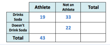
Our question asked how many students drink soda. We add up the numbers in the "drinks soda" row to get the total:

This means that  students drink soda.
To help answer this question, we can construct a two-way table and fill in our known quantities from the question.
The columns of the table will represent the students who are athletes or are not athletes and the rows will contain the students who drink soda or do not drink soda. The first bit of information that we were given from the question was that
Our question asked how many students drink soda. We add up the numbers in the "drinks soda" row to get the total:
This means that
Compare your answer with the correct one above
A middle school teacher conducted a survey of the  grade class and found that
  students were athletes and
  of those students drink soda. There were
  students that were not athletes, but drank soda. Last, they found that
  students were neither athletes nor drank soda. Given this information, how many students don't drink soda?
A middle school teacher conducted a survey of the
To help answer this question, we can construct a two-way table and fill in our known quantities from the question.
The columns of the table will represent the students who are athletes or are not athletes and the rows will contain the students who drink soda or do not drink soda. The first bit of information that we were given from the question was that  students were athletes; therefore,
  needs to go in the "athlete" column as the row total. Next, we were told that of those students,
  drinks soda; therefore, we need to put
  in the "athlete" column and in the "drinks soda" row. Then, we were told that
  students were not athletes, but drink soda, so we need to put
  in the "not an athlete" column and the "drinks soda" row. Finally, we were told that
  students are not athletes or soda drinkers, so
  needs to go in the "not an athlete" column and "doesn't drink soda" row. If done correctly, you should create a table similar to the following:
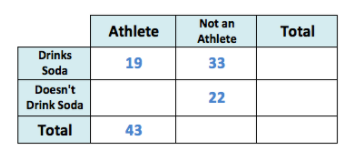
Our question asked how many students don't drink soda. We add up the numbers in the "doesn't drink soda" row to get the total, but first, we need to fill in a gap in our table, students who were athletes, but don't drink soda. We can take the total number of students who are athletes,  , and subtract the number of students who drink soda,

This means that  students who are athletes, don't drink soda.
Now, we add up the numbers in the "doesn't drink soda" row to get the total:

This means that  students don't drink soda.
To help answer this question, we can construct a two-way table and fill in our known quantities from the question.
The columns of the table will represent the students who are athletes or are not athletes and the rows will contain the students who drink soda or do not drink soda. The first bit of information that we were given from the question was that
Our question asked how many students don't drink soda. We add up the numbers in the "doesn't drink soda" row to get the total, but first, we need to fill in a gap in our table, students who were athletes, but don't drink soda. We can take the total number of students who are athletes,
This means that
Now, we add up the numbers in the "doesn't drink soda" row to get the total:
This means that
Compare your answer with the correct one above