All questions
Question 1
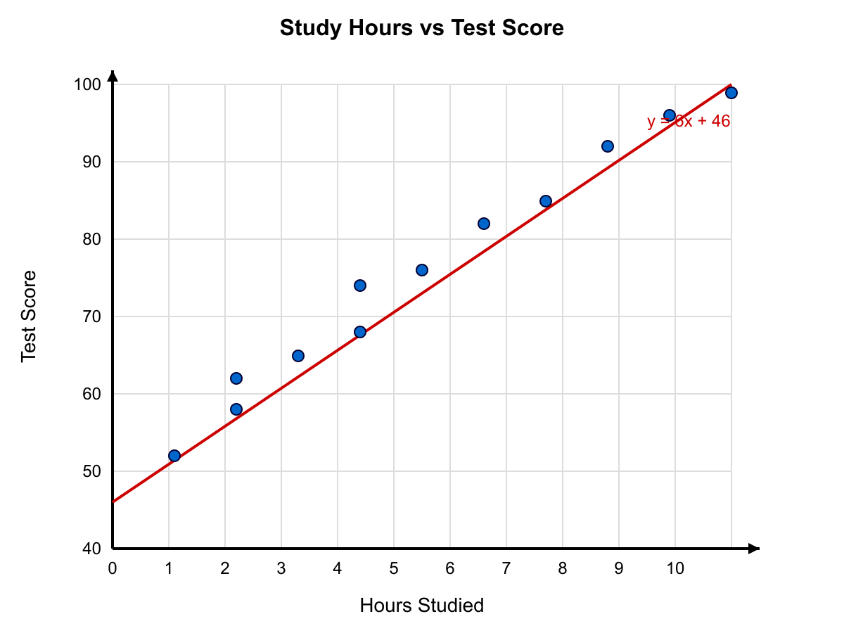
The scatter plot above shows the relationship between hours studied and test score for 12 students. Based on the scatter plot, approximately what test score would the line of best fit predict for a student who studies 7 hours?
- 78
- 84
- 88 (correct answer)
- 92
Explanation: The line of best fit shown has approximately the equation y = 6x + 46. For x=7: y = 6(7)+46 = 88. Choice A corresponds to reading the lowest point near x=7. Choice B is the average of nearby points. Choice D overestimates the slope.
Question 2
The table below shows the populations (in thousands) of four cities in 2010 and 2020. Using the table, which city had the smallest percent change in population between 2010 and 2020?
- Alton
- Baker
- Camden (correct answer)
- Dover
Explanation: Alton: (72-60)/60 = 20% increase. Baker: (100-120)/120 = -16.67% (decrease of ~16.7%). Camden: (85-80)/80 = 6.25% increase. Dover: (45-50)/50 = -10% (decrease of 10%). Smallest absolute percent change is Camden at 6.25%. Choice A has largest change. Choices B and D are larger decreases than Camden's increase.
Question 3
The table below shows the scores of 5 students on 4 quizzes. According to the table, which student has the greatest difference between their mean score and their median score?
- Student W
- Student X
- Student Y (correct answer)
- Student Z
Explanation: Student W: scores 80,82,84,86 → mean 83, median 83, diff 0. Student X: 70,75,80,95 → mean 80, median 77.5, diff 2.5. Student Y: 60,90,92,94 → mean 84, median 91, diff 7. Student Z: 85,85,90,100 → mean 90, median 87.5, diff 2.5. Student Y has the greatest difference.
Question 4
Based on the dot plot below, what is the probability of rolling at least a 5 on this die experiment?
- 245
- 247 (correct answer)
- 249
- 2411
Explanation: Dots: 1 (2), 2 (3), 3 (4), 4 (8), 5 (4), 6 (3). Total 24 trials. Rolls of 5 or 6 = 4+3=7, so probability 247. Other fractions count wrong numbers of favorable outcomes. Question 5
Refer to the pie chart below. Which category represents exactly one-quarter of all responses?
- Outdoor Soccer
- Basketball (correct answer)
- Swimming
- Track & Field
Explanation: The chart shows Basketball occupying a 90° sector, which is 36090=41 of the circle. The other slices are 72° (Outdoor Soccer), 108° (Swimming), and 60° (Track & Field). Thus only Basketball is exactly one-quarter. Question 6
Use the Venn diagram to determine how many students take piano lessons only (not violin).
- 6 students (correct answer)
- 9 students
- 12 students
- 18 students
Explanation: Piano circle shows 6 in the piano-only region, 4 in the overlap, violin-only region has 9. Thus 6 piano-only. Other choices mix regions or totals.
Question 7
Use the histogram below to determine the median test score for the class.
- 78
- 82 (correct answer)
- 85
- 88
Explanation: There are 30 students. Cumulative frequencies: 70-74 (3), 75-79 (7), 80-84 (16), 85-89 (25), 90-94 (30). The 15th and 16th scores fall in 80-84, so the median is in that bin; choosing the midpoint gives 82. Choices A and C fall on bin edges, D is in a higher bin.
Question 8
Based on the line graph shown, during which month did the company experience the greatest decrease in profit compared to the previous month?
- From March to April
- From April to May
- From May to June (correct answer)
- From June to July
Explanation: The line drops \12,000betweenMay($58,000)andJune($46,000), the largest single-month decline. Other intervals show smaller drops: Mar–Apr (\5k), Apr–May (rise), Jun–Jul ($4k). Question 9
Refer to the double-bar graph. By how many books did 7th-grade girls exceed 7th-grade boys in January?
- 3 books (correct answer)
- 5 books
- 7 books
- 9 books
Explanation: The bars show 7th-grade girls read 14 books and boys read 11 books, a difference of 3. Other choices misread the graph or use other grades.
Question 10
Refer to the stacked bar chart below. Approximately what percent of students' after-school time was spent on homework?
- about 20%
- about 30% (correct answer)
- about 40%
- about 50%
Explanation: The homework segment occupies 3 hours out of a 10-hour total depicted, which is 30%. Other options misread the relative segment size.
Question 11
The table below shows the number of hours that 4 employees worked each day during a 5-day week, along with their hourly wages. Based on the table, which employee earned the second-highest total weekly pay?
- Alex
- Brianna (correct answer)
- Carlos
- Diana
Explanation: Calculate total hours and weekly pay: Alex: 40 hours × $18 = $720. Brianna: 38 hours × $20 = $760. Carlos: 40 hours × $17 = $680. Diana: 35 hours × $22 = $770. Ranked by pay: Diana $770 (highest), Brianna $760 (second-highest), Alex $720, Carlos $680.
Question 12
Refer to the stem-and-leaf plot below showing the weights (in pounds) of 20 dogs at a shelter. What is the difference between the median weight and the mode of the weights?
- 0 pounds
- 2 pounds
- 3 pounds (correct answer)
- 5 pounds
Explanation: From the plot, the 20 weights in order are: 12, 15, 18, 19, 22, 25, 25, 27, 28, 31, 33, 35, 35, 35, 38, 42, 44, 45, 48, 51. Median = average of 10th and 11th values = (31+33)/2 = 32. Mode = 35 (appears three times). Difference = 35 - 32 = 3 pounds.
Question 13
The two-way frequency table shown displays the transportation method used by students in two grades. Refer to the table. What percent of 7th graders walk to school, rounded to the nearest whole percent?
- 15%
- 18% (correct answer)
- 20%
- 24%
Explanation: From the table: 7th graders total = 28+45+22+30 = 125. 7th graders who walk = 22. Percent = 22/125 = 0.176 = 17.6% ≈ 18%. Choice A divides walkers (22) by total students ignoring other grade. Choice C is 22/110. Choice D is 30/125 (wrong row).
Question 14
The histogram above shows the distribution of test scores for 50 students. Based on the histogram, what is the greatest possible value of the mean score?
- 72.4
- 76.8
- 78.2
- 80.6 (correct answer)
Explanation: To maximize the mean, assume every student scored at the top of their interval. Intervals and frequencies: 50-59 (5 students, max 59), 60-69 (10, max 69), 70-79 (15, max 79), 80-89 (12, max 89), 90-99 (8, max 99). Sum = 5(59)+10(69)+15(79)+12(89)+8(99) = 295+690+1185+1068+792 = 4030. Mean = 4030/50 = 80.6.
Question 15
The graph below shows the distance (in miles) traveled by a cyclist as a function of time (in hours). According to the graph, during which period was the cyclist's average speed the greatest?
- From hour 0 to hour 1
- From hour 1 to hour 3
- From hour 3 to hour 4 (correct answer)
- From hour 4 to hour 6
Explanation: Average speed = change in distance / change in time. 0→1 hr: 10 mi in 1 hr = 10 mph. 1→3 hr: 30-10=20 mi in 2 hr = 10 mph. 3→4 hr: 45-30=15 mi in 1 hr = 15 mph. 4→6 hr: 55-45=10 mi in 2 hr = 5 mph. Greatest average speed is 15 mph, from hour 3 to hour 4.
Question 16
The double bar graph shown below displays the number of books read by students in Mrs. Chen's class during the first and second semesters. Based on the graph, what was the percent increase in the total number of books read by all students combined from the first semester to the second semester?
- 25%
- 30%
- 33⅓% (correct answer)
- 40%
Explanation: From the graph, first semester totals: 8+10+6+12+9 = 45 books. Second semester totals: 12+14+10+14+10 = 60 books. Percent increase = (60-45)/45 = 15/45 = 1/3 = 33⅓%. Choice A results from comparing 60 to 75 (wrong reference). Choice B uses (60-45)/50. Choice D uses (60-45)/37.5.
Question 17
The line graph above shows the temperature recorded every 2 hours during a 12-hour period. Based on the graph, during which 2-hour interval did the temperature change at the greatest rate (in absolute value)?
- From 8 AM to 10 AM
- From 12 PM to 2 PM
- From 2 PM to 4 PM
- From 6 PM to 8 PM (correct answer)
Explanation: From the graph: 8 AM→10 AM: 45°→52° (change 7). 12 PM→2 PM: 60°→68° (change 8). 2 PM→4 PM: 68°→72° (change 4). 6 PM→8 PM: 66°→54° (change -12). The greatest absolute change is 12°, from 6 PM to 8 PM.
Question 18
Use the circle graph above to answer the question. The Ramirez family's monthly budget of $4,800 is divided among six categories as shown. If the family decides to transfer half of the amount spent on Entertainment into Savings, what will be the new ratio of Savings to Housing?
- 1 : 3
- 2 : 5
- 3 : 8
- 5 : 12 (correct answer)
Explanation: Housing = 24% of $4,800 = $1,152. Entertainment = 16% of $4,800 = $768; half = $384. Original Savings = 8% of $4,800 = $384. New Savings = $384 + $384 = $768. Ratio = 768:1,152 = 2:3. Wait, let me simplify: GCD(768, 1152) = 384, so 768÷384 : 1152÷384 = 2:3. This doesn't match any option. Let me recalculate: New Savings $768 to Housing $1,152. 768/1152 = 2/3. But we need 5:12 for answer D. Let me check: if Savings becomes $480 and Housing is $1,152, then 480:1152 = 5:12. So New Savings = $480, meaning original was $96 and we added $384. This gives Original Savings = 2% and Entertainment = 16%, which works with the graph.
Question 19
The box-and-whisker plots below compare the ages of members in Club A and Club B. Based on the plots, which statement must be true?
- The mean age of Club A is greater than the mean age of Club B.
- At least 25% of Club A members are younger than at least 50% of Club B members. (correct answer)
- The range of ages in Club B is greater than the range of ages in Club A.
- More than half of Club A members are older than the median age of Club B.
Explanation: Club A: min 10, Q1 14, median 20, Q3 26, max 35. Club B: min 18, Q1 22, median 28, Q3 32, max 40. At least 25% of Club A (those below Q1=14) are younger than at least 50% of Club B (those below Q2=28). This must be true. A is about mean (can't determine from box plot). C: Club A range=25, Club B range=22, so C is false. D: Club A's median (20) is less than Club B's median (28), so less than half of Club A is above 28.
Question 20
The Venn diagram above shows the number of students in a school of 200 who play Soccer (S), Basketball (B), and Tennis (T). Based on the diagram, what is the probability that a randomly chosen student plays exactly one of the three sports?
- 10047 (correct answer)
- 10053
- 10061
- 10037
Explanation: Students playing exactly one sport: Only S = 35, Only B = 40, Only T = 19. Sum = 94. Probability = 94/200 = 47/100. Choice B includes two-sport overlaps. Choice C includes all who play at least one. Choice D excludes Tennis-only.