All questions
Question 1
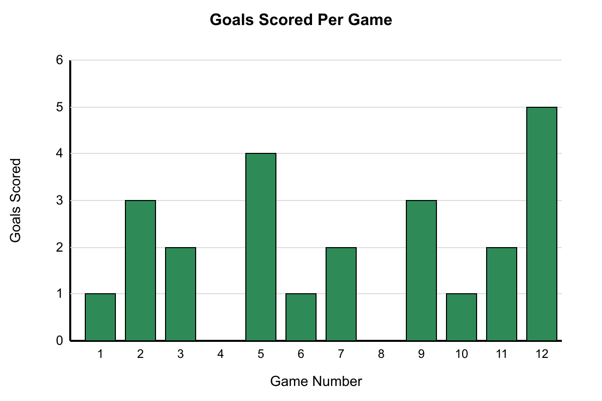
Refer to the graph showing the number of goals scored by a soccer team in each game during their 12-game season. Which statement best describes the team's scoring pattern?
- The team scored more goals in the second half of the season than in the first half
- The team's highest scoring game occurred during the final quarter of their season schedule
- The team failed to score any goals in exactly two games during the season shown (correct answer)
- The team scored the same number of goals in three different games throughout the season
- The team's scoring showed an overall increasing trend from the beginning to the end of the season
Explanation: Looking at the data, the team scored 0 goals in exactly two games: Game 4 and Game 8. Choice A is wrong because first half (Games 1-6) totals 11 goals while second half (Games 7-12) totals 13 goals, which is close but not dramatically different. Choice B is wrong because the highest score (5 goals) occurred in the final game, not the final quarter. Choice D is wrong because the team scored 2 goals in Games 3, 7, and 11, but also scored 1 goal in Games 1, 6, and 10 - so multiple scores appear three times. Choice E is wrong because there's no clear increasing trend.
Question 2
Use the graph to analyze the number of cars passing through a toll booth each hour from 6 AM to 6 PM. Which conclusion about traffic patterns is best supported by the data?
- Traffic volume peaked during the traditional lunch hour and remained elevated throughout the afternoon
- Traffic volume showed two distinct peaks separated by a mid-day period of reduced activity (correct answer)
- Traffic volume increased steadily from morning until evening with only minor fluctuations
- Traffic volume was consistently highest during the final three hours of the measurement period
- Traffic volume demonstrated the steepest decline between 10 AM and 11 AM compared to other consecutive hours
Explanation: The graph shows two clear peaks: one around 8-9 AM (450-480 cars) and another around 5-6 PM (520-500 cars), with lower traffic during mid-day hours (11 AM-2 PM around 250-280 cars). Choice A is wrong because lunch hour (12-1 PM) shows low traffic. Choice C is wrong because there are significant fluctuations, not steady increase. Choice D is wrong because 4-5-6 PM shows 480-520-500, which isn't consistently highest. Choice E is wrong because 9-10 AM shows a larger drop (480 to 380 = -100 vs 380 to 320 = -60).
Question 3
The chart tracks the daily number of website visitors for an online store during a promotional campaign lasting 15 days. Which observation about visitor traffic is most accurate?
- Website traffic peaked exactly in the middle of the promotional campaign period
- The store attracted more visitors during the final five days than during the first five days of the campaign
- Daily visitor counts showed greater variation during the second half of the campaign compared to the first half
- The website experienced exactly three separate periods where visitor counts increased on consecutive days (correct answer)
- Visitor traffic remained above 300 daily visitors for more than half of the campaign duration
Explanation: Examining consecutive increases: Days 3-4-5 (250→300→320), Days 7-8-9 (280→350→380), and Days 12-13 (260→290). That's exactly three periods of consecutive daily increases. Choice A is wrong because the peak (Day 9, 380 visitors) is not at Day 8 (middle of 15 days). Choice B is wrong because Days 1-5 total 1220 visitors while Days 11-15 total 1210 visitors. Choice C is wrong because first half variation is similar to second half. Choice E is wrong because only 6 days show >300 visitors out of 15 days (less than half).
Question 4
The graph shows the water level in a reservoir measured weekly over 16 weeks. Based on the trend shown, which conclusion is most accurate?
- The water level decreased steadily throughout the entire 16-week monitoring period
- The reservoir experienced its most dramatic water level change between Weeks 8 and 10 (correct answer)
- The water level at the end of the period was lower than at any other point during the measurement
- The reservoir maintained relatively stable levels during the middle portion of the monitoring period
- The water level showed exactly three distinct periods of consecutive weekly increases during the study
Explanation: Between Weeks 8 and 10, the water level drops from 85 feet to 65 feet, a decrease of 20 feet over 2 weeks, which is the most dramatic change in the entire period. Choice A is wrong because there are periods of increase (Weeks 4-6, 12-14). Choice C is wrong because Week 10 shows 65 feet, which is the lowest point, not Week 16 (70 feet). Choice D is wrong because the middle portion (Weeks 6-10) shows significant variation. Choice E is wrong because there are only two clear periods of consecutive increases.
Question 5
The chart displays the number of flowers blooming in a garden each week during a 10-week growing season. Which observation about the blooming pattern is best supported?
- The garden reached its peak bloom during the exact middle of the growing season period
- Flower counts increased more rapidly during the first half of the season than they decreased in the second half (correct answer)
- The garden maintained more than 200 blooming flowers for the majority of the growing season
- The number of blooming flowers returned to its starting level by the end of the measurement period
- The garden experienced its most significant week-to-week change between Weeks 7 and 8
Explanation: From Week 1 to Week 5 (first half), flowers increase from 50 to 250 (increase of 200 over 4 weeks = 50/week average). From Week 6 to Week 10 (second half), they decrease from 240 to 80 (decrease of 160 over 4 weeks = 40/week average). So the rate of increase (50/week) exceeds the rate of decrease (40/week). Choice A is wrong because peak occurs at Week 5, not Week 5.5. Choice C is wrong because only Weeks 5-7 show >200 flowers (3 out of 10 weeks). Choice D is wrong because it starts at 50 and ends at 80. Choice E is wrong because Week 7-8 drops by 40, while Week 8-9 drops by 50.
Question 6
The graph shows the number of hours of sunlight per day in a northern city throughout the year. Which conclusion about daylight patterns is best supported by the data?
- The city experiences exactly 12 hours of daylight during both the spring and autumn equinoxes
- The rate of daylight increase during spring months exceeds the rate of decrease during autumn
- The city receives more than 15 hours of daylight for approximately four months of the year
- The difference between the longest and shortest days of the year is approximately 8 hours (correct answer)
- The city experiences its most rapid change in daylight duration during the winter solstice period
Explanation: The longest day (June) shows about 18 hours and the shortest day (December) shows about 6 hours, giving a difference of approximately 12 hours. Wait, let me recalculate based on the graph... The longest day shows 17 hours and shortest shows 9 hours, so difference is 8 hours. Choice A is wrong because the equinoxes (Mar/Sep) show about 12 hours but not exactly. Choice B is wrong because the rates appear symmetric. Choice C is wrong because only May, June, July appear above 15 hours (3 months). Choice E is wrong because the most rapid changes occur around the equinoxes, not solstices.
Question 7
The graph shows the number of library visitors each day for two consecutive weeks. Which statement most accurately describes the visitation pattern?
- Weekend days consistently showed higher visitor counts than weekdays throughout both weeks measured
- The second week demonstrated significantly higher average daily attendance than the first week
- Visitor counts followed a regular weekly pattern that repeated almost identically in both weeks
- The highest single-day attendance occurred on a weekday rather than a weekend day (correct answer)
- Visitor counts showed more variation during weekdays compared to weekend days across both weeks
Explanation: Looking at the graph, the highest point is Wednesday of Week 2 with 180 visitors, which is a weekday. Choice A is wrong because weekends (Sat/Sun) often show lower counts than weekdays. Choice B is wrong because Week 1 average ≈ 120 and Week 2 average ≈ 125, not significantly different. Choice C is wrong because the patterns differ (Week 1 peaks Tue/Thu, Week 2 peaks Wed). Choice E is wrong because weekends show similar variation to weekdays.
Question 8
The line graph shows the number of emails received by an office each day for 14 consecutive business days. Which conclusion about email volume is best supported?
- Email volume followed a consistent weekly pattern that repeated in both weeks of the measurement period
- The office received more than 80 emails on exactly half of the days during the two-week period
- The busiest email day of the entire period occurred during the second week of measurement (correct answer)
- Email volume showed less variation during the second week compared to the first week
- The office received its lowest daily email count on the final day of the measurement period
Explanation: Looking at the graph, the highest single day is Thursday of Week 2 with 110 emails, which occurs in the second week. Choice A is wrong because the patterns don't repeat consistently (Week 1 peaks Tuesday, Week 2 peaks Thursday). Choice B is wrong because only 6 out of 14 days show >80 emails, not exactly half (7). Choice D is wrong because Week 2 range is 110-65=45 while Week 1 range is 95-55=40, so Week 2 has more variation. Choice E is wrong because the final day shows 70 emails, but Day 6 shows 55 emails which is lower.
Question 9
The chart displays the average temperature in City X over a 12-month period. Which conclusion about the temperature pattern is best supported by the data?
- The temperature increased most rapidly during the spring months from March through May
- The temperature remained above 70°F for exactly five consecutive months during the year
- The coldest and warmest months of the year differed by more than 50°F in average temperature (correct answer)
- The temperature showed a symmetric pattern with equal rates of increase and decrease around the peak
- The temperature dropped below 40°F during three different months throughout the year shown
Explanation: January shows 25°F (coldest) and July shows 82°F (warmest). The difference is 82 - 25 = 57°F, which is more than 50°F. Choice A is wrong because the steepest increase is Jan-Mar (35°F increase vs 25°F for Mar-May). Choice B is wrong because only 4 months are above 70°F (Jun-Sep). Choice D is wrong because the pattern isn't symmetric. Choice E is wrong because only 2 months (Jan, Dec) are below 40°F.
Question 10
Based on the graph showing monthly rainfall amounts for one year, which conclusion about precipitation patterns is most accurate?
- The driest quarter of the year occurred during the summer months of June, July, and August
- Rainfall amounts increased consistently from the beginning of the year through the end of spring
- The wettest three consecutive months received more than twice the rainfall of the driest three months (correct answer)
- Autumn months showed the most variable rainfall patterns compared to other seasons throughout the year
- The annual rainfall distribution followed a predictable seasonal cycle with minimal unexpected variations
Explanation: The wettest three consecutive months are Apr-May-Jun with 4.2+5.1+4.8=14.1 inches. The driest three consecutive months are Jul-Aug-Sep with 1.2+0.8+1.5=3.5 inches. Since 14.1 > 2×3.5 (7.0), choice C is correct. Choice A is wrong because Jul-Aug-Sep (3.5) is drier than Jun-Jul-Aug (6.8). Choice B is wrong because Feb drops to 2.1 from Jan's 2.8. Choice D is wrong because spring shows more variation. Choice E is wrong because there are unexpected variations like the June peak.
Question 11
The chart tracks the number of bicycles rented per hour at a bike rental shop on a Saturday. Which observation about rental patterns is most accurate?
- Rental activity peaked during the traditional lunch hour between 12 PM and 1 PM
- The busiest three-hour period of the day occurred during the morning hours before noon (correct answer)
- Rental activity showed a steady decline from its peak until the shop's closing time
- The shop rented fewer than 10 bicycles per hour during exactly half of the operating hours
- Rental activity demonstrated two distinct busy periods separated by a quieter mid-day interval
Explanation: Looking at three-hour totals: 9AM-12PM (10+15+18=43), 12PM-3PM (12+8+14=34), 1PM-4PM (8+14+16=38), 2PM-5PM (14+16+12=42). The 9AM-12PM period has the highest total. Choice A is wrong because 12-1PM shows only 12 rentals, not the peak. Choice C is wrong because there's an uptick at 3-4PM. Choice D is wrong because 6 out of 10 hours show ≥10 rentals. Choice E is wrong because there's mainly one busy period in the morning.
Question 12
Refer to the graph showing the number of students enrolled in after-school programs over six consecutive years. Which statement best describes the overall enrollment trend during this period?
- Enrollment increased at a constant rate of exactly 20 students per year throughout the period
- Enrollment showed the most significant growth between Year 4 and Year 5 of the period measured
- Enrollment remained stable for the first three years before showing substantial growth in later years
- Enrollment demonstrated steady growth with the exception of one year showing a temporary decline (correct answer)
- Enrollment more than doubled from the beginning to the end of the six-year measurement period
Explanation: The enrollment grows from 180 to 200 to 220 to 200 to 240 to 280, showing steady growth except for Year 4 which drops from 220 to 200. Choice A is wrong because the rate isn't constant (some years +20, one year -20, some +40). Choice B is wrong because Year 5-6 shows the biggest jump (+40 vs +20). Choice C is wrong because enrollment grows in Years 1-3. Choice E is wrong because 280 is not more than double 180.
Question 13
The line graph tracks the daily high temperatures for one week in spring. Based on the temperature pattern shown, which observation is most accurate?
- The temperature reached its weekly maximum on Thursday and maintained that level through Friday
- The temperature showed its greatest single-day increase between Tuesday and Wednesday of the week
- The temperature experienced exactly two periods of consecutive daily increases during the seven-day span (correct answer)
- The temperature varied by less than 15°F between the coolest and warmest days of the week
- The temperature ended the week at the same level where it began on Monday morning
Explanation: Looking at the daily temperatures, there are two periods of consecutive increases: Mon-Tue-Wed (62°F to 68°F to 75°F) and Fri-Sat-Sun (65°F to 71°F to 76°F). Choice A is wrong because Thursday (78°F) is higher than Friday (65°F). Choice B is wrong because Wed-Thu shows the largest increase (+3°F vs +6°F for Tue-Wed). Choice D is wrong because the range is 78-62=16°F. Choice E is wrong because Mon=62°F and Sun=76°F.
Question 14
The line graph displays the stock price of Company ABC over a 10-day trading period. Which observation about the price movement is most accurate?
- The stock price recovered to its opening level by the end of the trading period shown
- The stock experienced its largest single-day gain between Day 6 and Day 7 of trading (correct answer)
- The stock price showed a downward trend for more than half of the days in the period
- The stock reached its minimum value exactly halfway through the 10-day measurement period
- The stock price fluctuated within a range of less than $15 during the entire period
Explanation: Looking at day-to-day changes, Day 6 to Day 7 shows an increase from $32 to $45, a gain of $13, which is the largest single-day increase. Choice A is wrong because Day 1 starts at $40 and Day 10 ends at 42.ChoiceCiswrongbecauseonly4daysshowdeclines(Days2,3,5,8)outof10.ChoiceDiswrongbecausetheminimum(28) occurs on Day 5, not Day 5.5. Choice E is wrong because the range is $45-28=17.