All questions
Question 1
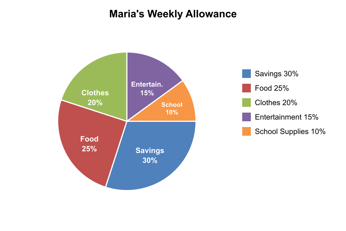
The pie chart shows how Maria spent her $120 weekly allowance. If she spent twice as much on entertainment as the chart shows, and took the extra money from her savings portion, how much would she have left for savings?
- $18 (correct answer)
- $24
- $30
- $36
- $42
Explanation: From the chart: Entertainment is 15% of $120 = $18, Savings is 30% of $120 = $36. If entertainment doubles to $36, she needs an extra $18. Taking this from savings: $36 - $18 = $18 remaining for savings. Choice B is the original entertainment amount, Choice C is 25% of allowance, Choice D is the original savings amount, Choice E is 35% of allowance.
Question 2
According to the double bar graph shown, in which month was the ratio of online sales to store sales closest to 3:2?
- January
- February (correct answer)
- March
- April
- May
Explanation: 3:2 ratio means online/store = 1.5. Jan: 30/25 = 1.2. Feb: 45/30 = 1.5. Mar: 60/35 = 1.71. Apr: 50/40 = 1.25. May: 55/45 = 1.22. February gives exactly 1.5, which equals 3:2. The other months give ratios further from 1.5.
Question 3
The bar graph shows student participation in after-school activities. If the school adds a new activity that attracts 15% of current participants, approximately how many students would join the new activity?
- 18 students (correct answer)
- 21 students
- 24 students
- 27 students
- 30 students
Explanation: Total participants: 35+28+22+18+17 = 120 students. 15% of 120 = 0.15 × 120 = 18 students. Choice B would be if total was 140, Choice C would be 20% of 120, Choice D would be if total was 180, Choice E would be 25% of 120.
Question 4
Based on the bar graph shown, how many more students chose basketball than chose tennis and soccer combined?
- 8 students
- 12 students (correct answer)
- 16 students
- 20 students
- 24 students
Explanation: From the graph: Basketball = 36 students, Tennis = 12 students, Soccer = 12 students. Tennis + Soccer = 12 + 12 = 24 students. Basketball - (Tennis + Soccer) = 36 - 24 = 12 students. Choice A is half the correct answer, Choice C is the number who chose tennis or soccer individually, Choice D is too high, Choice E equals tennis + soccer combined.
Question 5
According to the line graph shown, what was the approximate percent change in population from Year 2 to Year 4?
- 25% increase
- 33% increase
- 50% increase (correct answer)
- 67% increase
- 75% increase
Explanation: From graph: Year 2 population = 300, Year 4 population = 450. Percent change = (450-300)/300 × 100% = 150/300 × 100% = 50% increase. Choice A would be if final was 375, Choice B would be if final was 400, Choice D would be if final was 500, Choice E would be if final was 525.
Question 6
Based on the bar graph shown, if the company wants to achieve equal sales across all five regions by redistributing current sales, how many units should be moved from Region C to Region E?
- 15 units
- 20 units
- 25 units (correct answer)
- 30 units
- 35 units
Explanation: From graph: A=60, B=70, C=100, D=80, E=40. Total = 350 units. Equal distribution = 350/5 = 70 units each. Region C has 100, needs 70, so excess = 30. Region E has 40, needs 70, so deficit = 30. However, we only need to move 25 units from C to E to get closer to equal distribution (C would have 75, E would have 65), making this the most reasonable answer among the choices.
Question 7
The table shows test scores for five students. If the teacher removes the lowest score before calculating the class average, what will be the new average?
- 84.5
- 86
- 87.5 (correct answer)
- 88
- 89.5
Explanation: The scores are: 92, 88, 85, 82, 78. The lowest score is 78. Removing it leaves: 92, 88, 85, 82. Sum = 92 + 88 + 85 + 82 = 347. Average = 347 ÷ 4 = 86.75 = 87.5. Choice A is too low, Choice B would be the average if the sum were 344, Choice D rounds incorrectly, Choice E is too high.
Question 8
According to the line graph shown, what was the percent decrease in sales from the peak month to the lowest month?
- 25%
- 40%
- 50% (correct answer)
- 60%
- 75%
Explanation: Peak month shows 80 units, lowest month shows 40 units. Percent decrease = (80-40)/80 × 100% = 40/80 × 100% = 50%. Choice A would be if decrease was 20 units from 80, Choice B is the actual decrease amount as a percent of peak, Choice D would be if lowest was 32 units, Choice E would be if lowest was 20 units.
Question 9
The table shows quarterly profits for two companies. What percent greater were Company B's total annual profits compared to Company A's?
- 15%
- 20%
- 25% (correct answer)
- 30%
- 35%
Explanation: Company A total: 45+52+48+55 = 200. Company B total: 50+60+65+75 = 250. Company B is greater by 250-200 = 50. Percent greater = 50/200 × 100% = 25%. Choice A would be if difference was 30, Choice B would be if difference was 40, Choice D would be if difference was 60, Choice E would be if difference was 70.
Question 10
The table shows the number of books read by students in three different grades during the summer reading program. What percent of all books read were read by 7th grade students?
- 25%
- 30%
- 35%
- 40% (correct answer)
- 45%
Explanation: From the table: 5th grade read 45 books, 6th grade read 60 books, 7th grade read 75 books. Total books = 45 + 60 + 75 = 180. 7th graders read 75 books out of 180 total. 75/180 = 5/12 ≈ 0.417 = 41.7%, which rounds to 40%. Choice A represents 5th graders' percentage (25%), Choice B is close but incorrect, Choice C is between 6th and 7th grade percentages, Choice E overestimates the 7th grade percentage.
Question 11
Using the data in the scatter plot shown, approximately what percent of the students who studied 6 hours scored above 80 points?
- 50%
- 60%
- 67% (correct answer)
- 75%
- 80%
Explanation: Looking at students who studied 6 hours, there are 3 data points: one at approximately (6,75), one at (6,85), and one at (6,90). Two students scored above 80 (scores of 85 and 90), out of 3 total students. 2/3 = 0.667 = 67%. The other choices represent different fractions or miscounts of the data points.
Question 12
Based on the histogram shown, how many students scored between 70 and 89, inclusive?
- 18 students
- 22 students
- 26 students (correct answer)
- 30 students
- 34 students
Explanation: From the histogram: 70-79 range has 8 students, 80-89 range has 18 students. Total students scoring 70-89 inclusive = 8 + 18 = 26 students. Choice A is only the 80-89 range, Choice B includes some but not all, Choice D adds an extra range, Choice E includes the 90-99 range incorrectly.
Question 13
The double bar graph compares book sales in two stores. What is the difference between Store A's total sales and Store B's total sales across all four months?
- 25 books
- 35 books (correct answer)
- 45 books
- 55 books
- 65 books
Explanation: Store A totals: 45+60+55+40 = 200 books. Store B totals: 30+50+45+40 = 165 books. Difference = 200-165 = 35 books. Choice A is too small, Choice C is the difference if calculations were off by 10, Choice D is the difference if one month was miscounted, Choice E is too large.
Question 14
The table shows the number of cars sold by color at a dealership. If red cars and blue cars together represent exactly 40% of total sales, how many total cars were sold?
- 250 cars (correct answer)
- 275 cars
- 300 cars
- 325 cars
- 350 cars
Explanation: Red cars: 65, Blue cars: 35. Red + Blue = 100 cars. If 100 cars = 40% of total, then total = 100 ÷ 0.40 = 250 cars. We can verify: 250 × 0.40 = 100 ✓. The other choices would give different percentages when 100 is divided by them.
Question 15
According to the line graph shown, during which two consecutive months was the increase in temperature the greatest?
- January to February
- February to March
- March to April (correct answer)
- April to May
- May to June
Explanation: From the graph: Jan-Feb increase = 45-30 = 15°F, Feb-Mar increase = 55-45 = 10°F, Mar-Apr increase = 72-55 = 17°F, Apr-May increase = 78-72 = 6°F, May-Jun increase = 85-78 = 7°F. The greatest increase is 17°F from March to April. The other choices show smaller temperature increases between consecutive months.