All questions
Question 1
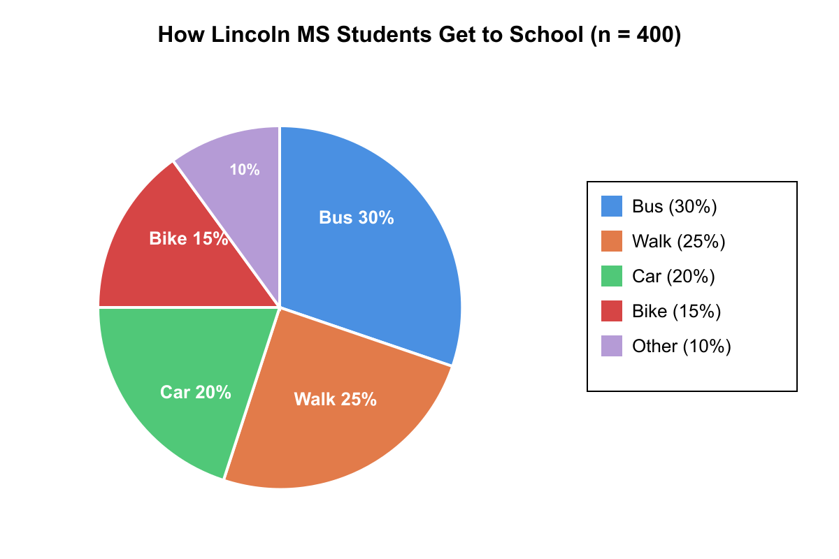
The circle graph below shows how the 400 students at Lincoln Middle School commute to school. Based on the graph above, how many more students walk or bike to school than take the bus?
- 20
- 40 (correct answer)
- 60
- 80
Explanation: Walk = 25% of 400 = 100. Bike = 15% of 400 = 60. Bus = 30% of 400 = 120. Walk + Bike = 160. Difference: 160 - 120 = 40. Distractor A (20) comes from confusing percent with count. Distractor C (60) comes from using bike alone vs bus. Distractor D (80) is 2× the correct difference.
Question 2
Use the table to answer the question.
Which statement about average speeds is true?
- Bus A's average speed was faster than Bus C's on every segment.
- Bus B had the highest single-segment speed listed. (correct answer)
- Bus C never exceeded 55 mph on any segment.
- Bus A's total distance traveled equals Bus B's.
Explanation: Highest speed shown is Bus B at 62 mph on Segment 3, making B true. A is false because Segment 2 shows Bus C at 58 mph vs Bus A at 55 mph. C is false (Bus C's 58 mph). D is false; total miles differ.
Question 3
Refer to the bar graph below.
Approximately what fraction of the total cans recycled over all four weeks was collected in Week 3?
- about 1⁄4 (correct answer)
- about 1⁄3
- about 1⁄2
- about 3⁄4
Explanation: Heights: Week1 = 150, Week2 = 180, Week3 = 170, Week4 = 200. Total = 700; Week3 is 170⁄700 ≈ 24%, roughly 1⁄4. Other options differ significantly.
Question 4
Use the histogram below to answer the question.
How many students scored at least 80 but less than 90 on the exam?
- 4
- 6 (correct answer)
- 8
- 10
Explanation: The bar for 80–89 is marked at a height of 6, so B is correct. The other counts correspond to heights of different bins or estimates but not this one.
Question 5
The table shows the number of books sold by a bookstore in each of four categories during the first and second halves of the year. Based on the table shown, which category had the greatest percent increase from the first half to the second half of the year?
- Fiction
- Non-Fiction
- Children's
- Reference (correct answer)
Explanation: Percent increases: Fiction: (480-400)/400 = 20%. Non-Fiction: (360-300)/300 = 20%. Children's: (420-350)/350 = 20%. Reference: (156-120)/120 = 30%. Reference has the greatest percent increase. Distractors A, B, and C all yield 20%, which is a common trap for students who only compute the raw difference (Fiction has the largest absolute increase of 80).
Question 6
The table shows the results of a survey of 200 adults about their favorite season, broken down by age group. Based on the table shown, if one respondent is chosen at random from those who chose Summer, what is the probability that the person is under 40?
- 207
- 127 (correct answer)
- 20035
- 20060
Explanation: Summer total = 60. Under 40 includes ages 18-24 (15) and 25-39 (20), totaling 35. Conditional probability = 35/60 = 7/12. Distractor A miscalculates the denominator. Distractor C uses total population instead of Summer subset. Distractor D gives P(Summer) rather than the conditional probability.
Question 7
The table shows the revenue (in thousands of dollars) for two stores over four quarters. Based on the table shown, in which quarter was Store B's revenue the largest percent of Store A's revenue?
- Q1
- Q2
- Q3 (correct answer)
- Q4
Explanation: Ratios B/A: Q1: 36/60 = 60%. Q2: 45/75 = 60%. Q3: 56/80 = 70%. Q4: 54/90 = 60%. Q3 is largest. A student comparing raw differences (A-B) might mistakenly pick Q1 or Q2 where both are 24–30, or Q4 where B is highest in absolute terms.
Question 8
The table shows the number of students enrolled in each grade at two middle schools. Based on the table shown, what percent of all the students shown are 7th graders at Jefferson Middle School? (Round to the nearest tenth of a percent.)
- 15.60%
- 17.20% (correct answer)
- 32.80%
- 52.30%
Explanation: Jefferson has 170 seventh graders. Total students across both schools = 990. Percent = 170/990 = 0.1717... ≈ 17.2%. Distractor A uses Hamilton's 7th grade count (150/990). Distractor C calculates within Jefferson only (170/540). Distractor D combines both schools' 7th graders (320/990).
Question 9
The table shows the distribution of scores on a 10-point quiz taken by a class of 25 students. Based on the table, what is the median score?
- 6
- 7 (correct answer)
- 7.5
- 8
Explanation: With 25 students, the median is the 13th value when ordered. Cumulative counts: score 4: 2, score 5: 2+3=5, score 6: 5+4=9, score 7: 9+6=15, score 8: 15+5=20, score 9: 20+3=23, score 10: 23+2=25. The 13th student falls in the score-of-7 group. Distractor A (6) occurs if a student lands one group early. Distractor C (7.5) confuses 25 with 26. Distractor D (8) uses the mode of the upper half.
Question 10
The double bar graph below shows the number of hours five students spent studying and sleeping on a particular school day. Based on the graph shown, for how many of the students was the ratio of sleeping hours to studying hours greater than 3:1?
- 1
- 2 (correct answer)
- 3
- 4
Explanation: Ratios (sleep:study): Anna 9:2 = 4.5, Ben 8:3 ≈ 2.67, Carla 10:3 ≈ 3.33, Dan 7:3 ≈ 2.33, Eva 9:4 = 2.25. Only Anna and Carla exceed 3:1, so 2 students. A student who miscounts Carla (3.33 > 3) or mistakenly counts Ben (2.67) may pick 1 or 3.
Question 11
The line graph below shows the temperature (°F) recorded every 2 hours from 6 AM to 6 PM on a certain day. Based on the graph shown, during which 2-hour interval was the average rate of temperature change the greatest in magnitude?
- 6 AM to 8 AM
- 10 AM to 12 PM
- 2 PM to 4 PM
- 4 PM to 6 PM (correct answer)
Explanation: Changes: 6→8 AM: 52-45 = +7. 10→12: 68-60 = +8. 2→4 PM: 76-72 = +4. 4→6 PM: 72-60 = -12. The magnitude |-12| = 12 is the greatest. A student ignoring the negative sign might pick B (+8), and one looking only at the peak area might pick C.
Question 12
Use the frequency table to answer the question.
What is the cumulative frequency for scores less than 70?
- 9
- 14 (correct answer)
- 17
- 20
Explanation: Adding frequencies: 50–59:5 and 60–69:9 gives 14. Other choices correspond to individual bin (A=9) or sums that include higher bins (C=17 adds 70-79, D=20 adds even more).
Question 13
Refer to the pie chart below.
If the chart represents 360 total students, approximately how many selected "Drama" as their favorite elective?
- 30
- 60 (correct answer)
- 90
- 120
Explanation: The Drama slice is approximately 1/6 of the circle, and 1/6 of 360 is 60. Among the other choices, 30 would be 1/12 of the circle and a much slimmar slice of the pie. 90 would be 1/4 of the circle (about the size of "Art"). And 120 would be 1/3 of the circle.
Question 14
Use the table to answer the question.
During which months did rainfall exceed 4 inches?
- April and May only
- May and June only
- April, May, and June (correct answer)
- March and April only
Explanation: Rainfall: March 3.2, April 4.5, May 5.1, June 4.3. April, May, and June are above 4 inches. Other options omit one or more qualifying months.
Question 15
Refer to the bar graph below.
Which sport experienced the greatest percentage increase in participants from 2021 to 2022?
- Basketball
- Soccer
- Track
- Volleyball (correct answer)
Explanation: Volleyball rose from 40 to 65 athletes, an increase of 25. 25⁄40 ≈ 62.5%, the highest percent gain. Basketball (70→90) gained about 28.6%, Soccer (55→70) gained about 27.3%, and Track (80→95) gained 18.8%.
Question 16
Use the table to answer the question.
What is the median finishing time, in minutes, for the five runners listed?
- 113
- 116
- 118 (correct answer)
- 120
Explanation: Ordered times: 112, 116, 118, 120, 123. The middle value is 118; hence C is correct. Choices A and B pick lower‐ranked times; D selects one of the upper times, not the median.
Question 17
Refer to the double-line graph below.
On which day were the high and low tides at the same recorded height?
- Day 2
- Day 4 (correct answer)
- Day 5
- They never matched
Explanation: Both lines intersect at Day 4 at 2.1 m, so Day 4 is correct. Other days show different heights; thus choices A and C are wrong. They do match, so D is incorrect.
Question 18
Based on the pie chart below, which category receives exactly one quarter of the total budget?
- Utilities
- Maintenance (correct answer)
- Salaries
- Technology
Explanation: The chart labels Maintenance at 25%, representing one quarter. Utilities (15%), Salaries (45%), and Technology (15%) are not equal to 25%, so those choices are wrong.
Question 19
Based on the line graph below, during which two consecutive days did the plant grow the least?
- Day 1 to Day 2
- Day 2 to Day 3
- Day 3 to Day 4
- Day 4 to Day 5 (correct answer)
Explanation: Heights: Day1 = 12 cm, Day2 = 14 cm (+2), Day3 = 17 cm (+3), Day4 = 19 cm (+2), Day5 = 20 cm (+1). The smallest increase is +1 between Days 4 and 5. Other intervals show greater growth.
Question 20
Refer to the scatter plot below.
Which statement best describes the relationship between study hours and quiz score?
- There is a strong positive correlation. (correct answer)
- There is a strong negative correlation.
- There is almost no correlation.
- The data show a cyclical pattern.
Explanation: Points trend upward from lower‐left to upper‐right, indicating more hours correspond to higher scores—a strong positive correlation. B reverses direction, C ignores clear trend, D is not visible in data.