All questions
Question 1
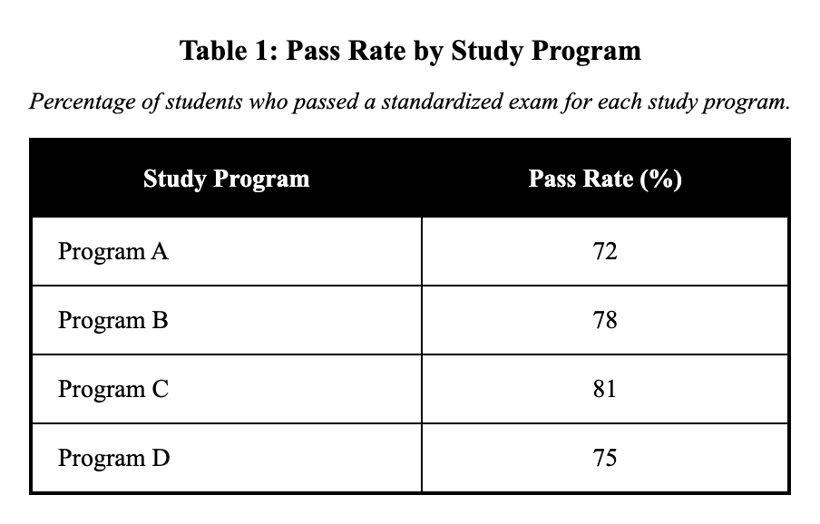
A school compared the percentage of students who passed a standardized exam after using four different study programs. The report states: "Program C outperformed Program A by percentage points."
Which choice most effectively uses data from the table to complete the text?
- 9 percentage points (81% minus 72%) (correct answer)
- 6 percentage points (78% minus 72%)
- 3 percentage points (75% minus 72%)
- 12 percentage points (81% minus 69%)
Explanation: The text requires the difference between Program C's and Program A's pass rates, specifically how many percentage points Program C outperformed Program A. Looking at the table, Program C had an 81% pass rate and Program A had 72%, so the difference is 81 - 72 = 9 percentage points. Choice A correctly calculates this as '9 percentage points (81% minus 72%).' Choice B incorrectly compares Programs B and A, choice C compares Programs D and A, and choice D compares Programs C and D. When calculating differences, always double-check that you're using the correct programs mentioned in the question.
Question 2
A transportation study recorded average bus on-time rates for four routes. The study concludes: "Route 2's on-time rate was at least 10 percentage points lower than Route 1's."
Which choice best describes data from the table that support the conclusion?
- Route 2 is 11 points lower than Route 1 (72% vs 83%). (correct answer)
- Route 4 is 8 points lower than Route 1 (75% vs 83%).
- Route 3 is 11 points higher than Route 2 (79% vs 72%).
- Route 2 is 10 points higher than Route 4 (72% vs 75%).
Explanation: The study concludes that Route 2's on-time rate was at least 10 percentage points lower than Route 1's. From the table: Route 1 has an 83% rate and Route 2 has a 72% rate, giving a difference of 83 - 72 = 11 percentage points. Since 11 points exceeds the 10-point minimum, choice A correctly supports this: 'Route 2 is 11 points lower than Route 1 (72% vs 83%).' Choice B shows only an 8-point difference, choice C compares Routes 3 and 2 rather than Routes 2 and 1, and choice D incorrectly claims Route 2 is higher than Route 4. When verifying 'at least' claims, ensure the actual difference meets or exceeds the stated threshold.
Question 3
Researchers tested four fertilizers and recorded average tomato yield per plant (in kilograms). They conclude that Fertilizer D produced the highest average yield.
Which choice most accurately represents information from the table?
- Fertilizer C had the highest yield at 3.6 kg.
- Fertilizer D had the highest yield at 3.9 kg. (correct answer)
- Fertilizer B had the highest yield at 3.1 kg.
- Fertilizer A had the highest yield at 3.4 kg.
Explanation: The researchers conclude that Fertilizer D produced the highest average yield, so we need to identify which fertilizer had the maximum yield value. From the table: Fertilizer A yielded 3.4 kg, B yielded 3.1 kg, C yielded 3.6 kg, and D yielded 3.9 kg. Since 3.9 kg is the highest value, choice B correctly states 'Fertilizer D had the highest yield at 3.9 kg.' Choices A and C incorrectly identify other fertilizers as having the highest yield, while choice D states a lower value for Fertilizer A. Always verify numerical comparisons by checking all values in the table before selecting an answer.
Question 4
A museum tracked attendance by day of week during a special exhibit. A staff report claims weekend days drew far more visitors than weekdays; specifically, the average of Saturday and Sunday exceeded the average of Monday through Friday by about .
Which choice most effectively uses data from the table to complete the text?
- 680 visitors (1,640 vs 960) (correct answer)
- 560 visitors (1,520 vs 960)
- 400 visitors (1,640 vs 1,240)
- 320 visitors (1,520 vs 1,200)
Explanation: The claim states that the average of weekend days (Saturday and Sunday) exceeded the average of weekdays (Monday through Friday), so we need to calculate both averages. Weekend average: (1,760 + 1,520) ÷ 2 = 1,640 visitors. Weekday average: (820 + 860 + 910 + 980 + 1,240) ÷ 5 = 960 visitors. The difference is 1,640 - 960 = 680 visitors. Choice B incorrectly calculates the weekend average as 1,520, Choice C uses 1,240 as the weekday average (which is just Friday), and Choice D makes errors in both calculations. When finding averages, sum all values in the group and divide by the count.
Question 5
A table reports the proportion of voters (%) favoring four candidates in a poll. A campaign memo claims that Candidate D is in second place, trailing Candidate B by 4 percentage points.
Candidate D trails Candidate B by .
Which choice most effectively uses data from the table to complete the text?
- 4 percentage points (29% versus 33%). (correct answer)
- 7 percentage points (22% versus 29%).
- 10 percentage points (19% versus 29%).
- 14 percentage points (19% versus 33%).
Explanation: The campaign memo claims Candidate D is in second place, trailing Candidate B by 4 percentage points, so we need to verify both the ranking and the margin. From the poll results: Candidate B leads with 33%, Candidate D has 29%, Candidate C has 22%, and Candidate A has 19%. Candidate D at 29% is indeed in second place. The difference between B (33%) and D (29%) is exactly 4 percentage points. Choice A correctly states this 4-point difference. Choice D incorrectly compares Candidates A and B rather than D and B, showing a 14-point difference that doesn't relate to the claim.
Question 6
A transit agency compared on-time performance (percent of trips on time) for four bus routes in 2023. The agency stated that Route 4 performed best and that the difference between the best and worst routes was 13 percentage points.
Which choice most accurately represents information from the table?
- Route 4 is 89%, and 89% minus 76% equals a 13-point difference. (correct answer)
- Route 3 is 89%, and 89% minus 76% equals a 13-point difference.
- Route 4 is 89%, and 89% minus 81% equals a 13-point difference.
- Route 2 is 76%, and 89% minus 84% equals a 13-point difference.
Explanation: The agency states that Route 4 performed best and the difference between best and worst was 13 percentage points. Route 4 at 89% is indeed the highest (best) performance. The lowest is Route 2 at 76%. The difference is 89% - 76% = 13 percentage points, confirming the stated gap. Choice A correctly identifies these values and the calculation. Choice C incorrectly uses 81% (Route 1's value) as the worst instead of 76%, which would only give an 8-point difference. When finding the range between best and worst, scan all values to identify the true extremes.
Question 7
A market analysis table reports the average price (in dollars) of a product at four stores. The analyst claims Store D is the cheapest option, costing at least $1.50 less than any other store.
Table: Average Price by Store ($) Store A: 12.99 Store B: 12.49 Store C: 13.25 Store D: 10.75
Which choice best describes data from the table that support the claim?
- Store D is $10.75, at least $1.74 below $12.49 or higher. (correct answer)
- Store B is $12.49, $0.50 below Store A at $12.99.
- Store C is $13.25, $0.26 above Store A at $12.99.
- Store A is $12.99, $2.24 above Store D at $10.75.
Explanation: The analyst claims Store D is cheapest and costs at least $1.50 less than any other store, so we need to verify Store D has the lowest price and calculate the price differences. Store D at $10.75 is indeed the lowest price. The differences are: Store D is 1.74lessthanStoreB(12.49 - 10.75),2.24 less than Store A (12.99−10.75), and 2.50lessthanStoreC(13.25 - 10.75$). Since the smallest difference is $1.74 (with Store B), which exceeds $1.50, choice A correctly supports the claim. Choice D gives accurate data but focuses on Store A being more expensive rather than Store D being cheapest. Question 8
After a scheduling overhaul, hospital administrators contend the policy cut average waits by about one-third at its busiest clinic. The bar chart compares average appointment wait times at three clinics before and after the change.
Which choice most effectively uses data from the chart to support the claim?
- Clinic B fell from 30 to 26 minutes, a 4-minute reduction.
- By 2024, the average across all three clinics was 26 minutes.
- Clinic A dropped from 45 minutes in 2022 to 30 minutes in 2024, a one-third reduction. (correct answer)
- The median wait at Clinic A was cut in half after the policy.
Explanation: Clinic A, the busiest in 2022 at 45 minutes, fell to 30 minutes in 2024, a one-third decrease. The other choices either do not address the busiest clinic, compute a different summary, or cite a statistic (median) not shown.
Question 9
An economics report listed unemployment rates (%) for a region across five years. The report argues that unemployment fell overall from 2019 to 2023 despite a temporary increase in 2021, dropping by .
Which choice most effectively uses data from the table to complete the text?
- 0.9 percentage points, from 6.8% in 2019 to 5.9% in 2023. (correct answer)
- 1.6 percentage points, from 7.5% in 2021 to 5.9% in 2023.
- 0.6 percentage points, from 6.2% in 2022 to 5.6% in 2023.
- 2.2 percentage points, from 8.1% in 2020 to 5.9% in 2023.
Explanation: The passage claims that unemployment fell overall from 2019 to 2023 despite a temporary increase, so we need the difference between these two years. Looking at the table, unemployment was 6.8% in 2019 and 5.9% in 2023, representing a decrease of 0.9 percentage points (6.8 - 5.9 = 0.9). The data confirms there was indeed a temporary increase in 2020 (8.1%) and 2021 (7.5%) before declining again. Choice D shows the largest decrease but uses 2020 as the starting point, which doesn't match the claim about the overall change from 2019 to 2023. When a claim specifies particular years for comparison, use only those years regardless of whether other years show more dramatic changes.
Question 10
A meteorologist compared average monthly rainfall (in millimeters) across four months in one region. The meteorologist claims that rainfall increased each month from April through July.
Which choice best describes data from the table that support the claim?
- Rainfall rises from 42 mm to 50 mm to 58 mm to 65 mm. (correct answer)
- July has 65 mm, which is 23 mm more than April's 42 mm.
- May has 50 mm, which is 8 mm more than April's 42 mm.
- June has 58 mm, which is 7 mm less than July's 65 mm.
Explanation: The meteorologist claims that rainfall increased each month from April through July, requiring evidence of a consistent upward trend. The data shows: April had 42 mm, May had 50 mm, June had 58 mm, and July had 65 mm, demonstrating steady increases (42 → 50 → 58 → 65). Choice A correctly describes this pattern: 'Rainfall rises from 42 mm to 50 mm to 58 mm to 65 mm.' Choices B, C, and D only describe individual comparisons between specific months rather than the complete trend. To support a claim about consistent change, choose the answer that shows the entire progression.
Question 11
A botanist measured the average height (in centimeters) of four plant varieties after 6 weeks under the same light conditions. The botanist argued that Variety D grew at least 8 cm taller than any other variety.
Which choice best describes data from the table that support the claim?
- Variety D reached 35 cm, at least 8 cm above the next highest (27 cm). (correct answer)
- Variety B reached 27 cm, 2 cm above Variety C at 25 cm.
- Variety A reached 24 cm, 11 cm below Variety D at 35 cm.
- Variety C reached 25 cm, 10 cm below Variety D at 35 cm.
Explanation: The botanist claims that Variety D grew at least 8 cm taller than any other variety, so we need to verify D's height advantage over the others. Variety D reached 35 cm, while the other varieties reached: A = 24 cm, B = 27 cm, and C = 25 cm. The differences are: D minus B = 35 - 27 = 8 cm, D minus C = 35 - 25 = 10 cm, and D minus A = 35 - 24 = 11 cm. Since B is the next highest at 27 cm, and 35 - 27 = 8 cm, Variety D is indeed at least 8 cm taller than all others. Choice A correctly states this relationship. The other choices either focus on the wrong comparisons or don't demonstrate the "at least 8 cm" criterion.
Question 12
An environmental table lists average particulate matter (PM2.5) concentrations (µg/m³) at four monitoring sites. The report asserts that Site A has the lowest PM2.5 level.
Which choice most accurately represents information from the table?
- Site A is 9.8 µg/m³, lower than 10.4 µg/m³ or higher elsewhere. (correct answer)
- Site C is 10.4 µg/m³, 1.7 µg/m³ lower than Site B at 12.1.
- Site B is 12.1 µg/m³, 0.9 µg/m³ lower than Site D at 13.0.
- Site D is 13.0 µg/m³, 3.2 µg/m³ higher than Site A at 9.8.
Explanation: The report asserts that Site A has the lowest PM2.5 level, so we need to identify the minimum value. Looking at the concentrations: Site A has 9.8 µg/m³, Site B has 12.1 µg/m³, Site C has 10.4 µg/m³, and Site D has 13.0 µg/m³. Site A at 9.8 µg/m³ is indeed the lowest value. Choice A correctly states that Site A's 9.8 µg/m³ is lower than all other sites, which have 10.4 µg/m³ or higher. Choice D provides accurate data about the difference between Sites D and A but doesn't establish that A has the lowest level among all sites.
Question 13
An education researcher analyzed a school's attendance initiative using data from Figure 1, which shows the percentage of students meeting a 95% attendance threshold each quarter. The researcher wrote: "The largest quarter-to-quarter gain occurred between Q2 and Q3, when the share meeting the threshold rose by ."
Which choice best describes data from the line graph that support the claim?
- 12 points (from 68% in Q2 to 80% in Q3). (correct answer)
- 8 points (from 60% in Q1 to 68% in Q2).
- 6 points (from 80% in Q3 to 86% in Q4).
- 26 points (from 60% in Q1 to 86% in Q4).
Explanation: The researcher claims the largest quarter-to-quarter gain in attendance rates occurred between Q2 and Q3, so we need data comparing consecutive quarters to identify the biggest increase in the percentage meeting the threshold. From the line graph, choice A shows a 12-point rise from 68% in Q2 to 80% in Q3, which is larger than other consecutive changes. This directly supports the claim by quantifying the steepest single-quarter improvement. Choice D might distract with a 26-point overall increase from Q1 to Q4, but the claim specifies quarter-to-quarter gains, not cumulative; choice C cites a smaller 6-point gain from Q3 to Q4. In graph questions, focus on the exact parameters of the claim, such as time intervals, to avoid confusing overall trends with specific segments.
Question 14
A city sustainability office compared recycling rates (percent of household waste recycled) across four districts in 2018 and 2023. Officials claimed that District C not only had the largest increase, but also surpassed District B by 2023.
Which choice best describes data from the table that support the claim?
- District C rose 12 points (24% to 36%) and exceeded District B's 34%. (correct answer)
- District A rose 6 points (22% to 28%) and remained below District D's 30%.
- District B rose 3 points (31% to 34%) and stayed above District A's 28%.
- District D rose 3 points (27% to 30%) and stayed below District B's 34%.
Explanation: The claim states that District C had the largest increase AND surpassed District B by 2023, so we need data showing both conditions are met. District C increased from 24% to 36%, a 12-point gain, which is indeed the largest increase (District A gained 6 points, B gained 3 points, and D gained 3 points). Additionally, District C's 2023 rate of 36% exceeds District B's 34%, confirming it surpassed District B. Choice A correctly presents both pieces of supporting data. The other choices either show smaller increases or don't demonstrate one district surpassing another. When evaluating claims with multiple parts, ensure the data supports all stated conditions.
Question 15
An economics class examined the unemployment rate (percent) in a region over four years. The instructor noted that the largest year-to-year decline occurred between 2021 and 2022.
Which choice best describes data from the table that support that statement?
- It fell 1.5 points from 6.9% (2021) to 5.4% (2022). (correct answer)
- It fell 0.9 points from 7.8% (2020) to 6.9% (2021).
- It fell 0.3 points from 5.4% (2022) to 5.1% (2023).
- It fell 2.7 points from 7.8% (2020) to 5.1% (2023).
Explanation: The instructor noted that the largest year-to-year decline occurred between 2021 and 2022, so we need to calculate all consecutive year changes. From 2020 to 2021: 7.8% to 6.9% = 0.9-point decline. From 2021 to 2022: 6.9% to 5.4% = 1.5-point decline. From 2022 to 2023: 5.4% to 5.1% = 0.3-point decline. The 1.5-point drop from 2021 to 2022 is indeed the largest year-to-year decline. Choice A correctly identifies this change. Choice D shows the total change over all years (2.7 points) rather than a year-to-year change, which doesn't address what the question asks for.
Question 16
A city survey recorded the percentage of residents supporting four proposed policies. Analysts claim that Policy 3 had the highest level of support, exceeding every other policy by at least 8 percentage points.
Which choice best describes data from the table that support the claim?
- Policy 3 is 55%, at least 8 points above 47% or lower. (correct answer)
- Policy 2 is 47%, which is 3 points above Policy 4 at 44%.
- Policy 1 is 41%, which is 14 points below Policy 3 at 55%.
- Policy 4 is 44%, which is 3 points above Policy 1 at 41%.
Explanation: The claim states that Policy 3 had the highest support and exceeded every other policy by at least 8 percentage points, so we need to verify both conditions. Looking at the table, Policy 3 has 55% support, which is indeed the highest. Comparing to other policies: Policy 3 (55%) exceeds Policy 1 (41%) by 14 points, Policy 2 (47%) by 8 points, and Policy 4 (44%) by 11 points. Choice A correctly states that Policy 3 at 55% is at least 8 points above all others (which are 47% or lower). Choice B accurately describes Policy 2's relationship to Policy 4 but doesn't address the claim about Policy 3 having the highest support.
Question 17
A climate summary listed average annual temperature (in °C) for a city across four years. A writer claims: "From 2021 to 2024, the city warmed overall by 0.9°C."
Which choice most effectively uses data from the table to support the claim?
- It rose from 14.6°C in 2021 to 15.5°C in 2024. (correct answer)
- It rose from 14.9°C in 2022 to 15.5°C in 2024.
- It rose from 14.6°C in 2021 to 15.1°C in 2023.
- It rose from 14.6°C in 2021 to 15.4°C in 2024.
Explanation: The writer claims the city warmed overall by 0.9°C from 2021 to 2024, so we need to calculate the temperature change between these specific years. From the table: 2021 averaged 14.6°C and 2024 averaged 15.5°C, giving a difference of 15.5 - 14.6 = 0.9°C. Choice A correctly identifies this: 'It rose from 14.6°C in 2021 to 15.5°C in 2024.' Choice B uses 2022 as the starting year instead of 2021, choice C uses 2023 as the ending year instead of 2024, and choice D incorrectly states the 2024 temperature as 15.4°C when it's actually 15.5°C. When calculating overall change, always use the exact start and end points specified in the claim.
Question 18
A city health department summarized survey results in Table 1 showing the percentage of adults who reported exercising at least 150 minutes per week, by age group. A spokesperson claimed that reported exercise rates generally decline with age, and added: "The steepest drop occurs between ages 30–44 and 45–59, where the rate falls by ."
Which choice best describes data from the table that support the claim?
- 11 points (from 62% among ages 30–44 to 51% among 45–59). (correct answer)
- 6 points (from 68% among ages 18–29 to 62% among 30–44).
- 9 points (from 51% among ages 45–59 to 42% among 60+).
- 26 points (from 68% among ages 18–29 to 42% among 60+).
Explanation: The spokesperson claims that exercise rates generally decline with age, with the steepest drop between ages 30–44 and 45–59, so we need data comparing rates across age groups to identify the largest decrease in consecutive brackets. From the table, choice A shows an 11-point fall from 62% for ages 30–44 to 51% for 45–59, which is steeper than other adjacent drops. This directly quantifies the biggest single-step decline. Choice C cites a 9-point drop from 51% to 42% (ages 45–59 to 60+), which is true but smaller than 11 points and not the steepest; choice D gives the overall drop, ignoring the focus on consecutive groups. When analyzing grouped data, compare adjacent categories to match claims about specific transitions.
Question 19
A biology class measured plant height after 6 weeks under different light conditions. A student concludes that full sun produced the tallest plants, exceeding partial shade by .
Which choice most effectively uses data from the table to complete the text?
- 4.5 cm (24.6 minus 20.1) (correct answer)
- 1.7 cm (24.6 minus 22.9)
- 9.8 cm (24.6 minus 14.8)
- 5.3 cm (20.1 minus 14.8)
Explanation: The student concludes full sun produced the tallest plants and exceeded partial shade by a certain amount, so we need to compare these two conditions. Full sun produced plants averaging 24.6 cm and partial shade produced 20.1 cm, for a difference of 24.6 - 20.1 = 4.5 cm. Choice B compares full sun (24.6) to grow light (22.9), Choice C compares full sun (24.6) to low light (14.8), and Choice D compares partial shade (20.1) to low light (14.8). The claim specifically compares full sun to partial shade, making other light condition comparisons irrelevant.
Question 20
A linguistics team compared reading speeds across font sizes using the results in Table 1 (words per minute, WPM). In their discussion, the researchers noted that the fastest average speed occurred at 12-point type, and they added: "Compared with 10-point type, 12-point type increased average reading speed by ."
Which choice most effectively uses data from the table to complete the text?
- 12 WPM (from 218 WPM at 10 pt to 230 WPM at 12 pt). (correct answer)
- 8 WPM (from 230 WPM at 12 pt to 222 WPM at 14 pt).
- 4 WPM (from 226 WPM at 16 pt to 230 WPM at 12 pt).
- 18 WPM (from 212 WPM at 8 pt to 230 WPM at 12 pt).
Explanation: The researchers claim the fastest average reading speed occurred at 12-point type, specifically comparing it to 10-point with an increase, so we need data showing the speed at 12 pt versus 10 pt and the difference. From the table, choice A notes a 12 WPM increase from 218 WPM at 10 pt to 230 WPM at 12 pt, demonstrating the gain and implying 230 as the peak. This precisely matches the comparison in the statement. Choice D cites an 18 WPM increase from 212 at 8 pt to 230 at 12 pt, which is true but compares to the wrong font size, not 10 pt; choice B shows a decrease from 12 pt to 14 pt, irrelevant to the claim. Always return to the specific elements in the claim, like exact comparisons, to select supporting data from the table.