All questions
Question 1
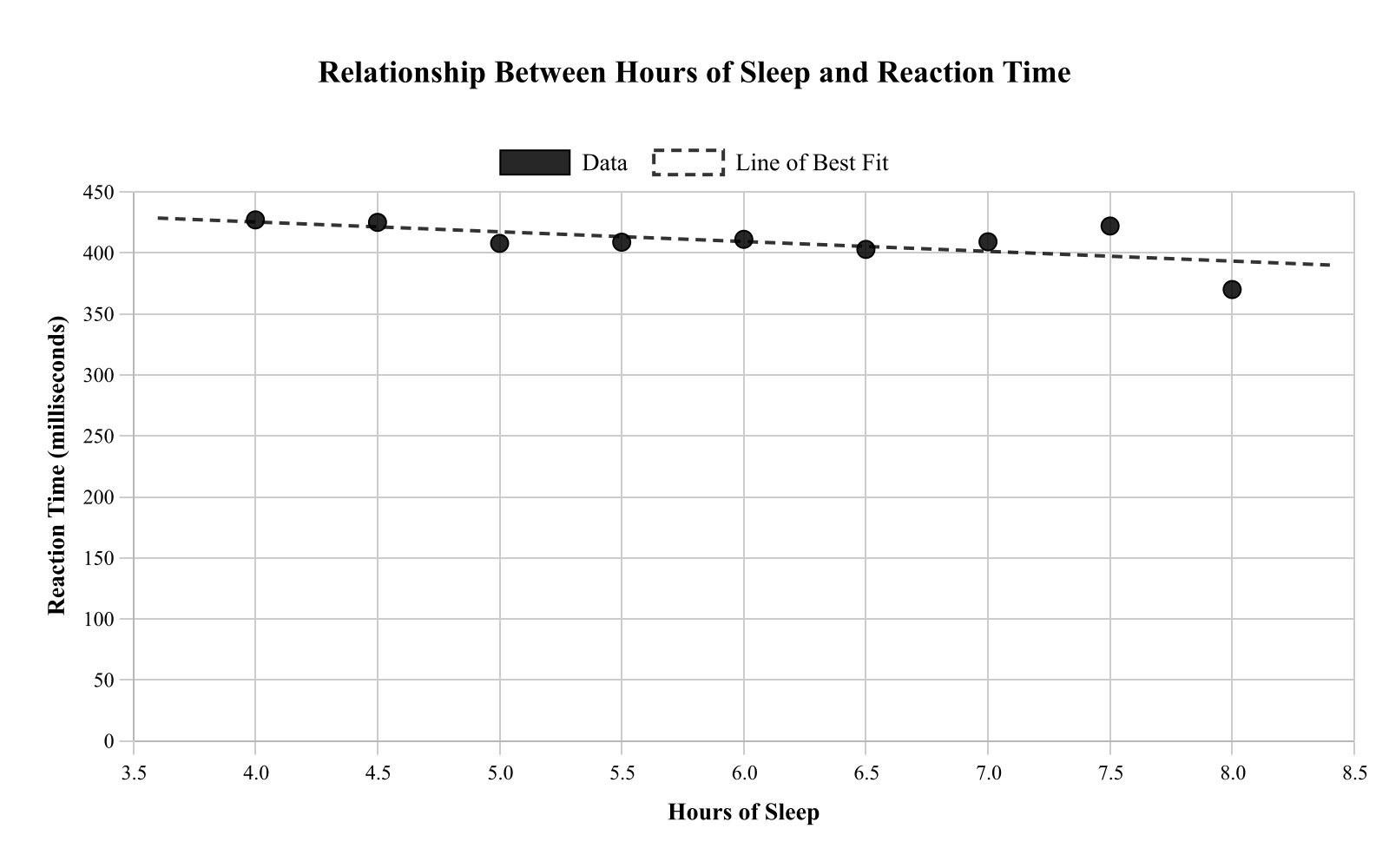
A student investigated whether the number of hours of sleep (hours) is related to reaction time (milliseconds) for 9 trials. The scatterplot shows sleep on the x-axis and reaction time on the y-axis. Which statement best describes the pattern?
- The scatterplot proves sleeping more causes faster reactions for everyone.
- Reaction time is constant regardless of sleep (no association).
- Reaction time decreases as sleep increases (negative association). (correct answer)
- Reaction time increases as sleep increases (positive association).
Explanation: The question asks which statement describes the pattern in nine paired measurements of sleep and reaction time. Reading the plot from left to right, the points drift downward: trials with more sleep go with lower reaction times, so the description of reaction time decreasing as sleep increases, a negative association, fits the data. The statement that reaction time increases as sleep increases reverses the direction of the trend. The statement that reaction time is constant regardless of sleep would require a roughly flat, patternless cloud of points, which is not what a clear downward drift looks like. And the statement that the plot proves more sleep causes faster reactions for everyone overreaches twice: nine trials in one student's investigation show an association rather than causation, and no scatterplot can establish that a pattern holds for every person.
Question 2
A small gym tracked, for 12 members, the number of weeks since joining (weeks) and the time they can hold a plank (seconds). The scatterplot displays the data. Which statement best describes the relationship shown between weeks since joining and plank time?
- There is a strong negative association; plank time decreases as weeks increase.
- There is a strong positive association; plank time tends to increase as weeks increase. (correct answer)
- The data prove that joining the gym causes plank time to increase.
- There is no association; plank time stays constant as weeks increase.
Explanation: The question asks how weeks since joining relates to plank time for 12 gym members. Reading left to right, the points rise: members with more weeks of membership generally hold a plank longer, and they cluster fairly tightly around an upward line, so the description of a strong positive association in which plank time tends to increase as weeks increase fits. The description of a strong negative association with plank time decreasing reverses the direction the points actually travel. The description of no association with plank time staying constant would require a flat, shapeless cloud rather than a clear upward trend. And the claim that the data prove joining the gym causes plank time to increase moves past describing the pattern into causation, which a scatterplot of members' existing habits cannot establish; those who stay enrolled longest may also be the ones training hardest.
Question 3
A researcher measured the number of hours of sleep and reaction time (milliseconds) for 10 participants. The scatterplot shows a line of best fit. Which interpretation of the y-intercept of the line of best fit is most reasonable in context?
- The hours of sleep for someone whose reaction time is 0 milliseconds.
- The participant with the fastest reaction time.
- The reaction time for someone who sleeps 0 hours, though it may be outside the data range. (correct answer)
- The amount reaction time changes per additional millisecond of sleep.
Explanation: Sleep hours is the input variable here and reaction time is the output, so the y-intercept is the value the line of best fit predicts for reaction time when hours of sleep is 0. That is why the correct choice describes it as the predicted reaction time for someone who sleeps 0 hours while noting that this input almost certainly lies outside the range of the 10 measured participants, making it an extrapolation. The choice describing hours of sleep for a reaction time of 0 swaps the two variables and reads the wrong axis. The choice pointing to the participant with the fastest reaction time names an individual data point rather than any feature of the fitted line. The choice describing how much reaction time changes per additional millisecond of sleep defines the slope, not the intercept, and mislabels sleep in milliseconds.
Question 4
A school counselor plotted students' number of absences and their course grade for 13 students. The scatterplot shows Absences (days) versus Course Grade (percent). Which statement is best supported by the scatterplot?
- Students with more absences tend to have lower grades. (correct answer)
- Grades are unrelated to absences because all grades are above 90%.
- Absences cause grades to drop by exactly 5% per day.
- Students with more absences tend to have higher grades.
Explanation: With absences on one axis and course grade on the other for 13 students, the trend in the points runs downward: as absence counts rise, grades tend to fall. That negative association is what the statement saying students with more absences tend to have lower grades captures, and it does so without adding claims the plot cannot support. The statement that students with more absences tend to have higher grades reverses the direction of that trend. The statement that grades are unrelated to absences because all grades exceed 90% confuses the size of the values with the presence of a relationship; association is about how the points trend, not how high they sit. The statement that absences cause grades to drop exactly 5% per day asserts both causation and a precise rate, neither of which a scatterplot can establish.
Question 5
A nutritionist recorded the number of sugary drinks consumed per week (drinks) and a health score (points) for 8 clients. The scatterplot shows drinks on the x-axis and health score on the y-axis. Which statement best describes the correlation?
- No correlation
- Strong positive correlation
- Perfect correlation, so sugary drinks cause the health score change.
- Strong negative correlation (correct answer)
Explanation: The question asks which description fits the relationship between weekly sugary drinks and health score for 8 clients. Direction comes from what happens to the y-values as x increases: here health scores decline as sugary drink consumption rises, which makes the relationship negative, and because the points track that downward pattern closely instead of scattering widely, the correlation counts as strong rather than weak. The description of a strong positive correlation reverses the direction, which would mean more drinks accompany higher health scores. The description of no correlation would require health scores to show no systematic change as drinks increase, contradicting the trend in the data. And calling the relationship perfect and concluding that sugary drinks cause the score change fails twice: real data rarely fall exactly on a line, and no correlation, however tight, establishes causation from recorded observations.
Question 6
A farmer recorded the amount of fertilizer used (in kilograms) and the crop yield (in tons) for 10 fields. The scatterplot shows a positive trend for fertilizer amounts between 10 and 40 kg. Using the line of best fit, the farmer predicts the yield at 60 kg. Which is the best critique of this prediction?
- It is interpolation, so it is always reliable.
- It is extrapolation beyond the data range, so it may be less reliable. (correct answer)
- It is invalid because positive trends cannot be modeled with lines.
- It is guaranteed accurate because the points are close to the line.
Explanation: This question addresses the reliability of predictions outside the data range, specifically predicting yield at 60 kg when data only covers 10-40 kg. This is extrapolation - extending the line beyond the observed data range - which is less reliable than interpolation (predicting within the data range). Choice B correctly identifies this as extrapolation and notes it may be less reliable because we don't know if the linear relationship continues beyond 40 kg. In agriculture, factors like nutrient saturation might cause the relationship to level off at higher amounts. When making predictions, always note whether you're interpolating (within the data) or extrapolating (beyond the data), as extrapolation carries greater uncertainty.
Question 7
A school counselor recorded the number of hours 12 students studied for a math test and their resulting scores. The scatterplot shows hours studied (hours) on the x-axis and test score (points) on the y-axis, along with a dashed line of best fit. Based on the line of best fit, what is the predicted test score when a student studies for 6 hours, and is this prediction an interpolation or extrapolation?
- About 70 points; extrapolation
- About 78 points; interpolation (correct answer)
- About 84 points; extrapolation
- About 90 points; interpolation
Explanation: This question asks for the predicted test score based on the line of best fit for a student who studies 6 hours and whether this prediction is an interpolation or extrapolation. The scatterplot displays a positive linear trend, with data points generally increasing from lower hours and scores to higher ones, clustered moderately around the dashed line of best fit. To find the prediction, locate x=6 on the hours axis and trace up to the line of best fit, which intersects at approximately y=78 points on the score axis; since 6 hours falls within the range of observed data points (assuming from about 0 to 8 hours), this is an interpolation. A common error is misreading the graph scale or confusing interpolation (within data range) with extrapolation (beyond data range), leading to incorrect choices like 70 or 84 points with extrapolation. Another mistake might involve eyeballing the line incorrectly, resulting in overestimations like 90 points. When dealing with scatterplots, always verify if the prediction point is inside or outside the observed x-range to distinguish between interpolation and extrapolation, promoting careful visual interpretation over hasty assumptions.
Question 8
A teacher compared the number of pages read and the number of minutes spent reading for 9 students. The scatterplot shows pages (pages) on the x-axis and time (minutes) on the y-axis. A line of best fit is shown. Based on the line of best fit, what is the predicted time for a student who reads 55 pages?
- About 40 minutes
- About 55 minutes
- About 70 minutes (correct answer)
- About 85 minutes
Explanation: The question seeks the predicted reading time based on the line of best fit for a student who reads 55 pages. The scatterplot shows a positive linear trend, with time increasing as pages read increase, and points moderately scattered around the line. To predict, find x=55 on the pages axis and trace to the line, intersecting at about y=70 minutes. This involves substituting into the implied linear equation or visually estimating from the graph. A key error is misaligning with the scale, leading to underestimates like 40 or 55 minutes or overestimates like 85. When predicting from lines of best fit, double-check axis scales and use interpolation for values within the data range to promote accurate data literacy.
Question 9
An environmental scientist measured the percentage of tree canopy cover and the average daytime temperature in 10 neighborhoods. The scatterplot shows canopy cover (%) on the x-axis and temperature (°F) on the y-axis with a line of best fit. Which statement is best supported by the scatterplot?
- Neighborhoods with higher canopy cover tend to have higher daytime temperatures.
- Neighborhoods with higher canopy cover always have exactly the same temperature.
- Increasing canopy cover by 10% will cause temperature to drop by 10°F in every neighborhood.
- Neighborhoods with higher canopy cover tend to have lower daytime temperatures. (correct answer)
Explanation: This question asks which statement is best supported by the scatterplot of tree canopy cover and daytime temperature. The scatterplot indicates a negative association, with temperatures tending to decrease as canopy cover percentage increases, and points loosely following the downward line of best fit. This supports that neighborhoods with higher canopy cover tend to have lower temperatures, as seen in the overall pattern. Arrive at this by noting the direction of the trend without assuming causation or exact predictions. Errors include reversing the association (choice A), overgeneralizing to 'always' or causation (choices B and C), often from ignoring variability. Focus on descriptive language like 'tend to' to differentiate correlation from causation, enhancing careful interpretation of visual data.
Question 10
A city analyst compared daily high temperature and total hot chocolate sales at a café over 11 days. The scatterplot shows temperature (°F) on the x-axis and sales (cups) on the y-axis, with a dashed line of best fit. Based on the scatterplot, which equation best models the line of best fit for predicting hot chocolate sales y from temperature x?
- y=2x+10
- y=−2x+160 (correct answer)
- y=−0.5x+60
- y=0.5x+20
Explanation: This question asks for the equation that best models the line of best fit for predicting hot chocolate sales from temperature. The scatterplot shows a negative linear trend, with sales decreasing as temperature increases, and data points scattered around the dashed line with a steep downward slope. To identify the equation, estimate the y-intercept around 160 cups when x=0 and the slope as about -2 cups per degree, matching y = -2x + 160. This can be verified by checking if the line passes through key points, like high sales at low temperatures and low sales at high ones. Common errors involve selecting positive slopes (choices A or D) by ignoring the negative association or miscalculating the slope magnitude (choice C). A useful strategy is to calculate slope using two points on the line and confirm the intercept, emphasizing careful reading of visual trends over guessing.
Question 11
A researcher recorded the number of minutes 9 participants spent on a puzzle and the number of errors they made. The scatterplot shows time (minutes) on the x-axis and errors (errors) on the y-axis. A line of best fit is shown. Which data point appears farthest from the line of best fit?
- The point at about (10,18) (correct answer)
- The point at about (20,13)
- The point at about (30,9)
- The point at about (40,3)
Explanation: The question seeks to identify which data point is farthest from the line of best fit in the scatterplot of time spent on a puzzle versus errors made. The scatterplot exhibits a negative trend, with errors decreasing as time increases, and most points aligning closely with the line, but some deviating noticeably. The point at approximately (10, 18) shows the largest vertical distance from the line, indicating it's the farthest. To determine this, visually compare the perpendicular distances of each listed point to the line, confirming (10, 18) has the greatest residual. Errors often occur by focusing on horizontal distance instead of vertical or misidentifying points like (20, 13) as more deviant due to clustering. When analyzing residuals, prioritize vertical deviations for y-predictions to enhance understanding of data spread and model fit.
Question 12
A botanist measured the amount of fertilizer applied and the height of 10 plants after 6 weeks. The scatterplot shows fertilizer (grams) versus plant height (cm), with a line of best fit. What does the slope of the line of best fit represent in this context?
- The number of plants measured in the study.
- The plant height when no fertilizer is applied, measured in grams.
- The predicted increase in fertilizer (grams) for each additional centimeter of height.
- The predicted increase in plant height (cm) for each additional gram of fertilizer. (correct answer)
Explanation: The question asks what the slope of the line of best fit means when fertilizer in grams is on the x-axis and plant height in centimeters is on the y-axis. Slope is change in y per one-unit change in x, so it predicts how many additional centimeters of height accompany each extra gram of fertilizer, which is the reading given as the predicted increase in plant height per additional gram. The description of a predicted increase in fertilizer for each additional centimeter of height reverses the two variables and reports grams per centimeter, the reciprocal quantity. The description of plant height when no fertilizer is applied refers to the y-intercept rather than the slope, and it also attaches grams to a height. And the number of plants measured is just the sample size, which no feature of the line describes.
Question 13
A store manager recorded advertising spending (dollars) and weekly revenue (thousands of dollars) for 10 weeks. The scatterplot shows the data. The point at (900,58) appears to be an outlier. If this outlier were removed, which change would most likely occur to the correlation between spending and revenue?
- The correlation would change from positive to negative.
- The positive correlation would become weaker.
- The correlation would become exactly zero.
- The positive correlation would become stronger. (correct answer)
Explanation: This question asks how removing the outlier at (900, 58) would affect the correlation. Currently, the scatterplot shows a positive correlation between advertising spending and revenue. The point (900, 58) appears to be below the general trend - at $900 spending, the revenue of $58k is lower than expected. When this below-the-trend outlier is removed, the remaining points would show a tighter, more consistent upward pattern, making the positive correlation stronger. Outliers that deviate from the overall pattern tend to weaken correlation; removing them strengthens it. The correlation would remain positive (not change direction) since the overall upward trend remains.
Question 14
A student tracked, over 9 days, the amount of time spent on social media (minutes) and the number of pages read for homework (pages). The scatterplot is shown. Which statement best describes the relationship between social media time and pages read?
- Pages read tend to increase as social media time increases.
- Pages read tend to decrease as social media time increases. (correct answer)
- Pages read are constant regardless of social media time.
- The data prove social media use causes fewer pages to be read.
Explanation: This question asks about the relationship between social media time and pages read for homework. Examining the scatterplot, as social media time increases (moving right), the number of pages read generally decreases (points trend downward), showing a negative association. Choice B correctly describes this inverse relationship without claiming causation. Choice D is incorrect because correlation doesn't prove causation - we can only say the two variables are associated, not that one causes the other. The downward trend makes intuitive sense as more time on social media might leave less time for reading. When interpreting relationships, describe the association pattern without assuming causal mechanisms.
Question 15
A librarian recorded, for 10 students, the number of books checked out (books) and the number of minutes spent reading that week (minutes). The scatterplot is shown. Which statement best describes the strength and direction of the association?
- Strong negative association
- Weak negative association
- Moderate positive association (correct answer)
- No association
Explanation: This question asks about the strength and direction of association between books checked out and reading time. Looking at the scatterplot, as the number of books increases (moving right), reading time generally increases (points trend upward), indicating a positive association. The points show some scatter but follow a general upward trend - not tightly clustered (which would be strong) nor widely scattered (which would be weak), making this a moderate association. The upward trend is clear enough to rule out "no association" but not tight enough for "strong." When assessing association strength, consider how closely points follow the overall pattern: tight clustering = strong, loose clustering = moderate, no pattern = weak or none.
Question 16
A botanist recorded the amount of fertilizer used (grams) and plant height after 6 weeks (centimeters) for 9 plants of the same species. The scatterplot is shown. Which statement is best supported by the scatterplot?
- Using more fertilizer causes every plant to grow exactly 3 cm taller.
- There is a positive association; taller plants tend to correspond to more fertilizer. (correct answer)
- There is a negative association; taller plants tend to correspond to less fertilizer.
- There is no association; plant height is unrelated to fertilizer amount.
Explanation: This question asks which statement is best supported by the scatterplot of fertilizer amount versus plant height. Looking at the data, as fertilizer amount increases (moving right), plant height generally increases (points trend upward), showing a positive association. Choice B correctly describes this pattern without making causal claims. Choice A incorrectly claims causation and suggests an exact relationship, while the scatterplot shows variation. Choice C incorrectly states a negative association, and choice D is wrong as there is clearly an upward trend. When interpreting scatterplots, describe the association (positive/negative) without assuming causation - correlation does not imply causation.
Question 17
A city recorded the number of miles driven (miles) and the total cost of gasoline used (dollars) for 9 trips using the same car. The scatterplot shows the relationship and includes a solid line of best fit. What does the slope of the line of best fit represent in this context?
- The fixed cost of starting a trip, in dollars.
- The average dollars per mile spent on gasoline. (correct answer)
- The average miles per dollar spent on gasoline.
- The average change in miles for each additional dollar.
Explanation: This question asks about the meaning of the slope in the context of miles driven versus gasoline cost. The slope of a line represents the rate of change - how much y changes for each unit increase in x. Since x is miles and y is dollars, the slope has units of dollars/mile, representing the average cost per mile. This matches choice B: the average dollars per mile spent on gasoline. Choice C incorrectly inverts the units to miles/dollar, while choices A and D misinterpret what slope represents. When interpreting slope in context, always consider the units: (change in y)/(change in x) gives you the units of the slope.
Question 18
A school tracked, for 10 students, the number of absences (days) and their final course grade (percent). The scatterplot shows the data and a dashed line of best fit. For the student with x=8 absences, approximately how much greater is the actual grade than the grade predicted by the line of best fit?
- About 2 percentage points
- About 8 percentage points (correct answer)
- About 15 percentage points
- About 25 percentage points
Explanation: This question asks how much greater the actual grade is compared to the predicted grade for a student with 8 absences. First, we locate x = 8 on the horizontal axis and find both the actual data point and the predicted value on the line. The actual data point at x = 8 appears to be at approximately 68%, while the line of best fit predicts about 60% for 8 absences. The difference is 68% - 60% = 8 percentage points, making the actual grade about 8 percentage points greater than predicted. This represents a positive residual, where the student performed better than the model predicted. When calculating residuals, always subtract predicted from actual: residual = actual - predicted.
Question 19
A botanist measured the height of 10 sunflower plants and the number of days since planting. The scatterplot shows Days Since Planting (days) versus Height (cm). Which statement best describes the relationship shown in the scatterplot?
- There is a strong negative association between days and height.
- There is a strong positive association between days and height. (correct answer)
- There is no association because the points form a horizontal band.
- The relationship is nonlinear because height decreases then increases.
Explanation: This question asks us to describe the relationship between days since planting and sunflower height. Examining the scatterplot, as days increase (moving right), the height values increase (moving up), indicating a positive association. The points follow an upward trend from lower left to upper right, which is characteristic of a strong positive association. Students might incorrectly choose option D if they misinterpret normal variation in growth as a decrease, but the overall trend is clearly increasing. When describing associations, focus on the overall pattern rather than individual point variations.
Question 20
A student compared the number of practice problems completed and the time to finish a quiz for 12 classmates. The scatterplot shows Practice Problems (problems) versus Quiz Time (minutes). Which statement best describes the relationship?
- No association: quiz time is the same for all practice amounts.
- Negative association: more practice corresponds to shorter quiz times. (correct answer)
- Perfect association: all points lie exactly on a line.
- Positive association: more practice corresponds to longer quiz times.
Explanation: The question asks which description fits the pattern between practice problems completed and quiz time. Reading the scatterplot from left to right, the points trend downward: classmates who completed more practice problems generally finished the quiz in fewer minutes. A pattern where one variable increases while the other decreases is a negative association, so the statement that more practice corresponds to shorter quiz times is the right description. The claim of no association fails because quiz time clearly changes with practice instead of staying the same for every practice amount. The claim of a positive association reverses the direction, predicting longer quiz times as practice increases. The claim of a perfect association overstates the evidence: scattered points that merely trend downward do not all sit exactly on one line, and perfect requires exactly that.