All questions
Question 1
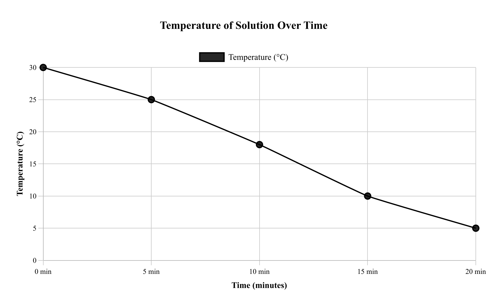
A lab measured the temperature of a solution as it cooled over time. The line graph shows temperature (in °C) at 0, 5, 10, 15, and 20 minutes. What is the average rate of change in temperature from 5 minutes to 15 minutes? Compute ΔtΔT using the values at those times.
- −1.0 ∘C/min
- −1.5 ∘C/min (correct answer)
- −2.0 ∘C/min
- −2.5 ∘C/min
Explanation: The question asks for the average rate of temperature change from 5 to 15 minutes. From the graph, at 5 minutes the temperature is 25°C and at 15 minutes it's 10°C. The rate is (10 - 25)/(15 - 5) = -15/10 = -1.5°C/min. The negative sign indicates cooling, and students often forget to include it or mix up the order in the numerator.
Question 2
A cafeteria tracked how many cartons of milk were sold each day. The line graph shows cartons sold from Day 1 to Day 7. On which day did sales first reach at least 90 cartons? Identify the earliest day whose plotted value is ≥90 using the y-axis scale.
- Day 3
- Day 4
- Day 5 (correct answer)
- Day 6
Explanation: The question asks on which day milk sales first reached at least 90 cartons. Examining the line graph from Day 1 to Day 7, I need to find the first day where the value is ≥ 90. Day 5 is the first day showing a value at or above 90 cartons on the y-axis. Students often confuse "first reached" with "highest value" or misread the scale.
Question 3
A teacher compared the number of correct answers on a 20-question quiz across four class periods. The bar graph shows the class average (in questions correct) for Periods 1–4. What is the difference between the highest and lowest class averages? Use the exact bar heights to compute the spread.
- 4 questions
- 5 questions
- 3 questions (correct answer)
- 2 questions
Explanation: The question asks for the difference between the highest and lowest class averages. From the bar graph, the highest average is Period 3 with 17 questions correct, and the lowest is Period 2 with 14 questions correct. The difference is 17 - 14 = 3 questions. Students often confuse finding the range with finding an average or misidentify which bars are highest and lowest.
Question 4
The bar graph shows the number of pages read by four students (Alex, Bri, Chen, and Dev) over the weekend. A separate note says each student planned to read 60 pages. Based on the graph, which student fell short of the goal by the greatest number of pages, and by how many pages? Compute 60−(pages read) for each student.
- Chen by 5 pages
- Bri by 15 pages
- Dev by 20 pages (correct answer)
- Alex by 10 pages
Explanation: The question asks which student fell short of the 60-page goal by the most. From the bar graph, I calculate shortfalls: Alex read 50 (short by 10), Bri read 55 (short by 5), Chen read 65 (exceeded by 5), Dev read 40 (short by 20). Dev fell short by the greatest amount at 20 pages. Students often miscalculate by subtracting in the wrong order or missing that Chen exceeded the goal.
Question 5
A bar graph shows the number of hours four students studied for a test: Ava 6, Ben 4, Cara 7, Dan 5. According to the graph, how many more hours did Cara study than Ben?
- 1 hour
- 3 hours (correct answer)
- 4 hours
- 2 hours
Explanation: The question asks for the difference in study hours between Cara and Ben. According to the graph, Cara studied 7 hours and Ben studied 4 hours. The difference is: 7 - 4 = 3 hours. A common error would be subtracting in the wrong order or reading the wrong students' values from the graph.
Question 6
A fitness app tracked the number of steps a user walked each day for 6 days. The bar graph shows steps (in thousands) for Day 1 through Day 6. What is the total number of steps (in thousands) for Day 2, Day 4, and Day 6 combined? Add the three bar values carefully using the y-axis scale.
- 20 thousand (correct answer)
- 18 thousand
- 19 thousand
- 21 thousand
Explanation: The question asks for the total steps (in thousands) for Days 2, 4, and 6 combined. Reading from the bar graph: Day 2 shows 5 thousand, Day 4 shows 7 thousand, and Day 6 shows 8 thousand steps. The total is 5 + 7 + 8 = 20 thousand steps. Students often misread the scale or accidentally include adjacent days in their calculation.
Question 7
A runner tracked distance run each week for 4 weeks. The line graph shows Week 1 through Week 4 distances in miles. According to the graph, what was the average (mean) distance per week over the 4 weeks?
- 3.5 miles
- 4.0 miles (correct answer)
- 4.5 miles
- 5.0 miles
Explanation: The question asks for the average distance run per week over 4 weeks, based on the line graph. The plotted points show Week 1 at 3.5 miles, Week 2 at 4.0, Week 3 at 4.5, and Week 4 at 4.0, so sum these values: 3.5 + 4.0 + 4.5 + 4.0 = 16 miles. Divide by 4 to find the mean: 16 ÷ 4 = 4.0 miles. Use the exact points, not a trend. A key error is calculating the median instead of the mean or misreading one point, like confusing 4.5 with 5.0 due to scale issues.
Question 8
Bonnie is conducting a survey in her class to understand how many fruits her peers eat on a daily basis. How many of Bonnie's peers eat less than 2 fruits daily?
- 4
- 8
- 11 (correct answer)
- 15
Explanation: This problem comes down to two things: reading the historgram correctly, and reading the question correctly. According to the histogram, 3 of her peers eat 0 fruits daily and 8 of her peers eat 1 fruit daily. This gives us 11 classmates. And the question asks for the number of classmates who eat less than two (not "exactly two" or "two or less" which each have trap answer choices associated with them), so be certain to read carefully.
Question 9
A cafeteria recorded the number of sandwiches sold on a Friday, separated by type. The bar graph shows Turkey, Ham, Veggie, and Tuna. According to the graph, which sandwich type accounts for the least number sold, and what is that number?
- Ham, 15 sandwiches
- Tuna, 18 sandwiches
- Veggie, 12 sandwiches (correct answer)
- Turkey, 20 sandwiches
Explanation: The question asks which sandwich type had the least number sold on Friday and what that number is, based on the bar graph. Examining the bars, Veggie has the shortest bar at 12 sandwiches, while Turkey is at 20, Ham at 15, and Tuna at 18, so identify the lowest height and its label. Confirm by comparing: 12 is less than 15, 18, and 20. A common mistake is misaligning the bar with the y-axis scale, leading to reading 10 or 15 instead. Always read both the category label and bar height carefully to avoid confusing similar bars.
Question 10
A bar graph shows the number of visitors to a museum on Saturday. According to the graph, what is the median number of visitors among these five hours?
- 65 visitors
- 50 visitors
- 60 visitors
- 55 visitors (correct answer)
Explanation: The question asks for the median number of visitors among five hourly counts: 40, 55, 70, 65, 50. To find the median, we arrange these in order: 40, 50, 55, 65, 70. The median is the middle value, which is 55 visitors. A common error would be calculating the mean instead of the median or not properly ordering the values first.
Question 11
A school tracked the number of students who joined each club this semester. The bar graph shows the number of new members in Art, Chess, Debate, Music, and Robotics. According to the graph, how many more students joined Robotics than Debate? Use the y-axis scale in students to compute the difference, not an estimate.
- 5 students
- 10 students (correct answer)
- 15 students
- 20 students
Explanation: The question asks for the difference in new members between Robotics and Debate clubs. Looking at the bar graph, I need to find the exact heights for Robotics and Debate bars using the y-axis scale. Robotics shows 45 students and Debate shows 35 students. The difference is 45 - 35 = 10 students. A common error is misreading bar heights when they're close together or estimating instead of using the scale precisely.
Question 12
A small factory recorded the number of defective items produced by each machine in one shift. The bar graph shows defects for Machines A–E. If the factory removes 2 defects from Machine C's count after reinspection (they were false alarms), what would be the new total number of defects across all machines? Add all counts, then subtract 2 from Machine C.
- 22 defects
- 24 defects
- 25 defects
- 23 defects (correct answer)
Explanation: The question asks for the new total defects after removing 2 false alarms from Machine C. First, I sum all defects from the bar graph: A(4) + B(5) + C(6) + D(3) + E(7) = 25 total defects. After removing 2 from Machine C: 25 - 2 = 23 defects. A common error is only recalculating Machine C's count without updating the total.
Question 13
A gym tracked the number of new memberships sold from January to May. The line graph shows the monthly totals. According to the graph, what is the total number of new memberships sold in March and April combined?
- 85 memberships
- 70 memberships
- 80 memberships (correct answer)
- 75 memberships
Explanation: The question asks for the total number of new gym memberships sold in March and April combined, based on the line graph. On the graph, the point for March is at 45 memberships, and for April at 35, so add these specific monthly values. The total is 45 + 35 = 80 memberships. Avoid comparing the months or subtracting instead of adding, as the question specifies 'combined.' A key error might be misreading the scale on the y-axis, perhaps confusing it with cumulative totals rather than monthly.
Question 14
A school tracks the number of students who joined four clubs this year. The bar graph shows the number of members in Art, Drama, Robotics, and Chess. According to the graph, how many more students joined Robotics than Drama?
- 10 students (correct answer)
- 15 students
- 20 students
- 5 students
Explanation: The question asks how many more students joined the Robotics club than the Drama club based on the bar graph. Looking at the graph, the bar for Robotics reaches 25 students, while the bar for Drama reaches 15 students, and the y-axis is scaled in increments of 5 students, so ensure you align the bar tops accurately with the grid lines. To find the difference, subtract the number for Drama from Robotics: 25 - 15 = 10 students. A common error is misreading the scale, such as thinking increments are 10 instead of 5, which could lead to incorrect differences; always confirm the axis labels. Another mistake might be comparing the wrong clubs, so double-check the category labels on the x-axis.
Question 15
A science class measured plant height each week. The line graph shows height (in cm) for Weeks 0, 1, 2, 3, and 4. If the trend from Week 3 to Week 4 continues for one more week at the same weekly increase, what height would you predict for Week 5? Use the last observed increase as the rate for one more week.
- 18 cm
- 19 cm
- 20 cm (correct answer)
- 21 cm
Explanation: The question asks for a Week 5 prediction based on the Week 3 to Week 4 trend. From the graph, Week 3 shows 16 cm and Week 4 shows 18 cm, an increase of 2 cm. If this continues, Week 5 would be 18 + 2 = 20 cm. Students often use the wrong weeks to establish the trend or forget to add the increase to the Week 4 value.
Question 16
A pie chart shows how a student spent 40 hours on activities in one week. Based on the chart, how many hours were spent on School?
- 8 hours
- 10 hours (correct answer)
- 12 hours
- 14 hours
Explanation: The question asks how many hours were spent on School given 40 total hours and School at 25%. To convert percentage to hours, we calculate 25% of 40 hours. This equals 0.25 × 40 = 10 hours. Remember to convert the percentage to a decimal (25% = 0.25) before multiplying by the total hours.
Question 17
A bar graph shows the number of books sold by a school club over 4 weeks. According to the graph, how many more books were sold in Week 2 than in Week 3?
- 6 books
- 12 books (correct answer)
- 42 books
- 48 books
Explanation: The question asks how many more books were sold in Week 2 than in Week 3 based on the bar graph. The bar labels indicate Week 2 at 30 books and Week 3 at 18 books. Subtract 18 from 30 to find the difference of 12 books. A key error to avoid is comparing the wrong weeks or misreading the labels, so always confirm the specific categories mentioned. Additionally, since values are provided directly, there's no need to estimate from the graph's scale.
Question 18
A histogram shows how many items each customer had in their shopping cart in a single day at a grocery store. Which range of items-per-cart was the most common among shoppers that day?
- 0–9 items
- 10–19 items
- 20–29 items (correct answer)
- 30–39 items
Explanation: The question asks for the modal bin (most common range) in the histogram. Examining the bar heights for each range, the 20-29 items bin has the highest frequency. This is the mode because it represents the interval with the most occurrences. Students sometimes confuse mode with mean or median, or misread which bar is tallest.
Question 19
A cafeteria tracked the number of sandwiches sold each day for 5 days. The line graph shows: Mon 90, Tue 110, Wed 100, Thu 120, Fri 130. According to the graph, what is the total number of sandwiches sold from Tuesday through Thursday?
- 330 sandwiches (correct answer)
- 360 sandwiches
- 340 sandwiches
- 320 sandwiches
Explanation: The question asks for the total sandwiches sold from Tuesday through Thursday. According to the graph: Tuesday = 110, Wednesday = 100, Thursday = 120. Adding these: 110 + 100 + 120 = 330 sandwiches. A common error would be including Monday or Friday in the calculation, or making an arithmetic error when adding the three values.
Question 20
A bar graph shows the number of laptops sold by a store in four quarters: Q1 120, Q2 150, Q3 135, Q4 165. According to the graph, what percent increase in laptops sold occurred from Q1 to Q4? (Round to the nearest whole percent.)
- 38% (correct answer)
- 28%
- 45%
- 50%
Explanation: The question asks for the percent increase from Q1 (120 laptops) to Q4 (165 laptops). The increase is: 165 - 120 = 45 laptops. The percent increase is: (45/120) × 100% = 37.5%, which rounds to 38%. A common error would be using Q4 as the denominator instead of Q1, or forgetting to multiply by 100 to convert to a percentage.