All questions
Question 1
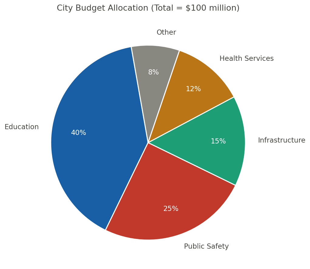
Based on the pie chart below, which category accounts for approximately three-eighths of the city's annual budget?
- Education (correct answer)
- Public Safety
- Infrastructure
- Health Services
Explanation: Three-eighths equals 37.5 %. The chart shows Education at 40 %, closest to and slightly above that fraction. Public Safety (25 %), Infrastructure (15 %), and Health (12 %) are all substantially smaller portions.
Question 2
A wildlife agency counted nesting pairs of a seabird on four islands (Table 1). A biologist notes that Island C had the highest count, with more pairs than Island A.
Which choice most effectively uses data from the table to complete the text?
- 120 more pairs, from 310 pairs (A) to 430 pairs (C) (correct answer)
- 90 more pairs, from 340 pairs (B) to 430 pairs (C)
- 120 more pairs, from 430 pairs (A) to 310 pairs (C)
- 90 more pairs, from 310 pairs (A) to 400 pairs (D)
Explanation: The biologist's claim requires data showing Island C's highest nesting pairs exceeding Island A by a specific count. Choice A cites 120 more pairs from 310 (A) to 430 (C), as 430−310=120, supporting C as highest. Choice C uses 120 more but reverses from 430 (A) to 310 (C), implying A exceeds C, contradicting the claim. Choice B shows 90 more from B to C, true but not comparing to A. When using tables for comparisons, select the specified items and direction to accurately reflect terms like 'more than.' Question 3
A climate summary lists the average monthly rainfall in a town for April through August. The summary notes that rainfall decreased each month from May to August, dropping from 78 mm in May to in August.
Which choice most effectively uses data from the table to complete the text?
- 42 mm
- 48 mm (correct answer)
- 52 mm
- 60 mm
Explanation: The summary notes rainfall decreased monthly from May to August, dropping from 78 mm in May to a specific amount in August, so data should show the August value fitting the decline pattern. The table lists August at 48 mm, consistent with decreases from 78 mm. Choices like D at 60 mm would not show a decrease if misreading months. In sequential data tables, confirm the direction of change across all periods mentioned.
Question 4
Researchers tested how four fertilizer treatments affected tomato yield in a greenhouse. Data from Table 1 show that while Treatment B had the highest average yield, the largest improvement over the no-fertilizer control occurred with .
Which choice most effectively uses data from the table to complete the text?
- Treatment B, increasing yield from 2.1 to 3.4 kg per plant (+1.3). (correct answer)
- Treatment D, increasing yield from 2.1 to 3.0 kg per plant (+0.9).
- Treatment C, increasing yield from 2.1 to 2.8 kg per plant (+0.7).
- Treatment A, increasing yield from 2.1 to 2.5 kg per plant (+0.4).
Explanation: The text notes that Treatment B had the highest average yield but asks for the treatment with the largest improvement over the no-fertilizer control of 2.1 kg per plant, so we need to calculate each treatment's gain from the table and identify the maximum difference. The table data show Treatment A at 2.5 kg (+0.4), B at 3.4 kg (+1.3), C at 2.8 kg (+0.7), and D at 3.0 kg (+0.9), confirming that B has the largest improvement of +1.3 kg, as stated in choice A. Choice B incorrectly selects Treatment D with +0.9, which is not the largest, perhaps confusing a moderate yield with the biggest gain. Choice D picks Treatment A with the smallest gain of +0.4, likely from miscalculating differences or focusing only on final yields. To build data literacy in such questions, subtract the control value from each treatment to compute improvements, then compare those deltas directly rather than the absolute yields.
Question 5
A climate summary lists average annual rainfall in a region from 2018 to 2022 (Figure 1). The summary claims rainfall was highest in 2020 and exceeded 2019 by millimeters.
Which choice most effectively uses data from the line graph to complete the text?
- 140 mm, from 760 mm in 2019 to 900 mm in 2020 (correct answer)
- 120 mm, from 780 mm in 2018 to 900 mm in 2020
- 140 mm, from 900 mm in 2019 to 760 mm in 2020
- 120 mm, from 760 mm in 2019 to 880 mm in 2021
Explanation: The summary's claim requires data showing 2020's highest rainfall exceeding 2019 by a specific millimeters. From the line graph, choice A notes 140 mm from 760 mm in 2019 to 900 mm in 2020, calculating 900 minus 760 as 140. Choice C cites 140 mm but reverses from 900 in 2019 to 760 in 2020, implying lower in 2020, opposing highest. Choice B shows 120 mm from 2018 to 2020, accurate but not 2019 comparison. When reading line graphs, verify peaks and calculate differences in the correct direction for exceeding claims.
Question 6
Researchers tested four fertilizers on tomato plants and recorded average yield per plant (Figure 1). In a summary, they claim Fertilizer C produced the highest average yield, exceeding Fertilizer A by .
Which choice most effectively uses data from the bar graph to complete the text?
- 0.7 kg per plant, from 3.1 kg (A) to 3.8 kg (C) (correct answer)
- 0.4 kg per plant, from 3.4 kg (B) to 3.8 kg (C)
- 0.7 kg per plant, from 3.8 kg (C) to 3.1 kg (A)
- 0.4 kg per plant, from 3.1 kg (A) to 3.5 kg (D)
Explanation: The researchers' claim requires data showing Fertilizer C's yield exceeds Fertilizer A's by a specific amount, emphasizing C as highest. From the bar graph, choice A cites 0.7 kg per plant from 3.1 kg (A) to 3.8 kg (C), correctly calculating the difference as 3.8 minus 3.1. Choice C uses the same 0.7 kg but reverses the order from 3.8 kg (C) to 3.1 kg (A), implying A exceeds C, which contradicts the claim. Choice B accurately notes a 0.4 kg difference but compares B to C instead of A to C, missing the required pairing. In bar graphs, always confirm labels and directions to avoid reversing comparisons or selecting incorrect bars.
Question 7
A city transportation office summarized ridership by mode in 2019 and 2023 (Table 1). An analyst argues that total ridership increased primarily because bus ridership grew sharply; specifically, bus ridership rose by .
Which choice most effectively uses data from the table to complete the text?
- about 12 million trips, from 38 million in 2019 to 50 million in 2023 (correct answer)
- about 6 million trips, from 44 million in 2019 to 50 million in 2023
- about 12 million trips, from 50 million in 2019 to 62 million in 2023
- about 6 million trips, from 38 million in 2019 to 44 million in 2023
Explanation: The analyst's claim requires data evidencing a sharp increase in bus ridership from 2019 to 2023 to support that it primarily drove total ridership growth. Choice A effectively uses the table's data by stating an increase of about 12 million trips from 38 million in 2019 to 50 million in 2023, as 50 minus 38 equals 12, aligning with a substantial rise. In contrast, choice C cites a 12 million increase but from 50 million in 2019 to 62 million in 2023, which mismatches typical table values and could represent incorrect year labels. Choices B and D show smaller 6 million increases, which accurately calculate differences but do not convey 'sharp' growth as strongly. When interpreting tables, carefully match row labels like modes and column labels like years to extract accurate changes supporting the specific claim.
Question 8
Researchers tested four soil treatments and measured plant height after 6 weeks. They argue that Treatment C produced taller plants than Treatment A by .
Which choice most effectively uses data from the bar graph to complete the text?
- 4 cm, with 22 cm under Treatment C and 18 cm under Treatment A (correct answer)
- 3 cm, with 21 cm under Treatment C and 18 cm under Treatment A
- 4 cm, with 20 cm under Treatment C and 16 cm under Treatment A
- 5 cm, with 23 cm under Treatment C and 18 cm under Treatment A
Explanation: The researchers argue Treatment C produced taller plants than A by a specific amount, needing data comparing heights with the correct difference. The bar graph shows 22 cm for Treatment C and 18 cm for A, a 4 cm difference. Choice C also gives a 4 cm difference but with incorrect heights of 20 cm and 16 cm, likely a misreading of bars. Choice B understates to 3 cm using different values. When interpreting bar graphs, measure heights precisely and confirm they match the claimed comparison.
Question 9
A city transportation office tracked average weekday ridership on its light-rail system from 2019 to 2023. Using data from Figure 1, an analyst noted that ridership fell sharply in 2020 but then increased each year afterward, with the largest year-to-year gain occurring between .
Which choice most effectively uses data from the line graph to complete the text?
- 2021 and 2022, rising from 48,000 to 60,000 riders (+12,000).
- 2020 and 2021, rising from 35,000 to 48,000 riders (+13,000). (correct answer)
- 2022 and 2023, rising from 60,000 to 68,000 riders (+8,000).
- 2019 and 2020, rising from 62,000 to 35,000 riders (+27,000).
Explanation: The analyst notes that ridership fell sharply in 2020 but increased each year afterward, with the largest year-to-year gain in that post-2020 period, so we need to calculate the positive changes from the line graph and identify the maximum. Using the data provided in the choices, the increases are +13,000 riders from 35,000 in 2020 to 48,000 in 2021, +12,000 from 48,000 to 60,000 in 2021-2022, and +8,000 from 60,000 to 68,000 in 2022-2023, making 2020-2021 the largest as in choice B. Choice D claims a rise from 62,000 in 2019 to 35,000 in 2020 with +27,000, but this is actually a decrease of -27,000 and falls outside the post-2020 timeframe, misrepresenting both direction and period. Choice A cites +12,000 for 2021-2022, which is accurate but not the largest gain. In line graph trend questions, focus on the specified time frame, calculate differences carefully, and note the direction (gain vs. loss) to connect data to the claim accurately.
Question 10
A regional energy summary lists electricity generation by source in 2024. An analyst notes that renewable sources (wind plus solar) together generated more electricity than coal by gigawatt-hours (GWh).
Which choice most effectively uses data from the table to complete the text?
- 40 GWh, with wind+solar at 260 GWh and coal at 220 GWh (correct answer)
- 60 GWh, with wind+solar at 280 GWh and coal at 220 GWh
- 20 GWh, with wind+solar at 240 GWh and coal at 220 GWh
- 40 GWh, with wind+solar at 260 GWh and coal at 200 GWh
Explanation: The analyst notes renewables (wind plus solar) exceeded coal by a specific GWh, requiring summed renewables higher than coal with matching difference. The table lists wind plus solar at 260 GWh and coal at 220 GWh, a 40 GWh excess. Choice D uses the same 40 but with coal at 200 GWh, which would actually be 60 GWh, showing inconsistent math. Choice B inflates to 60 with different sums. In tables, perform calculations like sums and differences yourself to validate stated figures.
Question 11
A demographer charted the population (in millions) of a region from 2000 to 2020. The demographer notes that the population grew fastest between 2010 and 2015, increasing by million.
Which choice most effectively uses data from the line graph to complete the text?
- 2.4 million, from 12.1 million in 2010 to 14.5 million in 2015 (correct answer)
- 2.0 million, from 12.5 million in 2010 to 14.5 million in 2015
- 2.4 million, from 12.1 million in 2010 to 14.1 million in 2015
- 1.8 million, from 12.1 million in 2010 to 13.9 million in 2015
Explanation: The demographer notes fastest growth between 2010 and 2015 by a specific million, requiring the largest increase in that period. The line graph shows from 12.1 to 14.5 million, a 2.4 million rise. Choice C states 2.4 but to 14.1, actually 2.0, inconsistent. Choice B understates to 2.0. Trace exact periods in line graphs to avoid misaligned data points.
Question 12
A study compared average quiz scores for students using different study strategies (Table 1). The authors claim that practice testing led to the highest average score, beating rereading by points.
Which choice most effectively uses data from the table to complete the text?
- 11 points, from 74 (rereading) to 85 (practice testing) (correct answer)
- 8 points, from 77 (flashcards) to 85 (practice testing)
- 11 points, from 85 (rereading) to 74 (practice testing)
- 8 points, from 74 (rereading) to 82 (summarizing)
Explanation: The authors' claim requires data showing practice testing's highest score beating rereading by a specific points. Choice A cites 11 points from 74 (rereading) to 85 (practice testing), as 85 minus 74 equals 11, confirming superiority. Choice C uses 11 points but reverses from 85 (rereading) to 74 (practice testing), suggesting rereading beats testing, contradicting the claim. Choice B shows 8 points from flashcards to testing, true but wrong strategy comparison. In tables, ensure comparisons and directions align with specific claims to avoid misattributing highest values.
Question 13
A school compared the average minutes students spent reading for pleasure per day across four grade levels. The principal claims that reading time declines steadily from 6th grade to 9th grade, with 9th graders reading minutes per day on average.
Which choice most effectively uses data from the table to complete the text?
- 28 minutes, compared with 44 minutes for 6th graders (correct answer)
- 32 minutes, compared with 44 minutes for 6th graders
- 28 minutes, compared with 38 minutes for 7th graders
- 32 minutes, compared with 34 minutes for 8th graders
Explanation: The principal claims reading time declines from 6th to 9th grade, with 9th graders at a specific average, so data should show 9th graders' time and a comparison supporting the decline. The table lists 44 minutes for 6th graders and 28 for 9th, illustrating the drop. Choice D uses 32 minutes, which might fit if misreading grades, but doesn't match the lowest for 9th. Choice C compares to 7th graders, irrelevant to the overall trend claim. In tables with sequences, verify the full pattern like steady decline before filling specifics.
Question 14
Urban ecologists tracked the number of native bee species observed in four city parks in 2010 and again in 2020. The researchers argue that the park with the largest increase in native bee species over the decade was .
Which choice most effectively uses data from the table to complete the text?
- Park B, which showed the greatest gain in native bee species over the decade among the four parks studied (correct answer)
- Park A, which showed a steady rise in native bee species but ended the decade below the highest final count
- Park D, which showed the smallest starting count of native bee species and modest growth over the decade
- Park C, which reached the highest final count of native bee species by the end of the decade in 2020
Explanation: The researchers claim the park with the largest increase in bee species over the decade is a specific one, so we need data showing the greatest numerical gain for that park. The table shows Park B increasing from 18 to 33 species, a 15-species gain, which is larger than the 9, 8, and 7 gains in other choices. Choice D might attract because Park C ends at 34, the highest final count, but the claim focuses on increase, not final total. Choice B shows a smaller gain for Park A, misidentifying the park with the maximum change. In table questions, calculate changes yourself rather than assuming highest final values indicate greatest growth.
Question 15
A nutrition survey recorded the percentage of adults who reported eating fruit daily in four age groups. The researchers note that daily fruit consumption generally increases with age, with the highest rate occurring in the group.
Which choice most effectively uses data from the bar graph to complete the text?
- 18–29 group at 41%
- 30–44 group at 46%
- 45–64 group at 52%
- 65+ group at 58% (correct answer)
Explanation: The researchers note daily fruit consumption increases with age, with the highest in a specific group, so data should show progressively higher percentages culminating in the oldest group. The bar graph indicates rates of 41% for 18–29, 46% for 30–44, 52% for 45–64, and 58% for 65+, confirming the peak in the 65+ group. Choice A might mislead by highlighting the lowest rate, but the claim specifies the highest. In bar graphs, scan all categories to confirm patterns like increases before selecting the extreme value.
Question 16
An environmental study measured average particulate matter (PM2.5) in four neighborhoods (Table 1). The study notes that Downtown had the highest PM2.5 level, exceeding Riverside by micrograms per cubic meter (μg/m3).
Which choice most effectively uses data from the table to complete the text?
- 6.4 μg/m3, from 9.8 (Riverside) to 16.2 (Downtown) (correct answer)
- 4.1 μg/m3, from 12.1 (Uptown) to 16.2 (Downtown)
- 6.4 μg/m3, from 16.2 (Riverside) to 9.8 (Downtown)
- 4.1 μg/m3, from 9.8 (Riverside) to 13.9 (Industrial)
Explanation: The study's claim requires data showing Downtown's highest PM2.5 exceeding Riverside by specific μg/m³. Choice A cites 6.4 μg/m³ from 9.8 (Riverside) to 16.2 (Downtown), calculating 16.2 minus 9.8 as 6.4. Choice C uses 6.4 but reverses from 16.2 (Riverside) to 9.8 (Downtown), suggesting lower in Downtown. Choice B shows 4.1 from Uptown to Downtown, true but wrong neighborhood. When reading tables, match specified entries and direction to evidence 'exceeding' accurately.
Question 17
An education nonprofit tracked the percentage of students meeting a math benchmark in four schools. The nonprofit claims that School B outperformed School D by percentage points.
Which choice most effectively uses data from the table to complete the text?
- 9 points, with School B at 64% and School D at 55% (correct answer)
- 11 points, with School B at 66% and School D at 55%
- 9 points, with School B at 64% and School D at 57%
- 7 points, with School B at 62% and School D at 55%
Explanation: The nonprofit claims School B outperformed School D by specific points, needing percentage data with the correct difference. The table shows School B at 64% and D at 55%, a 9-point gap. Choice C states 9 points but with D at 57%, actually 7 points, inconsistent. Choice B inflates to 11 with wrong B value. Recalculate differences in tables to verify option accuracy against the claim.
Question 18
A university tracked acceptance rates for four departments (Table 1). A student newspaper claims the Arts department was the most selective, with an acceptance rate percentage points lower than Engineering.
Which choice most effectively uses data from the table to complete the text?
- 12 points lower, from 38% (Engineering) to 26% (Arts) (correct answer)
- 9 points lower, from 35% (Science) to 26% (Arts)
- 12 points lower, from 26% (Engineering) to 38% (Arts)
- 9 points lower, from 38% (Engineering) to 29% (Business)
Explanation: The newspaper's claim requires data showing Arts' lowest acceptance rate, lower than Engineering by specific points. Choice A cites 12 points lower from 38% (Engineering) to 26% (Arts), as 38 minus 26 equals 12, confirming more selective. Choice C uses 12 points lower but reverses from 26% (Engineering) to 38% (Arts), implying higher in Arts. Choice B shows 9 points from Science to Arts, accurate but wrong department. In tables, calculate differences directionally to support comparative terms like 'lower than.'
Question 19
A physics class measured the distance a cart traveled (meters) under four different applied forces. The teacher notes that distance increased as force increased, and that the cart traveled 3.4 meters when the force was 4 newtons.
Which choice most accurately represents information from the line graph?
- At 4 N, the cart traveled 3.4 m, higher than 2.6 m at 3 N (correct answer)
- At 4 N, the cart traveled 3.4 m, lower than 3.6 m at 5 N
- At 4 N, the cart traveled 3.6 m, higher than 2.6 m at 3 N
- At 4 N, the cart traveled 3.4 m, lower than 3.2 m at 3 N
Explanation: The question asks for the choice that most accurately represents information from the line graph, given the teacher's note that distance increased with force and was specifically 3.4 meters at 4 newtons, so we need a statement with correct values and comparisons that align with this trend without errors. Choice A accurately cites the graph's data, stating that at 4 N the cart traveled 3.4 m, which is higher than 2.6 m at 3 N, matching the given value and demonstrating the increasing trend with specific numbers. A key distractor is choice C, which misstates the distance at 4 N as 3.6 m instead of 3.4 m, possibly from misreading the line's position or scale on the graph. Another distractor, choice D, correctly uses 3.4 m at 4 N but wrongly claims it is lower than 3.2 m at 3 N, which is mathematically incorrect since 3.4 > 3.2 and contradicts the increasing distance trend. In graph-based questions, always cross-check the exact values and directional comparisons like 'higher' or 'lower' against the visualization and any provided details to ensure the statement is factually accurate.
Question 20
A sports scientist recorded average heart rate (beats per minute) during four workout segments. The scientist states that the highest average heart rate occurred during Segment 3 at .
Which choice most accurately represents information from the bar graph?
- 152 bpm
- 158 bpm (correct answer)
- 160 bpm
- 165 bpm
Explanation: The scientist states highest heart rate in Segment 3 at a specific bpm, requiring the graph's tallest bar there. The bar graph shows 158 bpm in Segment 3, the peak. Choices like C at 160 might result from overestimating the bar height. Precisely read scale values in bar graphs to avoid approximation errors.