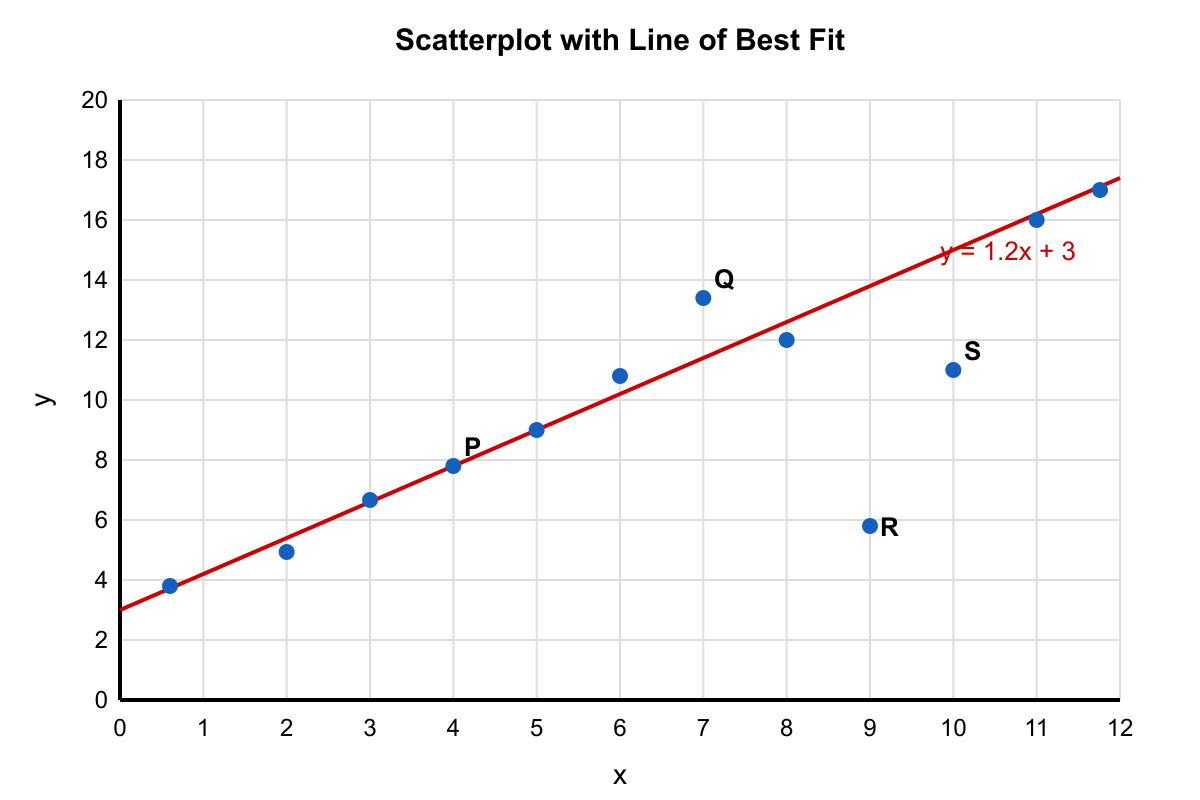
The scatterplot above shows 12 data points, and a line of best fit is drawn. Of the points labeled P, Q, R, and S on the scatterplot, which has the residual with the greatest absolute value?
Practice Scatter Plots in PSAT Math with focused quiz questions that help you check what you know, review explanations, and build confidence with test-style prompts.
What this quiz covers
This quiz focuses on Scatter Plots, giving you a quick way to practice the rules, question types, and explanations that matter most for PSAT Math.
How to use this quiz
Try each quiz question before looking at the correct answer. Use the explanations to review missed ideas, then come back to similar questions until the pattern feels familiar.
All questions
Question 1
The scatterplot above shows 12 data points, and a line of best fit is drawn. Of the points labeled P, Q, R, and S on the scatterplot, which has the residual with the greatest absolute value?
P
Q
R (correct answer)
S
Explanation: Residual magnitude is the vertical distance from a point to the line of best fit. Point R is visually farthest from the line in the vertical direction (about 8 units below the line). P is on the line, Q is about 2 units above, and S is about 4 units below. Thus R has the greatest |residual|.
Question 2
The scatterplot shown displays the number of ice cream cones sold at a beach stand on 15 summer days, with high temperature on the x-axis. The line of best fit is y=14x−600. If the actual sales on a day with temperature 80°F was 480 cones, what is the residual for that day?
−40 (correct answer)
40
520
1,000
Explanation: Predicted sales: 14(80)−600=1120−600=520. Residual = actual − predicted = 480−520=−40. Choice B reverses the sign. Choice C is the predicted value. Choice D comes from 14×80−(−600), a sign error in the intercept.
Question 3
A scientist measured the amount of fertilizer applied to 11 plants and the resulting plant height after 6 weeks. The scatterplot shows fertilizer (grams) on the x-axis and height (centimeters) on the y-axis. A dashed line of best fit is included. What does the slope of the line of best fit represent in this context?
The predicted increase in plant height (cm) for each additional gram of fertilizer. (correct answer)
The predicted increase in fertilizer (g) for each additional centimeter of height.
The plant height when fertilizer is 1 gram.
The total height increase for all plants combined.
Explanation: This question asks about the meaning of the slope in the context of fertilizer and plant height. In a scatterplot with fertilizer (grams) on the x-axis and height (cm) on the y-axis, the slope represents the change in y per unit change in x. Therefore, the slope tells us the predicted increase in plant height (cm) for each additional gram of fertilizer applied. A common error is reversing the interpretation (choice B) - remember that slope is always rise over run, or change in y over change in x. The slope does not represent a specific height value (choice C) or a total (choice D), but rather a rate of change.
Question 4
Based on the scatter plot shown, which statement best characterizes the relationship between daily study time and quiz score for the 12 students?
There is a strong positive linear association between the two variables. (correct answer)
There is a strong negative linear association between the two variables.
There is no apparent association between the two variables.
The association is positive but clearly nonlinear (curved).
Explanation: The points rise steadily from left to right, forming an upward-sloping cloud that is roughly straight, indicating a strong positive linear relationship. B is wrong because the pattern is increasing, not decreasing. C is wrong because a clear trend is visible. D is wrong because the pattern does not show noticeable curvature; it is approximately linear.
Question 5
Based on the scatter plot shown, what is the best estimate of the y-intercept of the line of best fit?
2 (correct answer)
4
-2
10
Explanation: The drawn best-fit line crosses the y-axis at approximately (0,2). Therefore, the y-intercept is about 2. The other numbers do not match the visible intercept point.
Question 6
N
14
28 (correct answer)
42
104
Explanation: The predicted difference is the slope times the difference in x: 3.5(12−4)=3.5(8)=28. Choice A uses 4 sessions instead of 8. Choice C uses 12. Choice D is the predicted score at x=12 (3.5(12)+62=104), not the difference.
Question 7
A store manager compared the price of a product to the number of units sold in 9 different weeks. The scatterplot (Price vs. Units Sold) shows a negative association. Which claim is supported by the scatterplot, without assuming causation?
Raising the price will always cause sales to drop by the same amount.
Weeks with higher prices tend to be associated with fewer units sold. (correct answer)
Weeks with higher prices tend to be associated with more units sold.
Price and units sold show no relationship in the data.
Explanation: This question asks which claim is supported by the scatterplot of price versus units sold, without assuming causation. The plot shows a negative association, with points trending downward, meaning higher prices link to fewer units sold across the weeks. Referencing the data pattern, the supported claim is that weeks with higher prices tend to be associated with fewer units sold, emphasizing correlation over cause. This avoids overreaching into causation like choice A. Common errors include assuming causation or misinterpreting the direction as positive (choice C) or none (choice D). Another mistake is implying constancy in the relationship, ignoring variability. When evaluating scatterplots, prioritize descriptive statements about associations to distinguish them from inferential claims in data literacy.
Question 8
A gardener measured the amount of fertilizer used and the height of tomato plants after 6 weeks for 9 plants. The scatterplot (Fertilizer vs. Plant Height) includes a line of best fit. What does the slope of the line of best fit represent in this context?
The predicted plant height when 0 grams of fertilizer are used.
The increase in plant height (cm) for each additional gram of fertilizer, on average. (correct answer)
The number of grams of fertilizer needed for each additional centimeter of height.
The difference between the tallest and shortest plant heights in the data set.
Explanation: The question asks what the slope of the line of best fit represents in the context of fertilizer amount versus plant height. The scatterplot shows a positive linear trend, with points spreading around the line, indicating that more fertilizer is generally linked to taller plants after 6 weeks. The slope, calculated as the change in height per unit change in fertilizer, represents the average increase in plant height (in cm) for each additional gram of fertilizer. This interpretation references the line's steepness and its real-world meaning in the data pattern. Common errors include confusing slope with y-intercept (choice A) or inverting the relationship (choice C). Another mistake is interpreting it as a range rather than a rate (choice D). When examining lines of best fit, focus on slope as a rate of change to build skills in interpreting visual trends descriptively.
Question 9
Examine the scatter plot. Which equation best models the linear relationship between the two variables?
y≈−0.03x+40
y≈−0.3x+4
y≈−3x+40 (correct answer)
y≈3x−40
Explanation: The points fall along a line that decreases about 3 units in y for every 1 unit increase in x and crosses the y-axis near 40, matching choice C. Choice A has too small a slope, B has correct intercept but wrong scale, and D has the wrong sign for the slope.
Question 10
Based on the scatter plot shown, which value is the most reasonable estimate of the correlation coefficient r between the two variables?
r≈−0.85 (correct answer)
r≈−0.20
r≈0.30
r≈0.90
Explanation: The points cluster tightly around a downward-sloping line, indicating a strong negative association, so r should be close to −1, with −0.85 the best of the given values. B shows only a weak negative correlation, C a weak positive, and D a strong positive—none of which match the graph.
Question 11
Based on the scatter plot above, which of the following points, if added, would most DECREASE the strength of the linear relationship?
(5, 52)
(9, 31)
(12, 80)
(14, 15) (correct answer)
Explanation: The existing data show a moderate positive trend: as x increases, y roughly increases. Point (14, 15) lies far below the trend line at a large x-value, making it a leveraged outlier that would pull the correlation downward. Points A and B fall near the present trend, while C also extends the trend upward, so they would either maintain or strengthen the correlation.
Question 12
Using the scatter plot shown, which of the following predicted values is LEAST reliable because it requires the greatest amount of extrapolation beyond the data?
The value of y when x=0
The value of y when x=3
The value of y when x=4
The value of y when x=7 (correct answer)
Explanation: The plotted data cover x-values from 1 to 6. Predicting at x=7 goes furthest beyond this range, making it the least reliable extrapolation. The prediction at x=0 is also outside the data but is closer than 7. Choices B and C are within the data range and therefore interpolations.
Question 13
Based on the scatter plot shown, what is the residual for the data point at x=6 when the line of best fit has equation y=2x+1?
1 (correct answer)
-1
7
-7
Explanation: For x=6, the line predicts y=2(6)+1=13. The actual plotted value is 14, so the residual (actual − predicted) is 14 − 13 = 1. B gives the negative of this value, and C and D confuse the difference in location with the residual.
Question 14
Consider the scatter plot shown. If the additional point (10, 90) were added to the data set, how would the correlation coefficient r most likely change?
r would increase because the point continues the upward trend. (correct answer)
r would decrease because the point is an outlier weakening the trend.
r would remain the same because adding points never changes r.
r would become 0 because the data would be uncorrelated.
Explanation: The existing points form an upward trend that appears to approach (9, 85). The new point (10, 90) is consistent with that pattern, so it would strengthen the linear relationship and make r larger in magnitude. B is incorrect because the point is not an outlier relative to the trend. C is false; adding any point can change r. D is obviously false because the relationship would not become uncorrelated.
Question 15
Use the scatter plot above to answer the question: According to the line of best fit shown, what is the best estimate of the selling price of a 7-year-old car?
$9,000
$10,000 (correct answer)
$11,000
$13,000
Explanation: The best-fit line descends roughly $2,000 for every additional year and crosses about $24,000 when the car is new. Substituting 7 years gives $24,000 − $2,000(7) = $10,000. The other values are either too low or too high relative to the plotted trend.
Question 16
The scatter plot displays plant height over time with a line of best fit given by y=4.5x+32, where x is days after planting and y is height in centimeters. What does the slope 4.5 represent in this context?
The plant's height increases about 4.5 centimeters for each additional day after planting. (correct answer)
The plant's height increases about 32 centimeters each day after planting.
The plant's height increases about 4.5 days for every additional centimeter of height.
On day 0, the plant's height is about 4.5 centimeters.
Explanation: Slope is rise over run, so 4.5 means the height (centimeters) rises 4.5 for every 1 day. B confuses slope with intercept. C inverts the units, and D confused slope with y-intercept.
Question 17
The scatterplot shown displays the mean SAT math score, y, of students in 15 schools versus the percentage, x, of students receiving free or reduced-price lunch at the school. The line of best fit is y=−2.4x+640. Which of the following is the best interpretation of the y-intercept in context?
The predicted mean SAT math score at a school where no students receive free or reduced-price lunch is 640. (correct answer)
The mean SAT math score decreases by 640 points for each 1% increase in students receiving free or reduced-price lunch.
The mean SAT math score remains constant at 640 points, regardless of the percentage of students receiving lunch assistance.
At a school where the mean SAT math score is 640, the model predicts that no students receive free lunch.
Explanation: The y-intercept is the predicted y-value when x=0, which here means the predicted mean SAT math score when 0% of students receive free/reduced-price lunch. Choice B confuses the intercept with the slope. Choice C ignores that the line has nonzero slope. Choice D reverses the roles of x and y and misstates a prediction as a certainty.
Question 18
The scatterplot above shows the relationship between x and y for 12 points. Curves A, B, C, and D are also shown. Which curve best models the data?
Curve A: y=2x+3
Curve B: y=0.5x2+1
Curve C: y=8x (correct answer)
Curve D: y=3(1.5)x
Explanation: The data points (1, 8), (4, 16), (9, 24), (16, 32) fit y=8x exactly: 81=8,84=16,89=24,816=32. Curve A (linear) underpredicts at small x and misses curvature. Curve B (parabolic upward) grows much too fast (at x=16 it predicts 129). Curve D (exponential) grows explosively (at x=16 it predicts about 1,500). Only curve C matches the concave-down, slowly increasing shape of the data.
Question 19
The scatterplot shown represents the relationship between outdoor temperature, in °F, and the daily electricity usage, in kilowatt-hours, for a household over 20 days. Which of the following best describes the association?
Positive and linear
Negative and linear
Nonlinear (U-shaped) (correct answer)
No association
Explanation: Electricity usage is high at low temperatures (heating) and high at high temperatures (air conditioning), with a minimum in the middle range. This produces a U-shaped (nonlinear) pattern. A purely linear description—positive or negative—misses the minimum at moderate temperatures. There is clearly an association, so choice D is wrong.
Question 20
The scatterplot displays the relationship between the length of a pendulum, L, in meters, and the period, T, in seconds, for 10 pendulums. Which of the following statements is best supported by the scatterplot?
As length increases, period increases linearly at a constant rate.
As length increases, period increases, but at a decreasing rate. (correct answer)
As length increases, period decreases.
There is no association between length and period.
Explanation: The scatter shows period increasing with length but with a clearly concave-down (square-root-like) shape: going from L = 0.25 to 1.0 produces a larger change than from L = 1.5 to 2.25. This indicates an increasing but decelerating relationship, consistent with T=2πL/g. Choice A (linear) ignores the curvature. Choice C contradicts the positive trend. Choice D ignores the strong association.