All questions
Question 1
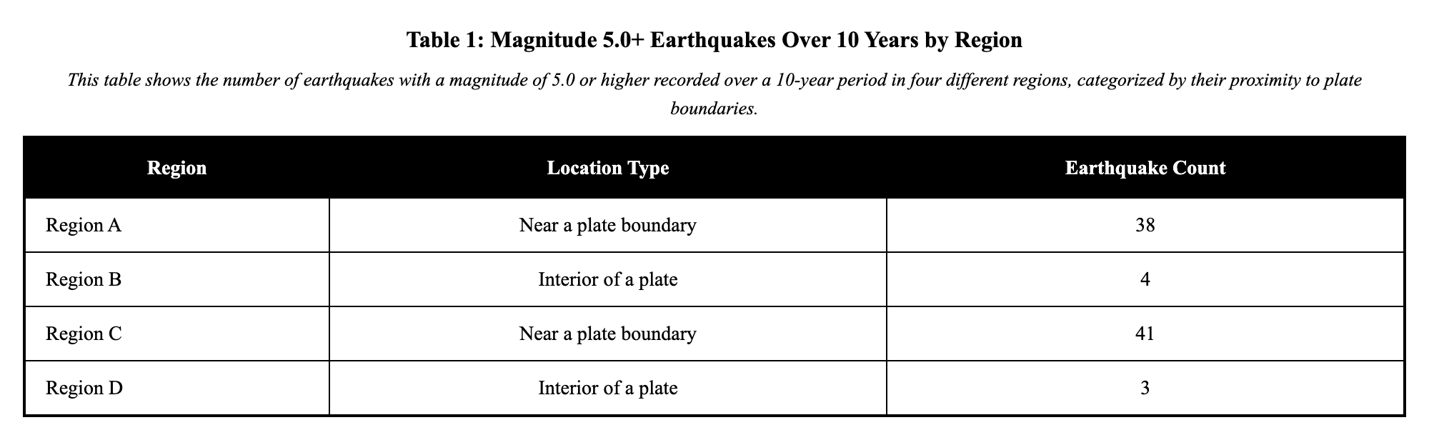
Earthquake records for four regions over 10 years are shown in the table (each count is earthquakes of magnitude 5.0+). Based on the data, which statement about earthquake patterns is supported?
Table: Magnitude 5.0+ earthquakes over 10 years
- Region A (near a plate boundary): 38
- Region B (interior of a plate): 4
- Region C (near a plate boundary): 41
- Region D (interior of a plate): 3
Use the pattern in the table to choose the best supported statement about risk.
- Earthquake risk is about the same everywhere because every region had at least one earthquake.
- Earthquakes are clustered near plate boundaries because Regions A and C have many more events than B and D. (correct answer)
- The region with the single largest earthquake must be the one with the most earthquakes.
- Because Regions B and D had few earthquakes, earthquakes cannot happen there in the future.
Explanation: Using data to identify hazard patterns involves examining records of events like earthquakes to spot where and when they occur more frequently. Hazards such as earthquakes are not evenly distributed across the Earth's surface but tend to concentrate in specific areas due to underlying geological features. Data from multiple regions can show clustering, with some areas experiencing many more events than others, revealing trends linked to factors like plate boundaries. To check for patterns, look for repeated high counts in certain locations across the dataset, comparing them to lower counts elsewhere. A common misconception is that if every area has at least one event, the risk is equal everywhere, but this ignores the uneven clustering that indicates varying risk levels. Recognizing these patterns allows us to assess which areas might have higher risk in the future. Even without certainty, such patterns help communities prepare more effectively for potential hazards.
Question 2
A class compares two volcano chains using the table of eruption counts from the last 30 years.
Table: Eruptions in 30 years
- Chain P (island arc near a trench): 22
- Chain Q (hot spot in the middle of a plate): 6
Which conclusion is supported by the data and shows how patterns help assess risk?
- Chain Q is more dangerous because it is in the middle of a plate, so it must erupt more often.
- Eruptions are clustered more in Chain P during this period, so areas near Chain P show higher volcanic risk based on this record. (correct answer)
- Because Chain P had many eruptions, it will stop erupting for the next 30 years.
- The counts do not matter because one eruption can happen anywhere at any time with equal chance.
Explanation: Using data to identify hazard patterns means comparing counts of events like volcanic eruptions in different chains to detect differences. Hazards like eruptions are not evenly distributed but cluster more in certain geological settings. Tables can show trends with much higher numbers in one chain over a period. Check by looking for consistent disparities in counts across the dataset. A misconception is that location doesn't matter since events can occur anywhere equally, but data reveals clustering. Patterns inform higher risk near active areas. This aids in risk evaluation, acknowledging unpredictability.
Question 3
A region is divided into four zones on a map. The dots show where floods were reported after heavy rain last year (each dot = one reported flood). Zone 3 has 14 dots clustered along a river, while Zones 1, 2, and 4 have 2, 3, and 1 dots scattered.
Which prediction is most reasonable based on the pattern (without being certain)?
- Future floods are more likely in Zone 3 near the river because past floods cluster there. (correct answer)
- Future floods are equally likely in all zones because rain falls across the whole region.
- Future floods are most likely in Zone 4 because it had the fewest dots last year.
- Future floods will not happen in Zones 1, 2, and 4 because they had few dots.
Explanation: Using data to identify hazard patterns requires examining maps of events like flood reports to find spatial groupings. Hazards like floods are not evenly distributed across zones but often cluster near features such as rivers. Dot maps can show higher densities in certain areas, indicating trends influenced by geography. A strategy is to compare counts and clustering across zones in the data. One misconception is that since rain affects everywhere, risks are equal, ignoring concentrated patterns. These patterns help predict areas of higher future likelihood. They enhance risk assessment and preparation, without claiming absolute certainty.
Question 4
Two coastal cities, Harborview and Sandport, track hurricane landfalls nearby.
The scatter plot shows landfall locations (dots) along the coastline over 25 years. The two cities are marked with stars.
Based on the clustering in the plot, where is a future landfall more likely (not certain) to occur?
- Near Harborview, because dots are clustered around that part of the coast, suggesting higher local risk there. (correct answer)
- Exactly halfway between the two cities, because hazards always spread out evenly over time.
- Near Sandport, because there are fewer dots there and nature "balances out" where storms hit.
- At whichever city has the larger population, because hurricanes mainly target human activity.
Explanation: Using data from scatter plots helps us identify patterns in natural hazards such as hurricane landfalls along coastlines. These hazards are not evenly distributed but cluster near certain locations. Plots can show dots grouping around specific cities, indicating spatial trends in likelihood. To check for patterns, examine if landfalls repeatedly cluster in the same areas over decades. A common misconception is that hazards balance out evenly or target populated areas equally, but data reveals clustering. Recognizing these patterns assists in assessing where future events are more probable. Even without certainty, this knowledge improves risk evaluation and community readiness.
Question 5
Two nearby valleys (Valley X and Valley Y) recorded the number of flood days (days when water covered roads) each month. Use the table to compare patterns.
- Valley X has a spring–early summer cluster of flood days, so those months show higher flood risk there.
- Both valleys have the same flood risk because they are nearby.
- Valley Y's single flood day in February proves February is always the worst month for floods everywhere.
- Because Valley X has some months with zero floods, floods cannot occur there during those months.
Explanation: Using data to identify hazard patterns means reviewing monthly records of events like flood days to find temporal concentrations. Hazards such as floods are not evenly distributed throughout the year but often cluster in specific seasons due to weather patterns. Tables can illustrate trends where certain months show repeated high numbers of events in one location compared to others. To check, look for consistent peaks in particular months across the dataset. One misconception is that nearby areas always share the same risk, but data can reveal distinct clustering in each. These patterns allow for better risk assessment in specific times and places. While not certain, they guide planning to reduce potential impacts.
Question 6
A geology class plotted locations of recent volcano eruptions and earthquakes on the same regional map. The points form a curved band rather than being spread evenly. What does this pattern suggest about risk, based on the evidence that hazards are clustered and not random?
- Risk is highest along the curved band where both hazards cluster, and lower farther away, even though events can still occur elsewhere. (correct answer)
- Risk is the same everywhere because volcanoes and earthquakes are unrelated.
- Risk is highest in the middle of the map because maps usually place the most important area in the center.
- Risk is highest far from the band because hazards avoid areas where they happened before.
Explanation: Using data to identify hazard patterns involves plotting events like volcanoes and earthquakes on maps to observe spatial relationships. Hazards are not evenly distributed, often aligning in bands due to tectonic activity. The data shows clustering along curved lines, revealing trends where multiple hazards overlap. Check for patterns by noting repeated points in the same band across different event types. A misconception is that risks are equal everywhere if hazards are unrelated, but shared patterns indicate connected risks. Recognizing these clusters helps evaluate higher danger in specific zones. Even without predicting exact events, patterns support informed risk reduction strategies.
Question 7
A student claims: "Volcanoes can erupt anywhere on Earth with equal chance, so location doesn't matter." The map legend below summarizes where 18 recent eruptions were recorded.
Map summary (each dot = one eruption):
- Along the West Coast subduction zone: 12 dots
- Along a mid-ocean ridge: 5 dots
- In the continental interior far from plate boundaries: 1 dot
Which claim is incorrect because it treats volcanic eruptions as randomly distributed?
- "Eruptions are more common near plate boundaries than far from them."
- "The interior had fewer eruptions in this record, but that does not mean eruptions are impossible there."
- "Because most dots are near boundaries, those areas show higher volcanic risk based on past patterns."
- "Because eruptions can happen anywhere, every location has equal volcanic risk no matter the pattern on the map." (correct answer)
Explanation: Using data to identify hazard patterns involves mapping events like volcanic eruptions to see if they concentrate in particular locations. Hazards like volcanoes are not evenly distributed but are often linked to specific geological zones such as plate boundaries. Maps with dots representing eruptions can show clustering near these zones, with fewer occurrences elsewhere. A useful checking strategy is to count and compare the density of events in different areas across the map. A common misconception is that since eruptions can happen anywhere, every location has equal risk, treating them as random when data shows otherwise. Recognizing nonrandom patterns helps assess varying risk levels across regions. This knowledge supports better preparedness, even if future events can't be predicted perfectly.
Question 8
An emergency planner has a map showing earthquake epicenters (dots) over the past 15 years. The dots form a dense band along a fault line in the east part of the map, with only a few scattered dots elsewhere.
Which conclusion is best supported by this spatial pattern and helps assess earthquake risk?
- Earthquakes are caused only by human activity, so the fault-line band is not meaningful.
- Earthquake risk is higher near the fault-line band because epicenters are clustered there. (correct answer)
- The scattered dots prove earthquakes are equally likely everywhere on the map.
- Because the east already had many earthquakes, it cannot have another one soon.
Explanation: Using data to identify hazard patterns includes mapping spatial distributions of events like earthquake epicenters to detect concentrations. Hazards like earthquakes are not evenly distributed but cluster along features such as fault lines due to tectonic activity. Maps can show dense bands of events in certain areas, with sparser occurrences elsewhere. A checking strategy is to observe repeated groupings in specific map sections across the time frame. A misconception is that scattered events mean equal likelihood everywhere, overlooking the clear clustering. Patterns like these help evaluate higher risk zones. They inform safety measures, recognizing that risks persist without full predictability.
Question 9
A coastal city council wants to choose a location for a new emergency shelter. The map shows hurricane landfalls over the last 40 years. Based on the pattern (clusters vs. sparse areas), where is a future landfall more likely compared with other areas, and how does this help assess risk?
- Near the cluster of past landfalls, because repeated landfalls in the same coastal section suggest higher risk there. (correct answer)
- Only in places with zero past landfalls, because storms avoid places they have hit before.
- Exactly at the single strongest storm point, because the biggest event always repeats in the same spot.
- Equally along the entire coast, because hurricanes can travel in any direction at any time.
Explanation: Using data to identify hazard patterns involves mapping past events like hurricane landfalls to spot likely future areas. Hazards are not evenly distributed, tending to repeat in clustered coastal sections due to storm paths. The data shows trends with dense points in specific areas over decades. Check for patterns by noting repeated landfalls near the same spots across years. A misconception is that risks are equal along the entire coast since storms can go anywhere, but clustering indicates uneven probabilities. These patterns aid in assessing higher risk zones for decisions like shelter placement. Even without guarantees, historical data enhances risk management planning.
Question 10
The bar graph shows the number of hurricanes that made landfall in three coastal regions over the same 15-year period.
Which conclusion is supported by the data about where hurricanes are most frequent (and therefore where risk is higher)?
- Region 2 has the highest hurricane risk because it has the most landfalls in the graph. (correct answer)
- All three regions have equal hurricane risk because hurricanes can form anywhere over the ocean.
- Region 3 has the highest hurricane risk because it has the lowest bar (fewer storms means storms are stronger).
- No region has higher risk because the future must be the opposite of the past pattern.
Explanation: Using data from graphs enables us to identify patterns in natural hazards such as hurricanes across regions. These hazards are not evenly distributed but tend to affect some areas more frequently than others. Data might show higher numbers of landfalls in certain coastal regions, highlighting spatial trends in frequency. To check for patterns, look for consistently higher bars or counts in the same regions over multiple years. A common misconception is that all regions have equal risk because hazards can occur anywhere, but graphs prove otherwise. Recognizing these patterns helps compare hurricane risk between different areas. Even without certainty, this information supports better risk assessment and preparedness strategies.
Question 11
The map shows flood reports (blue dots) along a river system after several storms. The river and its tributaries are drawn as lines.
Which statement about the flood pattern is supported by the map evidence (showing floods are not randomly distributed in space)?
- Flood reports are clustered along the main river channel and near tributary junctions, suggesting those areas have higher flood risk than upland areas far from the river. (correct answer)
- Flood reports are spread evenly across the entire region, so every location has the same flood risk.
- Flood reports are mostly in the north, so the river must flow north (direction can be determined from dot location alone).
- Because some areas have no dots, flooding is impossible there in the future.
Explanation: Using data from maps helps us identify patterns in natural hazards such as floods along river systems. These hazards are not evenly distributed but cluster in specific landscape features. Maps might show reports grouping near main channels and tributaries, revealing spatial trends. To check for patterns, look for repeated concentrations in the same areas after multiple events. A common misconception is that absences mean impossibility or that risks are equal everywhere, but data shows clustering. Recognizing these patterns allows for evaluating higher risk zones. Though future events aren't guaranteed, this aids in effective planning and mitigation.
Question 12
A map shows 30 years of earthquake epicenters (dots) and two proposed locations for a new hospital (Site 1 and Site 2).
Site 1 is near a dense cluster of dots along a fault line. Site 2 is far from the cluster, in an area with very few dots.
Which statement is best supported by the map for assessing risk (without claiming certainty)?
- Site 2 likely has lower earthquake risk than Site 1 because past earthquakes cluster near Site 1, and patterns help compare risk between locations. (correct answer)
- Site 1 is safer because the cluster shows the earthquakes already happened there, so that area is finished having earthquakes.
- Both sites have exactly the same risk because earthquakes can happen anywhere at any time.
- Site 2 has zero risk because there are no dots exactly on the Site 2 symbol.
Explanation: Using data from maps allows us to identify patterns in natural hazards like earthquakes for site selection. These hazards are not evenly distributed but concentrate near features like faults. Maps often show dense clusters of epicenters in certain areas, highlighting spatial trends. To check for patterns, look for repeated events near the same sites over many years. A common misconception is that past events make an area safer or that all locations have identical risk, but evidence shows differences. Recognizing these patterns helps compare relative risks between potential sites. Although nothing is certain, patterns inform safer choices for infrastructure.
Question 13
A student looks at a map of hurricane tracks and says: "The dots are spread out across the ocean, so hurricanes do not have any pattern." The map summary below describes the dot locations.
Map summary (each dot = one hurricane position at 12:00 UTC each day):
- 70% of dots fall within a narrow curved band that arcs toward the northwest
- 30% of dots are outside the band
Which statement is the best evidence-based response to the student that recognizes nonrandom patterns?
- The narrow band shows clustering, so hurricane tracks follow a common pathway more often than other paths, which helps assess risk for places near the band. (correct answer)
- Because some dots are outside the band, there is no pattern and hurricanes are equally likely to travel in any direction.
- The band means hurricanes can only occur inside it, so places outside it are safe.
- The band exists because people build cities there, which causes hurricanes to move that way.
Explanation: Using data to identify hazard patterns includes analyzing maps of events like hurricane tracks to find common pathways. Hazards such as hurricanes are not evenly distributed but often follow clustered routes due to atmospheric steering. Summaries can show a majority of positions within a narrow band, indicating a trend. Verify by checking the percentage of events repeating in the same area across the map. A misconception is that any spread means no pattern and equal likelihood everywhere, yet concentrations prove otherwise. Recognizing these patterns helps assess risks along frequent paths. It supports better forecasting and readiness, even without perfect predictions.