All questions
Question 1
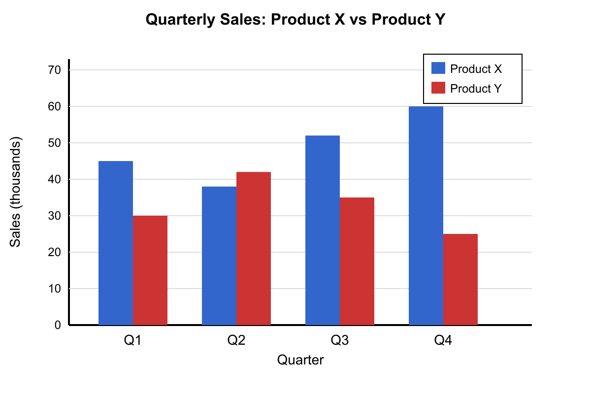
The bar chart displays quarterly sales data for two products over one year. In which quarter was the difference between Product X and Product Y sales the greatest?
- Quarter 1 had the greatest difference in sales between products
- Quarter 2 had the greatest difference in sales between products
- Quarter 3 had the greatest difference in sales between products
- Quarter 4 had the greatest difference in sales between products (correct answer)
Explanation: Calculating differences: Q1: |45-30| = 15, Q2: |38-42| = 4, Q3: |52-35| = 17, Q4: |60-25| = 35. Quarter 4 has the largest difference of 35 units. Choice A (Q1) has difference of 15. Choice B (Q2) has the smallest difference of 4. Choice C (Q3) has difference of 17.
Question 2
The multiple line graph tracks the daily temperature, humidity, and wind speed for one week. On which day was the difference between temperature and humidity the smallest?
- Monday had the smallest difference between temperature and humidity
- Wednesday had the smallest difference between temperature and humidity
- Friday had the smallest difference between temperature and humidity (correct answer)
- Sunday had the smallest difference between temperature and humidity
Explanation: Calculating differences (Temperature - Humidity): Monday: 75-60=15, Tuesday: 78-55=23, Wednesday: 80-50=30, Thursday: 82-45=37, Friday: 85-82=3, Saturday: 88-75=13, Sunday: 90-70=20. Friday has the smallest difference at 3 units. Choice A (Monday) has difference of 15. Choice B (Wednesday) has difference of 30. Choice D (Sunday) has difference of 20.
Question 3
The frequency table shows the distribution of student heights in a physical education class. What percentage of students are 66 inches or taller?
- Approximately 43% of students are 66 inches or taller
- Approximately 47% of students are 66 inches or taller (correct answer)
- Approximately 53% of students are 66 inches or taller
- Approximately 57% of students are 66 inches or taller
Explanation: Students 66 inches or taller: 66-67 inches (8 students) + 68-69 inches (6 students) + 70+ inches (3 students) = 17 students. Total students: 4 + 7 + 6 + 8 + 6 + 3 = 34 students. Percentage: 17/34 = 0.47 = 47%. Choice A uses 15/34. Choice C uses 18/34. Choice D uses 19/34.
Question 4
The table shows the results of rolling two dice 50 times and recording the sum. Based on this experimental data, what is the experimental probability of rolling a sum of 7?
- The experimental probability of rolling a sum of 7 is 508 (correct answer)
- The experimental probability of rolling a sum of 7 is 509
- The experimental probability of rolling a sum of 7 is 61 based on theoretical calculations
- The experimental probability of rolling a sum of 7 is 366 from the sample space
Explanation: From the frequency table, a sum of 7 occurred 8 times out of 50 rolls. Experimental probability = 8/50 = 4/25. Choice B uses an incorrect frequency count. Choice C gives the theoretical probability (1/6 ≈ 0.167), not experimental. Choice D gives the theoretical probability in unreduced form (6/36 = 1/6), not experimental.
Question 5
The stacked bar chart shows the composition of three different trail mixes by ingredient type. Which trail mix has the highest proportion of nuts?
- Mix A has the highest proportion of nuts at approximately 45%
- Mix B has the highest proportion of nuts at approximately 50% (correct answer)
- Mix C has the highest proportion of nuts at approximately 40%
- Mix A and Mix B have equal proportions of nuts at 45%
Explanation: Looking at the stacked bars: Mix A has nuts from 20% to 60% (40% nuts). Mix B has nuts from 15% to 65% (50% nuts). Mix C has nuts from 25% to 60% (35% nuts). Mix B has the highest proportion at 50%. Choice A incorrectly calculates Mix A's proportion. Choice C incorrectly identifies Mix C. Choice D incorrectly states equal proportions.
Question 6
The stem-and-leaf plot shows test scores for Ms. Garcia's math class. What is the median score for the class?
- The median test score is 78
- The median test score is 79 (correct answer)
- The median test score is 80
- The median test score is 81
Explanation: From the stem-and-leaf plot, the scores in order are: 65, 67, 72, 75, 76, 78, 78, 79, 79, 82, 84, 85, 88, 91, 93. With 15 scores, the median is the 8th value, which is 79. Choice A (78) is the 6th and 7th values. Choice C (80) is not in the data set. Choice D (81) is also not in the data set.
Question 7
The double bar graph compares the number of books read by boys and girls in grades 6-8 during the summer reading program. What is the ratio of total books read by girls to total books read by boys across all three grades?
- The ratio of girls' total to boys' total is 3:2
- The ratio of girls' total to boys' total is 4:3
- The ratio of girls' total to boys' total is 5:4 (correct answer)
- The ratio of girls' total to boys' total is 7:5
Explanation: From the graph: Girls read 45 + 52 + 48 = 145 books total. Boys read 36 + 44 + 36 = 116 books total. The ratio 145:116 simplifies to 5:4 (since 145 ÷ 29 = 5 and 116 ÷ 29 = 4). Choice A (3:2) would represent 174:116. Choice B (4:3) would represent approximately 155:116. Choice D (7:5) would represent approximately 162:116.
Question 8
The circle graph shows how a student spends their 24-hour day. Based on this data, how many hours does the student spend on activities other than sleeping and school?
- The student spends 6 hours on other activities during the day
- The student spends 7 hours on other activities during the day
- The student spends 8 hours on other activities during the day
- The student spends 9 hours on other activities during the day (correct answer)
Explanation: From the circle graph: Sleep = 37.5% of 24 hours = 9 hours, School = 25% of 24 hours = 6 hours. Other activities = 24 - 9 - 6 = 9 hours. Alternatively, other activities represent 37.5% (homework + recreation + meals), which equals 9 hours. Choice A represents 25% of 24 hours. Choice B represents about 29% of 24 hours. Choice C represents 33% of 24 hours.
Question 9
Based on the histogram shown, which statement about the data distribution is most accurate?
- The median value falls in the interval 20-30
- The mean is greater than the median due to positive skewness (correct answer)
- Exactly 25% of the data points fall below the value 15
- The distribution shows negative skewness with a left tail
Explanation: The histogram shows frequencies of 5, 12, 18, 15, 8, 2 from left to right, creating a distribution with a long right tail. This positive skew pulls the mean above the median. Choice A is incorrect because with 60 total data points, the median (30th and 31st values) falls in the 10-20 interval. Choice C is incorrect because only 5 out of 60 points (8.3%) fall below 15. Choice D incorrectly describes the skew direction.
Question 10
The table shows survey results about favorite school subjects from students in three different grades. If a student who chose Science as their favorite is randomly selected, what is the probability that this student is in 8th grade?
- The probability is 7518 that the Science student is in 8th grade
- The probability is 4518 that the Science student is in 8th grade (correct answer)
- The probability is 2518 that the Science student is in 8th grade
- The probability is 7545 that the Science student is in 8th grade
Explanation: Total students who chose Science: 12 + 15 + 18 = 45. Students in 8th grade who chose Science: 18. Probability = 18/45 = 2/5. Choice A uses total students (75) instead of Science students. Choice C uses only 8th grade totals (25). Choice D uses total Science students as numerator instead of 8th grade Science students.
Question 11
The dot plot shows the number of pets owned by students in Mr. Thompson's class. What is the mode of this data set?
- The mode is 1 pet because it appears most frequently
- The mode is 2 pets because it appears most frequently (correct answer)
- The mode is 3 pets because it appears most frequently
- There is no mode because multiple values appear equally often
Explanation: Counting the dots: 0 pets (3 dots), 1 pet (5 dots), 2 pets (7 dots), 3 pets (4 dots), 4 pets (2 dots), 5 pets (1 dot). The value 2 pets appears 7 times, which is more frequent than any other value. Choice A incorrectly identifies 1 pet (5 occurrences). Choice C incorrectly identifies 3 pets (4 occurrences). Choice D is incorrect since there is a clear single mode.
Question 12
The back-to-back stem-and-leaf plot compares test scores for two different teaching methods. What can be concluded about the effectiveness of the two methods?
- Method A produces higher scores with less variation (correct answer)
- Method B produces higher scores with less variation
- Method A shows greater variability than Method B
- Method B shows greater variability than Method A
Explanation: Method A scores: 68, 72, 74, 76, 78, 82, 84, 86, 88, 90, 92 (median = 82, range = 24). Method B scores: 55, 58, 62, 65, 68, 70, 72, 75, 78, 80, 85 (median = 70, range = 30). Method A has both a higher median score and smaller range, indicating higher performance with less variability. Choice B incorrectly reverses which method is superior. Choices C and D focus only on variability while ignoring the significant difference in score levels.
Question 13
The histogram displays the distribution of quiz scores for a statistics class. Based on the shape of the distribution, which measure of central tendency would be most appropriate to report?
- The mean would be most appropriate because the distribution is symmetric
- The median would be most appropriate because the distribution is skewed left (correct answer)
- The median would be most appropriate because the distribution is skewed right
- The mode would be most appropriate because it shows the most common score
Explanation: The histogram shows higher frequencies on the right side (higher scores) with a tail extending to the left (lower scores), indicating left skew. When data is skewed, the median is more appropriate than the mean because it's less affected by extreme values. Choice A is incorrect because the distribution is not symmetric. Choice C incorrectly identifies the skew direction. Choice D is incorrect because mode is rarely the most appropriate single measure of central tendency.
Question 14
The table shows the number of students in each grade who participated in different after-school activities. If a student is randomly selected from those who participate in Drama, what is the probability that the student is in 10th grade?
- 458
- 258 (correct answer)
- 208
- 4525
Explanation: From the table, 8 students in 10th grade participate in Drama, and the total number of students participating in Drama is 12 + 8 + 5 = 25. Therefore, the probability is 258. Choice A uses the total number of students (45) as the denominator instead of just Drama participants. Choice C uses only 9th and 10th grade Drama participants (20) as the denominator. Choice D uses the number of 10th graders in all activities as the numerator. Question 15
The scatter plot displays the relationship between hours of study time and test scores for 20 students. Which conclusion is best supported by the data?
- Studying for more than 8 hours guarantees a test score above 85
- The correlation coefficient is approximately -0.7, indicating strong negative correlation
- There is a moderate positive relationship, but some students score well with minimal study time (correct answer)
- The relationship is perfectly linear with no variation around the trend line
Explanation: The scatter plot shows a general upward trend (positive correlation) between study hours and test scores, but with notable scatter around the trend line. Some students achieve high scores (80+) with only 2-3 hours of study. Choice A is incorrect because one student studied 9 hours but scored only 78. Choice B is wrong because the correlation is positive, not negative. Choice D is incorrect because there is considerable variation around any potential trend line.
Question 16
The box plot shown represents the distribution of daily temperatures (in °F) for a city during March. Based on this plot, approximately what percentage of days had temperatures between 45°F and 55°F?
- 25% of the days had temperatures in this range
- 50% of the days had temperatures in this range
- 75% of the days had temperatures in this range
- Cannot be determined from the box plot alone (correct answer)
Explanation: Box plots show the five-number summary (minimum, Q1, median, Q3, maximum) but do not provide information about the distribution of data within the quartiles. We can see that Q1 is at 45°F and Q3 is at 55°F, meaning 50% of data falls between these values, but we cannot determine what percentage falls in any subinterval without knowing the actual data distribution within the interquartile range.
Question 17
The two-way table shows the relationship between grade level and participation in extracurricular activities. What is the probability that a randomly selected 10th grader participates in extracurricular activities?
- The probability is 12045 for a 10th grader to participate
- The probability is 7545 for a 10th grader to participate (correct answer)
- The probability is 7530 for a 10th grader to participate
- The probability is 20045 for a 10th grader to participate
Explanation: Among 10th graders, 45 participate in activities out of 75 total 10th graders. The probability is 45/75 = 3/5. Choice A uses total participants (120) instead of total 10th graders. Choice C uses non-participants (30) as numerator. Choice D uses the total student population (200) as denominator.
Question 18
The cumulative frequency graph shows the distribution of test scores for 80 students. How many students scored between 70 and 85 points?
- 20 students scored between 70 and 85 points
- 25 students scored between 70 and 85 points
- 30 students scored between 70 and 85 points (correct answer)
- 35 students scored between 70 and 85 points
Explanation: From the cumulative frequency graph: at score 85, cumulative frequency is 65; at score 70, cumulative frequency is 35. Students scoring between 70 and 85 = 65 - 35 = 30 students. Choice A (20) would be the difference between other points. Choice B (25) might result from misreading the graph values. Choice D (35) is the cumulative frequency at 70, not the difference.
Question 19
The frequency polygon displays test score distributions for two different classes. Based on the graph, which statement about the two classes is most accurate?
- Class A has higher scores overall with a mean around 85 points
- Class B shows more variability in scores with a wider distribution range (correct answer)
- Both classes have identical medians but different standard deviations from the center
- Class A has a bimodal distribution while Class B shows normal distribution patterns
Explanation: Class B's frequency polygon shows data spread from 40 to 95 points with relatively even distribution, indicating high variability. Class A's data clusters more tightly around 70-85. Choice A is incorrect because Class A's peak is around 75-80, not 85. Choice C cannot be determined from frequency polygons alone. Choice D is incorrect because Class A shows one peak (unimodal), and Class B is not clearly normal.
Question 20
The scatter plot shows the relationship between hours of TV watching per week and GPA for high school students. Which statement best describes what the data reveals about outliers?
- There are no outliers present in this data set based on the scatter pattern
- One student watches 25 hours of TV but maintains a 3.8 GPA, making them an outlier (correct answer)
- Multiple students with 0-5 hours of TV have GPAs below 2.0, making them outliers
- The student with 30 hours of TV and 1.5 GPA represents the expected trend, not an outlier
Explanation: The general trend shows that more TV watching correlates with lower GPA. A student watching 25 hours (high TV time) but maintaining a 3.8 GPA (high academic performance) goes against this trend, making them an outlier. Choice A is incorrect because outliers are present. Choice C is incorrect because low GPA with low TV time follows the negative correlation. Choice D is incorrect because 30 hours/1.5 GPA follows the expected trend.