All questions
Question 1
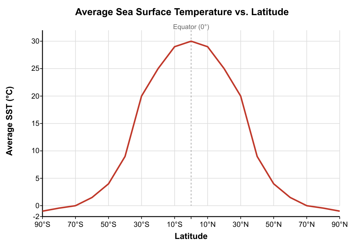
The graph shows the average sea surface temperature (SST) as a function of latitude. What is the most reasonable estimate for the average rate of SST change per degree of latitude between the Equator (0°) and 40°N?
- -1.50 °C/degree latitude
- +0.58 °C/degree latitude
- -0.45 °C/degree latitude (correct answer)
- -2.20 °C/degree latitude
Explanation: First, read the SST values from the graph at the specified latitudes. At the Equator (0°), the SST is approximately 28°C. At 40°N, the SST is approximately 10°C. The change in temperature is ΔT = 10°C - 28°C = -18°C. The change in latitude is ΔLat = 40°N - 0° = 40°. The rate of change is ΔT / ΔLat = -18°C / 40° = -0.45 °C/degree latitude. The negative sign indicates temperature decreases as one moves north from the equator.
Question 2
The graph shows a tidal record for a coastal location over 48 hours. Based on the pattern, what is the approximate tidal range during the first day's spring tide high water?
- 1.5 meters
- 2.0 meters
- 3.0 meters
- 3.5 meters (correct answer)
Explanation: First, identify the pattern. This is a semidiurnal tide, with two high and two low tides per day. The question assumes the graph shows a spring tide, which is characterized by the maximum tidal range. The tidal range is the vertical distance between a high tide and the subsequent low tide. On the first day (0 to 24 hours), the first high tide is at ~+2.0 m. The following low tide is at ~-1.5 m. The tidal range is the difference between these two levels: 2.0 m - (-1.5 m) = 3.5 m.
Question 3
The graph shows the average salinity gradient for a halocline in a particular basin. If a CTD sensor is lowered from the top of this halocline at 50 m to the bottom at 200 m, what is the total expected increase in salinity?
- 0.02 psu
- 1.5 psu
- 3.0 psu (correct answer)
- 4.5 psu
Explanation: The graph shows the salinity gradient, which is the change in salinity per unit depth (psu/m). The y-axis value is constant at 0.02 psu/m throughout the halocline. To find the total change in salinity, multiply the gradient by the thickness of the halocline. The thickness (Δz) is 200 m - 50 m = 150 m. The total salinity increase (ΔS) is Gradient × Δz = (0.02 psu/m) × (150 m) = 3.0 psu.
Question 4
The time-series graph shows dissolved oxygen and chlorophyll-a concentrations over one year at a fixed depth in a temperate coastal ocean. What is the most likely explanation for the sharp increase in dissolved oxygen during April and May?
- A decrease in water temperature, which increases the solubility of oxygen gas.
- A major phytoplankton bloom, where photosynthetic activity produces large amounts of oxygen. (correct answer)
- Increased wind and wave action, which mixes atmospheric oxygen into the water column.
- The decomposition of organic matter from the previous season, which releases stored oxygen.
Explanation: The graph shows a strong correlation between the peak in chlorophyll-a (an indicator of phytoplankton biomass) and the peak in dissolved oxygen. Photosynthesis, carried out by phytoplankton, consumes carbon dioxide and produces oxygen. The large spike in chlorophyll-a in April-May signifies a spring bloom, and the corresponding spike in dissolved oxygen is a direct result of this intense primary production.
Question 5
The graph illustrates the relationship between the mixed layer depth (MLD) and the top of the thermocline. If seasonal warming causes the surface temperature to increase from T1 to T2, how would the MLD and thermocline likely change?
- The MLD would deepen and the thermocline would become weaker.
- The MLD would become shallower and the thermocline would become stronger (sharper gradient). (correct answer)
- The MLD would remain constant, but the thermocline would shift to a greater depth.
- The MLD would become shallower, but the thermocline's temperature gradient would remain the same.
Explanation: Seasonal warming increases the temperature of the surface water. This increases the temperature difference between the surface and the deep water, making the thermocline stronger (a sharper gradient). A stronger thermocline creates greater density stratification, which inhibits vertical mixing. As a result, wind energy can only mix the water to a shallower depth, causing the mixed layer depth (MLD) to become shallower.
Question 6
The graphs show satellite data for sea surface temperature (SST) and chlorophyll-a concentration off the coast of California during a two-week period. What oceanographic process is best supported by these data?
- A warm-core eddy is moving onshore, bringing warm, nutrient-poor water to the coast.
- A period of intense coastal upwelling, where wind-driven currents bring cold, nutrient-rich deep water to the surface. (correct answer)
- A large river discharge event, which lowers coastal salinity and introduces terrestrial nutrients, causing a phytoplankton bloom.
- Seasonal surface warming, which is increasing the metabolic rate of phytoplankton and causing them to flourish.
Explanation: The graphs show a strong inverse correlation: as SST near the coast drops significantly (from 14°C to 10°C), the chlorophyll-a concentration increases dramatically. This is the classic signature of coastal upwelling. Winds parallel to the coast drive surface water offshore (due to Ekman transport), and it is replaced by cold water from below. This deep water is rich in nutrients (like nitrates and phosphates), which fertilize the phytoplankton in the sunlit surface waters, causing a massive bloom and thus a high chlorophyll-a concentration.
Question 7
The provided graph shows the relationship between ocean wave properties. A weather buoy in the open ocean, where the water depth is 1500 meters, measures waves with a wavelength of 200 meters. According to the graph and the definition of a deep-water wave, what would be the approximate period of these waves?
- 6 seconds
- 9 seconds
- 11 seconds (correct answer)
- 14 seconds
Explanation: First, confirm the wave type. The depth is 1500 m. The condition for a deep-water wave is Depth > Wavelength/2. Here, 1500 m > 200 m / 2, or 1500 m > 100 m. The condition is met, so we use the 'Deep-Water Waves' curve. Second, find the wavelength of 200 m on the x-axis. Trace vertically up to the 'Deep-Water Waves' curve. Third, trace horizontally to the left to read the corresponding value on the y-axis for Wave Period. The value is approximately 11 seconds.
Question 8
A contour plot of seawater density is shown as a function of temperature and salinity. A water sample is collected that has a temperature of 5°C and a salinity of 34.5 psu. A second sample from a different location has a temperature of 15°C and a salinity of 35.5 psu. What is the approximate difference in density between the two samples?
- The second sample is approximately 1.5 kg/m³ denser than the first.
- The first sample is approximately 2.0 kg/m³ denser than the second. (correct answer)
- The two samples have nearly identical densities.
- The first sample is approximately 1.0 kg/m³ denser than the second.
Explanation: To solve this, find the density of each sample from the contour plot. For Sample 1: locate 5°C on the y-axis and 34.5 psu on the x-axis. The point falls on the contour line labeled 1027.5 kg/m³. For Sample 2: locate 15°C on the y-axis and 35.5 psu on the x-axis. This point falls on the contour line labeled 1025.5 kg/m³. The difference is 1027.5 kg/m³ - 1025.5 kg/m³ = 2.0 kg/m³. The first sample (colder, slightly less salty) is denser than the second sample (warmer, slightly saltier).