All questions
Question 1
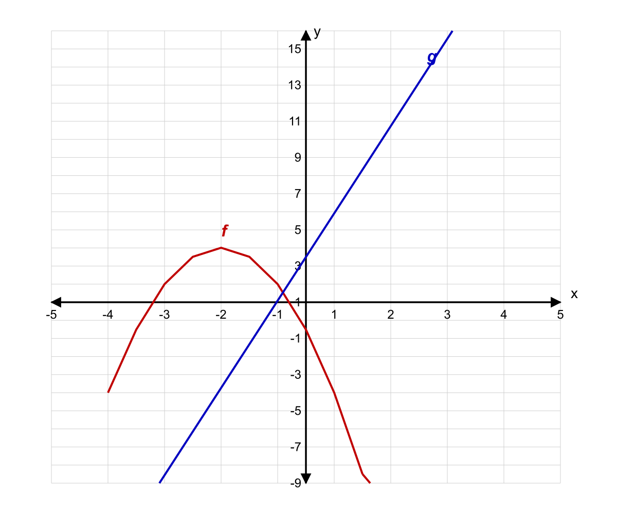
The coordinate plane below shows the graphs of two functions f(x) and g(x). Based on the graphs shown, for how many integer values of x in the interval [−4, 4] is f(x) > g(x)?
- 3
- 4 (correct answer)
- 5
- 6
Explanation: f(x) = x² − 4 and g(x) = 2x. Evaluate at each integer in [−4,4]: x=−4: f(16−4)=12, g(−8), so 12>−8 ✓. x=−3: f(9−4)=5, g(−6), so 5>−6 ✓. x=−2: f(4−4)=0, g(−4), so 0>−4 ✓. x=−1: f(1−4)=−3, g(−2), so −3<−2 ✗. x=0: f(0−4)=−4, g(0), so −4<0 ✗. x=1: f(1−4)=−3, g(2), so −3<2 ✗. x=2: f(4−4)=0, g(4), so 0<4 ✗. x=3: f(9−4)=5, g(6), so 5<6 ✗. x=4: f(16−4)=12, g(8), so 12>8 ✓. Therefore f(x) > g(x) for x = −4, −3, −2, 4, which is 4 values.
Question 2
Use the bar chart to answer the question. What fraction of Orthodontics revenue came from the North region?
- 41 (correct answer)
- 31
- 83
- 21
Explanation: Orthodontics bar totals $400 k: North 100 k, South 120 k, East 90 k, West 90 k. North share = 100/400 = 1/4. Other fractions use wrong component or wrong total.
Question 3
The line graph shows the population of bacteria (in millions) in a culture over 6 hours. Based on the line graph shown, during which one-hour interval was the average rate of change in population greatest in magnitude?
- Hour 1 to Hour 2
- Hour 2 to Hour 3
- Hour 3 to Hour 4
- Hour 5 to Hour 6 (correct answer)
Explanation: Rates of change: Hour 1→2: 8−3 = +5. Hour 2→3: 18−8 = +10. Hour 3→4: 15−18 = −3. Hour 4→5: 9−15 = −6. Hour 5→6: 2−9 = −7. Greatest magnitude is |−7| = 7, during Hour 5 to Hour 6.
Distractor A: +5, smaller magnitude.
Distractor B: +10 is the greatest positive change; students ignoring 'magnitude' will pick this.
Distractor C: −3, smaller magnitude than Hour 5→6.
Question 4
The stacked bar chart below shows the number of patients (in hundreds) seen at a clinic each weekday, broken down by type of visit. Refer to the chart. What percentage of all Emergency visits for the week occurred on Wednesday and Thursday combined?
- 33.30%
- 40.00%
- 46.70%
- 53.30% (correct answer)
Explanation: Emergency visits per day: Mon 3, Tue 2, Wed 5, Thu 3, Fri 2. Total = 15. Wed + Thu = 5 + 3 = 8. Percentage = 8/15 ≈ 53.3%.
Distractor A: 5/15 = 33.3%, using only Wednesday.
Distractor B: 6/15 = 40%, miscounting Thursday's emergency segment as 1.
Distractor C: 7/15 ≈ 46.7%, using Wed=5, Thu=2 (misread).
Question 5
The histogram shows the frequency distribution of patient wait times (in minutes) at a dental office. Based on the histogram, which of the following best approximates the median wait time?
- 12.5 minutes
- 17.5 minutes (correct answer)
- 22.5 minutes
- 27.5 minutes
Explanation: Frequencies: 0–10: 8, 10–20: 22, 20–30: 18, 30–40: 10, 40–50: 2. Total = 60. Median is the average of the 30th and 31st values. Cumulative: after 0–10 → 8; after 10–20 → 30; after 20–30 → 48. The 30th value is the last in the 10–20 bin; the 31st is the first in the 20–30 bin. Using linear interpolation in the median class (10–20): median ≈ 10 + ((30−8)/22)×10 = 10 + 10 = 20. The 30th and 31st values straddle this; 17.5 (midpoint of the median bin) is the best choice of the options.
Distractor A: Midpoint of first large bin, but only 8 values lie in 0–10.
Distractor C: Midpoint of 20–30 bin; student who miscounts cumulative frequency.
Distractor D: Midpoint of 30–40 bin; would require median in upper tail.
Question 6
The box plot summarizes the distribution of ages of patients at a dental clinic. Based on the box plot shown, which of the following statements must be true?
- The mean age is 42.
- Exactly 25% of patients are between 30 and 42 years old.
- The interquartile range is 25. (correct answer)
- More than 75% of patients are younger than 50.
Explanation: From the box plot: Q1 = 30 and Q3 = 55. The interquartile range (IQR) = Q3 − Q1 = 55 − 30 = 25. Choice A is incorrect because box plots show the median (42), not the mean. Choice B is incorrect because while approximately 25% fall between Q1 and the median, the exact percentage depends on ties at boundaries. Choice D is incorrect because we cannot determine what percentage falls below 50 from the given information.
Question 7
The double bar graph compares the number of cavities found in two age groups across four different towns. Based on the graph, in which town is the ratio of Children's cavities to Adults' cavities closest to 3:5?
- Town W
- Town X
- Town Y (correct answer)
- Town Z
Explanation: Target ratio 3:5 = 0.60. Town W: 45/80 = 0.5625. Town X: 30/40 = 0.75. Town Y: 60/100 = 0.60. Town Z: 50/90 ≈ 0.556. Town Y matches exactly.
Distractor A: 0.5625, close to 0.6 but not the closest.
Distractor B: 0.75, matches 3:4, a common confusion.
Distractor D: 0.556, close but farther from 0.60 than Town Y.
Question 8
The cumulative frequency graph shows the distribution of exam scores for 200 students. Based on the cumulative frequency graph, approximately how many students scored between 60 and 80?
- 60 students
- 80 students
- 100 students (correct answer)
- 120 students
Explanation: From the cumulative graph: at score = 60, cumulative frequency ≈ 40; at score = 80, cumulative frequency ≈ 140. Students scoring between 60 and 80 = 140 − 40 = 100.
Distractor A: Confusing cumulative with a single bin value (e.g., just reading 60 mark).
Distractor B: Slight misreading of the cumulative values (e.g., 130−50).
Distractor D: Including students who scored above 80 up to 90, or misreading 160−40.
Question 9
The scatter plot shows the relationship between hours of study (x) and exam scores (y) for 10 students, along with the line of best fit. Based on the scatter plot, how many data points lie strictly above the line of best fit by more than 5 points on the y-axis?
- 2
- 3 (correct answer)
- 4
- 5
Explanation: Line of best fit: y = 5x + 50. For each data point, compare actual y to predicted y = 5x+50 and check if residual > 5. Points: (1,60): pred 55, residual +5 (NOT strictly >5). (2,58): pred 60, res −2. (3,72): pred 65, res +7 ✓. (4,68): pred 70, res −2. (5,82): pred 75, res +7 ✓. (6,78): pred 80, res −2. (7,90): pred 85, res +5 (not strictly). (8,88): pred 90, res −2. (9,102): pred 95, res +7 ✓. (10,98): pred 100, res −2. Three points satisfy: (3,72), (5,82), (9,102).
Distractor A: Missing one of the three qualifying points.
Distractor C: Including a point with residual exactly +5 (not strictly greater).
Distractor D: Counting all points above the line regardless of distance.
Question 10
Refer to the radar chart to answer the question. Which category shows the greatest difference between Clinic P and Clinic Q?
- Waiting Time (correct answer)
- Patient Satisfaction
- Treatment Variety
- Equipment Quality
Explanation: In the radar chart, Waiting Time spokes differ by 4 units (P = 3, Q = 7) while other spokes differ by at most 2. Therefore Waiting Time shows the greatest gap.
Question 11
Based on the trend line in the scatter plot below, which of the following best describes the correlation between age and amount spent on dental care?
- Strong positive correlation (correct answer)
- Weak positive correlation
- No correlation
- Strong negative correlation
Explanation: The plotted points consistently rise with only a handful of outliers--and even those furoutliers that do not fit the overall trend increase relative to one another. This shows a strong positive correlation. No or negative correlation do not fit the upward slope.
Question 12
The table below shows the cost and caloric content of four lunch options at a cafeteria. Based on the table, which option provides the lowest cost per 100 calories?
- Option I
- Option II
- Option III
- Option IV (correct answer)
Explanation: Cost per 100 calories = (Price / Calories) × 100. Option I: (6.00/600)×100 = $1.00. Option II: (7.50/750)×100 = $1.00. Option III: (4.80/400)×100 = $1.20. Option IV: (8.40/900)×100 ≈ $0.93. Option IV is lowest.
Distractor A: $1.00 — tied for second-lowest.
Distractor B: $1.00 — tied for second-lowest.
Distractor C: Lowest absolute price but highest cost/calorie.
Question 13
The table below shows the distribution of blood types among 400 donors at a blood drive. Based on the table, if one donor is selected at random, what is the probability that the donor is either Rh-negative OR has type AB blood (or both)?
- 0.19
- 0.22
- 0.23 (correct answer)
- 0.29
Explanation: Using inclusion-exclusion principle: P(Rh− OR AB) = P(Rh−) + P(AB) − P(Rh− AND AB). From the table: Rh-negative donors = 28 + 16 + 8 + 8 = 60, so P(Rh−) = 60/400 = 0.15. AB donors = 32 + 8 = 40, so P(AB) = 40/400 = 0.10. AB-negative donors = 8, so P(Rh− AND AB) = 8/400 = 0.02. Therefore: P(Rh− OR AB) = 0.15 + 0.10 − 0.02 = 0.23.
Question 14
The table below shows the number of units produced per hour by three machines during a workday. Based on the table, if the factory wants the overall average productivity per hour across all three machines to be at least 55 units/hour for an 8-hour shift, by how many units must the total daily output increase?
- 32 units
- 48 units
- 72 units
- 96 units (correct answer)
Explanation: Current totals per machine over 8 hours: Machine 1: 8×50 = 400. Machine 2: 8×55 = 440. Machine 3: 8×48 = 384. Grand total = 1224 units. For an overall average of 55 units/hour across all three machines for 8 hours: Total machine-hours = 3 machines × 8 hours = 24 machine-hours. Required total output = 55 × 24 = 1320 units. Needed increase = 1320 − 1224 = 96 units.
Distractor A: Using only 8 hours instead of 24 machine-hours in calculation.
Distractor B: Miscalculating the current total or required total.
Distractor C: Error in the target average or shift duration calculation.
Question 15
The table shows the quarterly revenue (in thousands of dollars) for a dental practice over two years. Based on the table shown, which quarter exhibited the largest percentage increase in revenue compared to the same quarter of the previous year?
- Q1
- Q2
- Q3 (correct answer)
- Q4
Explanation: Calculate percentage increase for each quarter: Q1: (132-120)/120 = 10.0%. Q2: (165-150)/150 = 10.0%. Q3: (198-160)/160 = 23.75%. Q4: (210-180)/180 = 16.67%. Q3 has the largest increase at 23.75%.
Distractor A (Q1): Only 10% increase, though the absolute dollar increase ($12K) may seem noteworthy.
Distractor B (Q2): Also 10%; students may pick this due to the larger absolute gain of $15K.
Distractor D (Q4): 16.67%, the second-largest; students who misread the table or calculate Q4 first may stop there.