All questions
Question 1
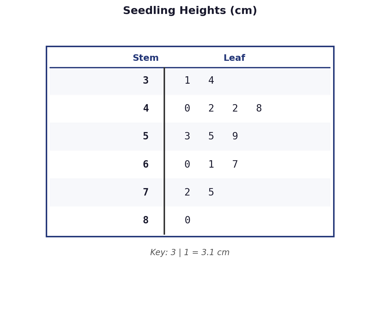
The stem-and-leaf plot shows the heights (in cm) of 15 seedlings. If the shortest seedling (height 3.1 cm) is removed from the data, which of the following measures of the dataset will increase?
I. The mean
II. The median
III. The standard deviation
- I only
- I and II only (correct answer)
- II and III only
- I, II, and III
Explanation: Original data (N=15): 3.1, 3.4, 4.0, 4.2, 4.2, 4.8, 5.3, 5.5, 5.9, 6.0, 6.1, 6.7, 7.2, 7.5, 8.0. The original median is the 8th value, which is 5.5 cm. The value being removed (3.1 cm) is the minimum value.
I. The mean: Removing a value that is below the original mean will cause the new mean to increase. This is true.
II. The median: After removing 3.1, there are N=14 data points. The new median is the average of the 7th and 8th values of the new list. The original 8th value was 5.5. The new 7th and 8th values are the original 8th and 9th values (5.5 and 5.9). The new median is (5.5 + 5.9)/2 = 5.7 cm. Since 5.7 > 5.5, the median increases.
III. The standard deviation: Removing an extreme value (the minimum) will make the data less spread out. Therefore, the standard deviation, a measure of spread, will decrease, not increase.
Thus, only the mean and the median will increase.
Question 2
A statistician creates a histogram for a large dataset with a bin width of 10 units. Finding the plot too coarse, she recreates the histogram using the same data but with a bin width of 2 units. Which of the following is the most likely consequence of this change?
- The general shape of the distribution will appear smoother and less detailed.
- The number of bars in the histogram will increase, potentially revealing features like bimodality. (correct answer)
- The apparent range of the data, as suggested by the x-axis, will decrease.
- The height of each frequency bar will increase to compensate for the narrower bins.
Explanation: Decreasing the bin width means the data is divided into more, narrower intervals. This will increase the number of bars in the histogram. While a very small bin width can create a noisy, jagged plot, changing from a coarse width (10) to a finer one (2) is likely to reveal more detail about the distribution's shape, such as gaps, clusters, or multiple modes, that were obscured by the larger bins. A smoother appearance (A) is associated with larger bin widths. The range of the data (C) is an intrinsic property and does not change. The frequency in each new, narrower bin will be smaller than the frequency in the original, wider bin it came from, so bar heights will generally decrease (D).
Question 3
A researcher wants to compare the distribution of salaries for recent graduates from two different universities, University A (sample size 18) and University B (sample size 21). She wants to use a graphical display that allows for a comparison of shape, center, and spread, while also preserving the actual data values. Which of the following displays would be most appropriate?
- A side-by-side boxplot
- Two separate histograms with identical axis scales
- A back-to-back stem-and-leaf plot (correct answer)
- A scatterplot with university as the categorical variable
Explanation: The key requirements are comparing two distributions and preserving the original data values. A back-to-back stem-and-leaf plot is specifically designed for comparing two small-to-medium sized datasets while showing every individual value. Side-by-side boxplots (A) are excellent for comparison but they hide individual values and distribution shape details. Histograms (B) also lose the original data values by grouping them into bins. A scatterplot (D) is used for examining the relationship between two quantitative variables, which is not the case here.
Question 4
An analyst is creating a histogram for a dataset of 150 integer exam scores, which range from 42 to 98. They choose the following class intervals: [40, 50), [50, 60), [60, 70), [70, 80), [80, 90). What is a significant flaw in this binning scheme?
- The bin widths are too large, which will hide important features of the data.
- The first bin starts at 40, even though the minimum score is 42.
- The scheme does not include a bin for scores from 90 to 98. (correct answer)
- Using a left-closed, right-open interval is incorrect for integer data.
Explanation: The data contains scores up to 98. The defined bins are [40, 50), [50, 60), [60, 70), [70, 80), and [80, 90). A score of 89 would fall into the last bin, but a score of 90, 91, ..., 98 would not be included in any of these bins because they are all greater than or equal to 90. The binning scheme is incomplete and would result in the omission of the highest scores. The other options are matters of choice or are less significant flaws. Starting a bin below the minimum (B) is common practice. The bin width (A) is a judgment call. The interval type (D) is a standard convention.
Question 5
An analyst is choosing between a dotplot and a histogram to display the weights of 35 newborn babies, recorded to the nearest tenth of a kilogram. Which statement provides the best rationale for choosing one plot over the other?
- A histogram is better because it can show the mean and median, whereas a dotplot cannot.
- A dotplot is better because it preserves each individual weight, which can be important for identifying gaps or multiple exact values. (correct answer)
- A histogram must be used for continuous data like weight, while a dotplot is only for discrete counts.
- A dotplot is better because its shape is less sensitive to the choice of bin width.
Explanation: The primary advantage of a dotplot (and stem-and-leaf plot) over a histogram is that it retains the individual data values. For a small dataset (N=35), this is feasible and valuable. It allows for precise calculation of all summary statistics and easy identification of features like gaps, clusters, and modes (especially repeated values). A histogram groups data, losing this granularity. (A) is false; center can be estimated from a histogram. (C) is false; dotplots can represent continuous data, especially when rounded. (D) is a key advantage of dotplots; their appearance is fixed, whereas a histogram's shape can change dramatically based on the chosen bin width, making dotplots less arbitrary.
Question 6
A set of measurements in kilograms is displayed in a histogram. The distribution is unimodal and symmetric. If every measurement is converted to pounds (1 kg ≈ 2.2 lbs) and then decreased by 5 pounds (to account for packaging weight), what will be the shape of the distribution in the new histogram?
- Unimodal and symmetric (correct answer)
- Unimodal and right-skewed
- Unimodal and left-skewed
- The shape will become uniform
Explanation: The conversion from kilograms (x) to pounds (y) is a linear transformation: y = 2.2x - 5. Linear transformations (multiplying by a positive constant and adding/subtracting a constant) change the center and spread of a distribution, but they do not change its basic shape. Skewness and modality are properties of the shape. Since the original distribution was unimodal and symmetric, the transformed distribution will also be unimodal and symmetric.
Question 7
A dataset contains the populations of 1,000 cities in a country. The distribution is known to be heavily right-skewed, with a few very large metropolitan areas and a vast number of small towns. Which type of plot would be LEAST effective for visualizing the distribution of populations among the smaller towns?
- A histogram with equal bin widths (correct answer)
- A stem-and-leaf plot
- A dotplot
- A histogram with logarithmic scaling on the x-axis
Explanation: With a heavily right-skewed dataset like city populations, a histogram with equal bin widths would be dominated by the range needed to include the few megacities. This would force all of the numerous smaller towns into the first one or two bins, completely obscuring any detail or structure in their distribution. A stem-and-leaf plot (B) or dotplot (C) would be extremely cluttered and impractical for 1,000 cities but would theoretically still show each individual value. A histogram with a logarithmic scale (D) is an excellent technique specifically designed to handle such skewed data, as it expands the view of the smaller values and compresses the view of the larger ones, making it very effective.
Question 8
A set of measurements in kilograms is displayed in a histogram. The distribution is unimodal and symmetric. If every measurement is converted to pounds (1 kg ≈ 2.2 lbs) and then decreased by 5 pounds (to account for packaging weight), what will be the shape of the distribution in the new histogram?
- Unimodal and symmetric (correct answer)
- Unimodal and right-skewed
- Unimodal and left-skewed
- The shape will become uniform
Explanation: The conversion from kilograms (x) to pounds (y) is a linear transformation: y = 2.2x - 5. Linear transformations (multiplying by a positive constant and adding/subtracting a constant) change the center and spread of a distribution, but they do not change its basic shape. Skewness and modality are properties of the shape. Since the original distribution was unimodal and symmetric, the transformed distribution will also be unimodal and symmetric.
Question 9
An analyst is creating a histogram for a dataset of 150 integer exam scores, which range from 42 to 98. They choose the following class intervals: [40, 50), [50, 60), [60, 70), [70, 80), [80, 90). What is a significant flaw in this binning scheme?
- The bin widths are too large, which will hide important features of the data.
- The first bin starts at 40, even though the minimum score is 42.
- The scheme does not include a bin for scores from 90 to 98. (correct answer)
- Using a left-closed, right-open interval is incorrect for integer data.
Explanation: The data contains scores up to 98. The defined bins are [40, 50), [50, 60), [60, 70), [70, 80), and [80, 90). A score of 89 would fall into the last bin, but a score of 90, 91, ..., 98 would not be included in any of these bins because they are all greater than or equal to 90. The binning scheme is incomplete and would result in the omission of the highest scores. The other options are matters of choice or are less significant flaws. Starting a bin below the minimum (B) is common practice. The bin width (A) is a judgment call. The interval type (D) is a standard convention.
Question 10
A dataset contains the populations of 1,000 cities in a country. The distribution is known to be heavily right-skewed, with a few very large metropolitan areas and a vast number of small towns. Which type of plot would be LEAST effective for visualizing the distribution of populations among the smaller towns?
- A histogram with equal bin widths (correct answer)
- A stem-and-leaf plot
- A dotplot
- A histogram with logarithmic scaling on the x-axis
Explanation: With a heavily right-skewed dataset like city populations, a histogram with equal bin widths would be dominated by the range needed to include the few megacities. This would force all of the numerous smaller towns into the first one or two bins, completely obscuring any detail or structure in their distribution. A stem-and-leaf plot (B) or dotplot (C) would be extremely cluttered and impractical for 1,000 cities but would theoretically still show each individual value. A histogram with a logarithmic scale (D) is an excellent technique specifically designed to handle such skewed data, as it expands the view of the smaller values and compresses the view of the larger ones, making it very effective.
Question 11
An analyst is choosing between a dotplot and a histogram to display the weights of 35 newborn babies, recorded to the nearest tenth of a kilogram. Which statement provides the best rationale for choosing one plot over the other?
- A histogram is better because it can show the mean and median, whereas a dotplot cannot.
- A dotplot is better because it preserves each individual weight, which can be important for identifying gaps or multiple exact values. (correct answer)
- A histogram must be used for continuous data like weight, while a dotplot is only for discrete counts.
- A dotplot is better because its shape is less sensitive to the choice of bin width.
Explanation: The primary advantage of a dotplot (and stem-and-leaf plot) over a histogram is that it retains the individual data values. For a small dataset (N=35), this is feasible and valuable. It allows for precise calculation of all summary statistics and easy identification of features like gaps, clusters, and modes (especially repeated values). A histogram groups data, losing this granularity. (A) is false; center can be estimated from a histogram. (C) is false; dotplots can represent continuous data, especially when rounded. (D) is a key advantage of dotplots; their appearance is fixed, whereas a histogram's shape can change dramatically based on the chosen bin width, making dotplots less arbitrary.
Question 12
A researcher wants to compare the distribution of salaries for recent graduates from two different universities, University A (sample size 18) and University B (sample size 21). She wants to use a graphical display that allows for a comparison of shape, center, and spread, while also preserving the actual data values. Which of the following displays would be most appropriate?
- A side-by-side boxplot
- Two separate histograms with identical axis scales
- A back-to-back stem-and-leaf plot (correct answer)
- A scatterplot with university as the categorical variable
Explanation: The key requirements are comparing two distributions and preserving the original data values. A back-to-back stem-and-leaf plot is specifically designed for comparing two small-to-medium sized datasets while showing every individual value. Side-by-side boxplots (A) are excellent for comparison but they hide individual values and distribution shape details. Histograms (B) also lose the original data values by grouping them into bins. A scatterplot (D) is used for examining the relationship between two quantitative variables, which is not the case here.
Question 13
A statistician creates a histogram for a large dataset with a bin width of 10 units. Finding the plot too coarse, she recreates the histogram using the same data but with a bin width of 2 units. Which of the following is the most likely consequence of this change?
- The general shape of the distribution will appear smoother and less detailed.
- The number of bars in the histogram will increase, potentially revealing features like bimodality. (correct answer)
- The apparent range of the data, as suggested by the x-axis, will decrease.
- The height of each frequency bar will increase to compensate for the narrower bins.
Explanation: Decreasing the bin width means the data is divided into more, narrower intervals. This will increase the number of bars in the histogram. While a very small bin width can create a noisy, jagged plot, changing from a coarse width (10) to a finer one (2) is likely to reveal more detail about the distribution's shape, such as gaps, clusters, or multiple modes, that were obscured by the larger bins. A smoother appearance (A) is associated with larger bin widths. The range of the data (C) is an intrinsic property and does not change. The frequency in each new, narrower bin will be smaller than the frequency in the original, wider bin it came from, so bar heights will generally decrease (D).
Question 14
Based on the histogram of a dataset shown, which of the following statements can be concluded with certainty?
- The mean of the dataset is greater than the median.
- The dataset contains no outliers.
- The modal value of the dataset is approximately 35.
- More than half of the data values are greater than 40. (correct answer)
Explanation: We can determine the number of data points in each bin with certainty. Let's check the cumulative counts. Total N = 2+5+10+15+12+6 = 50. The number of values greater than 40 are those in bins [40,50), [50,60), and [60,70], which is 15 + 12 + 6 = 33. Since 33 is more than half of 50 (which is 25), this statement is certain. (A) is likely true due to the slight right skew, but it's not a certainty without calculation. (B) cannot be concluded; there might be an outlier within the [60,70] bin that isn't visually distinct. (C) is incorrect; the modal class or bin is [40,50), but we cannot know the exact modal value within that bin.
Question 15
The histogram displays the distribution of housing prices in a certain neighborhood, which is strongly skewed to the right. Which of the following statements is the most likely relationship between the mean and median housing price?
- The mean price is approximately equal to the median price.
- The mean price is located in a bin to the right of the bin containing the median price. (correct answer)
- The mean price is located in a bin to the left of the bin containing the median price.
- The mean and median are both located in the modal bin of the distribution.
Explanation: For a right-skewed distribution, the mean is pulled in the direction of the long tail (the higher values). This means the mean will be greater than the median. The median is the value that splits the area of the histogram in half, while the mean is the 'balance point.' In a right-skewed distribution, the tail on the right pulls the balance point to the right of the 50th percentile mark (the median). Therefore, it is most likely that the mean is in a higher-valued bin than the median.
Question 16
The back-to-back stem-and-leaf plot compares the battery life (in hours) of two brands of smartphones, Brand A and Brand B. Which statement accurately compares the center and spread of the two distributions?
- Brand A has a higher median battery life and a larger IQR than Brand B.
- Brand A has a higher median battery life and a smaller IQR than Brand B.
- Brand B has a higher median battery life and a larger IQR than Brand A. (correct answer)
- Brand B has a higher median battery life and a smaller IQR than Brand A.
Explanation: For Brand A (N=15), the median is the 8th value: 31 hours. For the IQR, Q1 is the 4th value (26) and Q3 is the 12th value (38). So, IQR_A = 38 - 26 = 12. For Brand B (N=15), the median is the 8th value: 36 hours. For the IQR, Q1 is the 4th value (28) and Q3 is the 12th value (44). So, IQR_B = 44 - 28 = 16. Comparing these, Brand B has a higher median (36 > 31) and a larger IQR (16 > 12). Therefore, Brand B has a higher center and greater variability in the middle 50% of its battery lives.
Question 17
The histogram below shows the distribution of the final exam scores for a class of 80 students. In which interval is the 75th percentile (the third quartile, Q3) located?
- [60, 70)
- [70, 80)
- [80, 90) (correct answer)
- [90, 100]
Explanation: The 75th percentile (Q3) is the value below which 75% of the data falls. The position of Q3 in this dataset of 80 students is at the 0.75 * 80 = 60th position. To find the interval containing the 60th student, we sum the frequencies from the lowest interval upwards:
- [50, 60): 5 students
- [60, 70): 12 students (cumulative: 5 + 12 = 17)
- [70, 80): 23 students (cumulative: 17 + 23 = 40)
- [80, 90): 25 students (cumulative: 40 + 25 = 65)
The 60th student's score falls within the [80, 90) interval, as the cumulative frequency exceeds 60 in this bin.
Question 18
The stem-and-leaf plot displays a bimodal distribution of 21 data points. How does the midrange of the data compare to the median?
- The midrange is approximately equal to the median because the distribution is symmetric.
- The midrange is significantly lower than the median due to the lower cluster of data.
- The midrange is significantly higher than the median because the higher cluster has a greater range.
- The midrange is approximately equal to the median, but the distribution is not symmetric. (correct answer)
Explanation: First, let's find the required values. The minimum value is 11 and the maximum value is 59. The midrange is (Min + Max) / 2 = (11 + 59) / 2 = 70 / 2 = 35. For the median, there are N=21 data points, so the median is the (21+1)/2 = 11th value. Counting through the plot, the 11th value is 35. So, the midrange (35) is exactly equal to the median (35). Now we must assess the symmetry. The distribution is bimodal with clusters in the 10s/20s and the 40s/50s. The lower cluster (from 11 to 28) has a range of 17. The upper cluster (from 40 to 59) has a range of 19. The clusters are not mirror images of each other, nor is the gap perfectly centered. Therefore, the distribution is not symmetric, even though its midrange and median happen to coincide.
Question 19
The histogram below shows the distribution of weights (in pounds) for a sample of 100 dogs of a particular breed. Based on this distribution, which of the following is the most plausible value for the standard deviation of the weights?
- 0.5 pounds
- 4 pounds (correct answer)
- 15 pounds
- 55 pounds
Explanation: The histogram shows a roughly bell-shaped distribution. The range of the data is approximately 70 - 40 = 30 pounds. For a bell-shaped distribution, the range is typically about 4 to 6 times the standard deviation. Using this 'range rule of thumb', we can estimate the standard deviation (SD) as Range / 4 to Range / 6. This gives an estimate of 30/6 = 5 to 30/4 = 7.5 pounds. An alternative rule for more concentrated mounds is that almost all data is within +/- 3 SDs of the mean. With a mean around 55, a range from 40 to 70 spans 30 pounds, so 6*SD is roughly 30, making SD about 5. Among the choices, 4 pounds is the most plausible estimate. 0.5 is too small, 15 is too large (3 SDs would be 45, far exceeding the range), and 55 is close to the mean, not a measure of spread.
Question 20
The dotplot shows the number of books read by 25 students over the summer. What proportion of students read a number of books that was strictly greater than the median number of books?
- 0.44 (correct answer)
- 0.48
- 0.5
- 0.64
Explanation: First, find the median value. There are N=25 students, so the median is the (25+1)/2 = 13th value in the ordered dataset. We find the 13th dot by counting from the left: There are 2 dots at 0, 3 at 1, 4 at 2. This is a cumulative count of 2+3+4 = 9. The next group is at 3 books, which contains the 10th, 11th, 12th, and 13th students. So, the median is 3 books. The question asks for the proportion of students who read strictly greater than 3 books. We need to count the students who read 4, 5, or 6 books. There are 5 students at 4 books, 4 at 5 books, and 2 at 6 books. The total number of students reading more than 3 books is 5 + 4 + 2 = 11. The proportion is 11 out of 25, which is 11/25 = 0.44.