All questions
Question 1
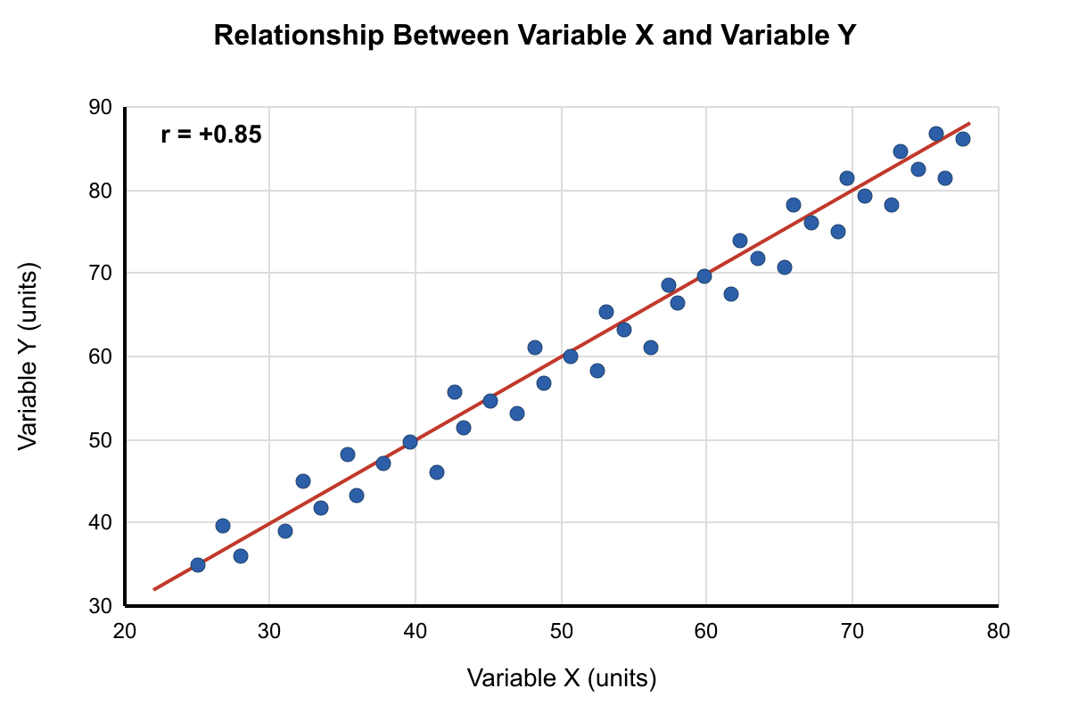
The scatter plot shows the relationship between two physiological measurements taken from the same individuals. The correlation coefficient (r) is +0.85. Which statement best interprets this statistical relationship?
- Since r = +0.85, exactly 85% of the variation in Variable Y can be explained by Variable X
- The correlation of +0.85 indicates that Variable X directly causes changes in Variable Y in 85% of cases
- Approximately 72% of the variance in Variable Y is associated with Variable X, but causation cannot be inferred (correct answer)
- The positive correlation proves that increasing Variable X will always result in proportional increases in Variable Y
- A correlation of +0.85 is too weak to suggest any meaningful relationship between these physiological variables
Explanation: The coefficient of determination (r²) indicates the proportion of variance in one variable associated with the other. With r = +0.85, r² = 0.72, meaning approximately 72% of the variance in Variable Y is associated with Variable X. However, correlation never implies causation. Choice A incorrectly uses the correlation coefficient directly as percent variance explained. Choice B incorrectly infers causation and misinterprets the percentage. Choice D incorrectly assumes causation and perfect predictability. Choice E incorrectly characterizes +0.85 as weak when it actually represents a strong positive correlation.
Question 2
The bar graph compares mean response values with 95% confidence intervals for four experimental groups. Which groups show statistically significant differences based on the confidence interval overlap patterns?
- Groups A and B are significantly different because their means are visibly different values
- Only Groups B and D show significant differences because they have the largest separation between mean values
- Groups A and C likely differ significantly since their confidence intervals show minimal overlap (correct answer)
- All adjacent groups are significantly different because each group has distinct confidence intervals
- No definitive significance conclusions can be drawn because the graph doesn't show p-values from statistical tests
Explanation: When 95% confidence intervals have minimal or no overlap, it suggests a likely significant difference between groups, though this is not definitive without formal statistical testing. Groups A and C show confidence intervals with minimal overlap, suggesting potential significance. Choice A incorrectly assumes different means equal significance. Choice B incorrectly focuses on separation of means rather than confidence interval overlap. Choice D overstates the conclusions from confidence intervals. Choice E is overly conservative - while confidence intervals don't replace statistical tests, minimal overlap does suggest potential significance.
Question 3
Analyze the dose-response relationship in the log-linear plot shown. What does the linear portion of the curve on this semi-logarithmic scale indicate about the underlying biological mechanism?
- The linear relationship proves that the response is directly proportional to the logarithm of the dose
- The straight line indicates first-order kinetics where response increases exponentially with dose
- The linear portion suggests the system follows Michaelis-Menten kinetics with the curve representing the linear phase
- The log-linear relationship indicates that equal percentage changes in dose produce equal absolute changes in response (correct answer)
- The linear portion represents saturation kinetics where the system has reached its maximum response capacity
Explanation: On a semi-logarithmic plot (log dose vs. linear response), a straight line indicates that equal log changes in dose (which represent equal percentage changes) produce equal absolute changes in response. This is characteristic of many biological systems showing proportional responses to relative changes in stimulus. Choice A is partially correct but doesn't explain the biological significance. Choice B incorrectly describes the kinetics. Choice C misapplies Michaelis-Menten kinetics. Choice E incorrectly identifies the linear portion as saturation when saturation would appear as a plateau.
Question 4
The scatter plot shows the relationship between two variables measured in a population study. Based on the trend line and data distribution, which statement most accurately describes the relationship?
- There is a strong positive correlation with minimal scatter, indicating that Variable X directly causes changes in Variable Y
- The correlation coefficient is approximately +0.7, suggesting a moderate positive relationship, but causation cannot be determined from this data (correct answer)
- The relationship is exponential rather than linear, as evidenced by the curved pattern in the upper range of the data
- There is no meaningful relationship between the variables because several data points fall far from the trend line
- The negative y-intercept of the trend line indicates that Variable X has an inhibitory effect on Variable Y at low concentrations
Explanation: The scatter plot shows data points that generally follow an upward trend with moderate scatter around the trend line, suggesting a correlation coefficient around +0.7. However, correlation does not imply causation - there could be confounding variables or the relationship could be bidirectional. Choice A incorrectly assumes causation from correlation. Choice C misinterprets normal scatter as exponential curvature. Choice D incorrectly dismisses a clear trend due to normal variation. Choice E inappropriately interprets a y-intercept in biological terms without context.
Question 5
The box plot compares gene expression levels across four different tissue types. Based on the distribution characteristics shown, which tissue demonstrates the most variable gene expression pattern?
- Tissue A shows the highest variability because it has the highest median expression level among all tissues
- Tissue B demonstrates the most variability due to the presence of multiple outlier points beyond the whiskers
- Tissue C exhibits the greatest variability as indicated by the largest interquartile range (box height) and longest whiskers (correct answer)
- Tissue D shows the most variable expression because the median line is not centered within the box
- All tissues show equivalent variability since they all have the same number of data points represented
Explanation: Variability in box plots is primarily indicated by the interquartile range (IQR, shown by box height) and the range (whisker length). Tissue C shows both the tallest box and the longest whiskers, indicating the greatest spread in gene expression values both within the central 50% of data and overall. Choice A confuses median level with variability. Choice B incorrectly assumes outliers indicate the most variability when the box and whiskers are more important indicators. Choice D misunderstands that asymmetric boxes indicate skewness, not necessarily greater variability. Choice E is incorrect because box plots can represent different amounts of variability regardless of sample size.
Question 6
Based on the growth curve data shown in the graph, during which phase is the population growth rate (slope) changing most rapidly?
- Phase I (0-10 hours) because this represents the steepest portion of the exponential growth curve
- Phase II (10-25 hours) because the population size increases most dramatically during this period
- Phase III (25-35 hours) because this transition period shows the greatest change in slope from positive to zero (correct answer)
- Phase IV (35-50 hours) because the growth rate stabilizes completely during the stationary phase
- The growth rate changes at a constant rate throughout the entire time course shown
Explanation: The question asks when the growth rate (slope) is changing most rapidly, not when growth rate is highest. Phase III shows the transition from exponential growth to stationary phase, where the slope changes from strongly positive to nearly zero - this represents the most rapid change in growth rate itself. Phase I shows steady exponential growth with relatively constant slope. Phase II shows the highest growth rate but the slope isn't changing as rapidly as in Phase III. Phase IV shows stable conditions with no change in slope. Choice E is clearly incorrect as the slope varies considerably.
Question 7
Based on the regression analysis shown in the figure, which statement most accurately describes the relationship between the predictor and response variables?
- The relationship is perfectly linear with R² = 1.0, indicating that the predictor variable completely determines the response
- The 95% confidence intervals around the regression line indicate that the relationship is not statistically significant
- The R² value of 0.64 suggests a moderately strong relationship, with significant scatter around the fitted line
- The negative slope indicates that increases in the predictor variable cause decreases in the response variable
Explanation: C
Question 8
Based on the graph shown, which conclusion about the relationship between enzyme concentration and reaction rate is most strongly supported by the data?
- Enzyme concentration and reaction rate show a linear relationship throughout the entire range tested
- The reaction rate becomes independent of enzyme concentration at higher enzyme concentrations due to substrate limitation (correct answer)
- Doubling the enzyme concentration always doubles the reaction rate regardless of the initial concentration
- The enzyme becomes denatured at concentrations above 0.6 mg/mL, causing the reaction rate to decrease
- Temperature fluctuations during the experiment caused the apparent plateau in reaction rate at higher concentrations
Explanation: The graph shows that reaction rate increases linearly with enzyme concentration up to about 0.4 mg/mL, then plateaus. This plateau indicates that the reaction rate becomes limited by substrate availability rather than enzyme concentration. At high enzyme concentrations, all substrate molecules are being processed as quickly as they become available. Choice A is incorrect because the relationship becomes non-linear at higher concentrations. Choice C is wrong because doubling doesn't always double the rate (evident in the plateau region). Choice D is incorrect because there's no decrease shown, just a plateau. Choice E is unsupported speculation about experimental conditions.
Question 9
The heatmap below displays gene expression changes across different experimental conditions. Based on the color intensity patterns and clustering, what can be concluded about the gene expression profiles?
- Genes 1-5 show identical expression patterns across all conditions, indicating they are functionally redundant
- Condition C produces the most dramatic changes in gene expression as evidenced by the darkest color intensities
- Genes 6-10 appear to be co-regulated, showing similar expression patterns that differ from Genes 1-5 (correct answer)
- The clustering pattern suggests that Conditions A and B are more similar to each other than either is to Condition C
- All genes show upregulation under Condition A, indicating this condition activates global transcription
Explanation: Looking at the heatmap, Genes 6-10 cluster together and show similar color patterns across conditions (mostly red/upregulated under Condition A, blue/downregulated under Condition C), while Genes 1-5 show different patterns. This suggests Genes 6-10 are co-regulated and respond similarly to the experimental conditions. Choice A is incorrect because even Genes 1-5 show some variation. Choice B focuses on intensity rather than patterns. Choice D makes claims about condition similarity that aren't clearly supported. Choice E incorrectly states all genes are upregulated under Condition A when some show downregulation (blue).
Question 10
The table presents results from a controlled experiment measuring plant growth under different light conditions. Based on the data and calculated standard deviations, which experimental conclusion is most justified?
- Blue light is definitively superior to red light because the mean growth rate is higher in all measured parameters
- The difference in stem elongation between red and blue light treatments is likely significant, while leaf number differences may not be (correct answer)
- Green light should be considered the control condition since plants appear green and reflect this wavelength
- The high variability in all treatments indicates that light wavelength has no consistent effect on plant growth parameters
- Red light causes the most predictable growth response because it shows the smallest coefficient of variation
Explanation: Looking at the data, stem elongation shows a large difference between red (15.2 ± 1.8 cm) and blue light (8.7 ± 1.4 cm) with relatively small standard deviations, suggesting this difference is likely significant. However, leaf number shows smaller differences between treatments (12.3 ± 2.1 vs 11.8 ± 2.4) with larger relative standard deviations, making significance less certain. Choice A overstates conclusions without statistical testing. Choice C incorrectly identifies green light as a control. Choice D misinterprets normal biological variation. Choice E incorrectly focuses on coefficient of variation rather than treatment effects.
Question 11
The histogram below displays the distribution of body weights in a population sample. What can be concluded about the nature of this distribution and its implications for data analysis?
- The distribution is perfectly normal, making it ideal for parametric statistical tests without any data transformation
- The distribution shows a slight right skew, suggesting that mean weight is likely higher than median weight (correct answer)
- The bimodal pattern indicates the presence of two distinct subpopulations that should be analyzed separately
- The distribution is too narrow to draw meaningful conclusions about the population characteristics
- The symmetric distribution around the central peak confirms that this sample accurately represents the entire population
Explanation: The histogram shows a distribution with a longer tail extending to the right (higher weights), which is characteristic of right skewness. In right-skewed distributions, the mean is typically pulled higher than the median by the extreme values in the long tail. Choice A is incorrect because the distribution is not perfectly normal due to the skewness. Choice C misidentifies skewness as bimodality. Choice D incorrectly suggests the range is too narrow. Choice E incorrectly assumes the sample represents the population and mischaracterizes the distribution as symmetric.
Question 12
Examine the experimental data presented in the figure. If the error bars represent standard error of the mean, what can be concluded about the statistical significance of the differences between treatments?
- Treatment A is significantly different from both Treatment B and Treatment C because the means are visibly different
- Only Treatment A and Treatment C show significant differences because their error bars do not overlap at all
- All three treatments are significantly different from each other because each has distinct error bars
- No definitive conclusions about significance can be made from error bar overlap alone, as this requires statistical testing (correct answer)
- Treatment B shows no significant difference from the control because its error bars are the smallest
Explanation: While non-overlapping error bars can suggest potential significance, overlapping error bars do not necessarily indicate non-significance. Statistical significance requires proper statistical tests (t-tests, ANOVA, etc.) that consider sample size, variance, and the specific type of error bars shown. The overlap or non-overlap of error bars provides only a rough visual guide and cannot substitute for statistical analysis. Choice A incorrectly assumes visible differences equal significance. Choice B misinterprets error bar overlap rules. Choice C assumes all different means are significant. Choice E incorrectly relates error bar size to significance with a control.
Question 13
Analyze the dose-response curve shown in the graph. At what approximate concentration does the response reach 50% of its maximum value (EC50), and what does the shape of the curve suggest about the underlying mechanism?
- EC50 ≈ 0.1 μM; the sigmoidal shape indicates simple one-to-one binding between drug and receptor
- EC50 ≈ 1.0 μM; the steep middle portion suggests cooperative binding or multiple binding sites are involved (correct answer)
- EC50 ≈ 10 μM; the gradual initial rise indicates the drug requires metabolic activation before becoming effective
- EC50 ≈ 0.01 μM; the plateau region shows that higher concentrations cause receptor desensitization
- EC50 ≈ 100 μM; the curve shape demonstrates competitive inhibition of the drug's target enzyme
Explanation: The EC50 is the concentration that produces 50% of the maximum response. From the graph, the maximum response is 100%, so 50% response occurs at approximately 1.0 μM. The sigmoidal (S-shaped) curve with a steep middle portion is characteristic of cooperative binding, where binding of the first molecule facilitates binding of additional molecules. Choice A has the wrong EC50 value and incorrect mechanism interpretation. Choice C misreads the EC50 and makes unsupported claims about metabolism. Choice D severely underestimates the EC50. Choice E greatly overestimates the EC50 and incorrectly describes the mechanism.
Question 14
Refer to the multi-panel figure showing experimental results from three different treatment groups. Which interpretation most accurately reflects what the error bars and sample sizes indicate about the reliability of these results?
- Treatment A provides the most reliable results because it shows the highest mean value across all measured parameters
- Treatment C results are most reliable due to the largest sample size, despite having larger error bars than Treatment B
- Treatment B offers the most precise measurements as indicated by the consistently smallest error bars across all parameters (correct answer)
- All treatments show equivalent reliability because they all include appropriate error bars and statistical information
- The reliability cannot be determined from this figure because the type of error bars is not specified in the legend
Explanation: Precision in experimental measurements is indicated by the size of error bars - smaller error bars indicate less variability and thus more precise measurements. Treatment B consistently shows the smallest error bars across all measured parameters, indicating the most precise and reliable measurements. Choice A confuses magnitude of response with reliability. Choice B incorrectly prioritizes sample size over precision when Treatment B's smaller error bars indicate better measurement quality. Choice D incorrectly assumes all treatments are equivalent. Choice E is wrong because the question asks about what the error bars indicate, regardless of their specific type.
Question 15
Examine the time-course data in the figure. The graph shows enzyme activity measured at different time points after adding an inhibitor at t = 10 minutes. What pattern best describes the inhibitor's mechanism of action?
- The inhibitor shows immediate competitive inhibition, as evidenced by the sharp drop in activity at t = 10 minutes
- The gradual decline in activity suggests irreversible inhibition where the inhibitor slowly modifies the enzyme structure (correct answer)
- The activity returns to baseline levels, indicating the inhibitor is rapidly metabolized and loses effectiveness over time
- The biphasic response pattern indicates two different enzymes are present with different sensitivities to the inhibitor
- The delayed effect suggests the inhibitor must first be converted to an active metabolite before it can affect enzyme function
Explanation: The graph shows enzyme activity declining gradually over time after inhibitor addition, rather than showing an immediate drop. This pattern is characteristic of irreversible inhibition, where the inhibitor slowly but permanently modifies the enzyme (often through covalent binding). The continued decline suggests progressive inactivation of enzyme molecules. Choice A is wrong because competitive inhibition would show immediate effects. Choice C is incorrect as activity doesn't return to baseline. Choice D unnecessarily invokes multiple enzymes. Choice E incorrectly suggests metabolic activation when the data shows direct progressive inhibition.
Question 16
Examine the survival curve data in the figure. Based on the patterns shown for the three different treatment groups, which conclusion about treatment effectiveness is most justified?
- Treatment A is most effective because it maintains 100% survival longer than the other treatments (correct answer)
- Treatment C provides the best long-term outcomes despite showing early mortality, as evidenced by the final survival plateau
- All treatments are equally effective since they all eventually reach similar survival percentages by the end of the study
- Treatment B offers the most consistent protection throughout the study period with gradual, steady decline
- The control group shows superior survival compared to all treatments, indicating the treatments are harmful
Explanation: Treatment A maintains 100% survival until day 15, then shows a gradual decline to 70% by day 30. This represents the longest period of complete protection and highest overall survival rate throughout the study. Treatment B shows steady decline starting from day 5, and Treatment C shows early rapid mortality followed by stabilization at a lower level. Choice B incorrectly prioritizes the plateau over overall survival. Choice C incorrectly focuses only on endpoints. Choice D mischaracterizes consistent decline as superior. Choice E incorrectly identifies one of the treatments as a control group.
Question 17
The stacked bar chart shows the relative composition of different cell types in tissue samples from three experimental groups. Based on the proportional changes shown, which conclusion is best supported by the data?
- Group C shows the highest total cell count because its bars appear tallest in the chart
- Cell Type 1 increases proportionally from Group A to Group C, while Cell Type 3 shows the opposite trend (correct answer)
- All cell types maintain constant absolute numbers across groups, with only their relative proportions changing
- Cell Type 2 remains completely unaffected by the experimental treatment across all three groups
- The experimental treatment causes Cell Type 4 to completely disappear from the tissue samples
Explanation: Examining the proportional changes in the stacked bars, Cell Type 1 (bottom segment) increases as a proportion from Group A to Group C, while Cell Type 3 shows a decreasing proportion across the same groups. Choice A is incorrect because stacked bar charts show proportions, not absolute totals (all bars are the same height representing 100%). Choice C makes unsupported claims about absolute numbers. Choice D is incorrect because Cell Type 2 does show proportional changes. Choice E is incorrect because Cell Type 4 is still present in all groups, just at different proportions.
Question 18
Study the two-way interaction plot shown in the figure. The graph displays how Factor A and Factor B jointly influence the measured response. What type of interaction is demonstrated by these data?
- No interaction exists because both factors show positive effects on the response variable
- A synergistic interaction where the combined effect of both factors exceeds the sum of their individual effects
- An antagonistic interaction where Factor B reduces the effectiveness of Factor A at higher levels
- A crossover interaction where the effect of Factor A depends on the level of Factor B (correct answer)
- A simple additive effect where both factors contribute independently to the total response
Explanation: The interaction plot shows lines that cross, indicating a crossover interaction. At low levels of Factor B, increasing Factor A decreases the response, but at high levels of Factor B, increasing Factor A increases the response. This means the effect of Factor A depends on the level of Factor B. Choice A is incorrect because crossover interactions definitely exist. Choice B incorrectly describes synergism when the lines cross. Choice C doesn't accurately describe the pattern shown. Choice E is wrong because parallel lines would indicate additive effects, but these lines cross.
Question 19
Study the concentration-response curves in the graph for two different compounds tested on the same biological system. What do the curve characteristics reveal about the relative potencies and efficacies of Compound A versus Compound B?
- Compound A is more potent and more efficacious than Compound B based on both curve position and maximum response
- Compound A is more potent but less efficacious than Compound B, as shown by leftward shift but lower maximum
- Compound B is more potent but both compounds show equivalent efficacy at their respective maximum responses
- Both compounds have identical potency but Compound B achieves greater efficacy than Compound A
Explanation: B